
UX case study: signup flow redesign for a boutique cinema club
Reel Heretics · 161-minute redesign
Reel Heretics needed its membership page to do a different job from a standard screening listing.
by Andrés Ossa ·
Open the prototype →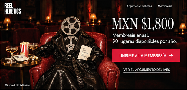
The approach
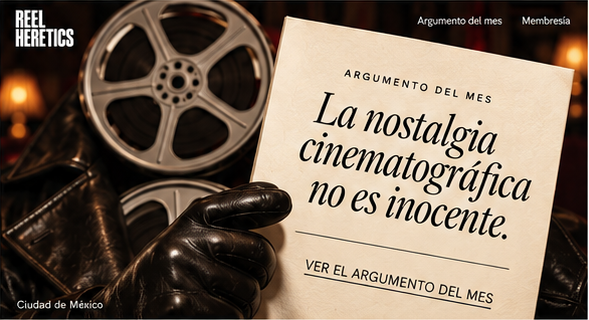
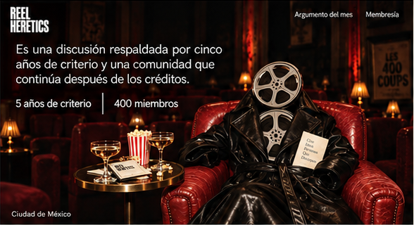
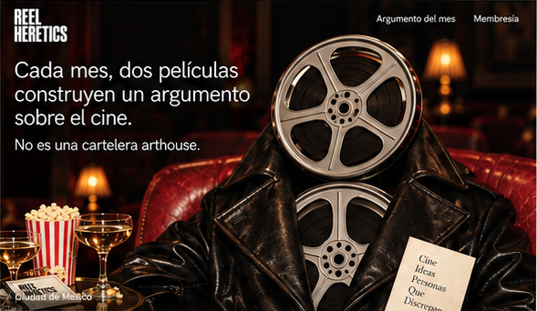
Reel Heretics needed its membership page to do a different job from a standard screening listing. The club already had monthly film programming, but the page read too much like a movie theater schedule. The objective was to reposition membership as a curated cultural identity, so joining would feel like a taste statement rather than a simple ticketing decision. I reorganized the story of the page into five screens: Screen 1, 05 la invitacion; Screen 2, 04 el argumento; Screen 3, 03 el respaldo; Screen 4, 02 dos peliculas; and Screen 5, 01 la declaracion. That sequence shifts the emphasis away from listings alone and toward an editorial point of view. Instead of leading with screenings in the manner of a calendar, the page is framed as an invitation and an argument, then supported, before arriving at the film examples and the declaration. The change was meant to make the club feel authored and intentional, not merely scheduled. The behavior this is meant to produce is a different kind of decision from the visitor. Rather than asking, “Do I want to attend this screening?”, the page aims to prompt, “Is this my kind of club?” That supports the client’s goal of making membership feel like affiliation with a community of cinephiles and a visible expression of taste. Unity, Authority, Belonging, and Pride were not documented.
The screens
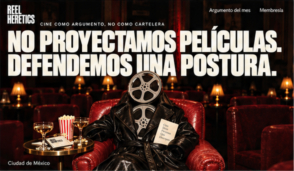
The brief
Reel Heretics — Boutique Cinema Club · Membership page for a monthly film screening club with curated programming
The page lists screenings like a movie theater. It doesn't transmit the curatorial point of view or the community of cinephiles.
Objective: Design a membership page that positions the club as a curated cultural identity — joining is a taste statement.
What the client already had
The first version their own LLM produced — the thing this redesign had to beat.
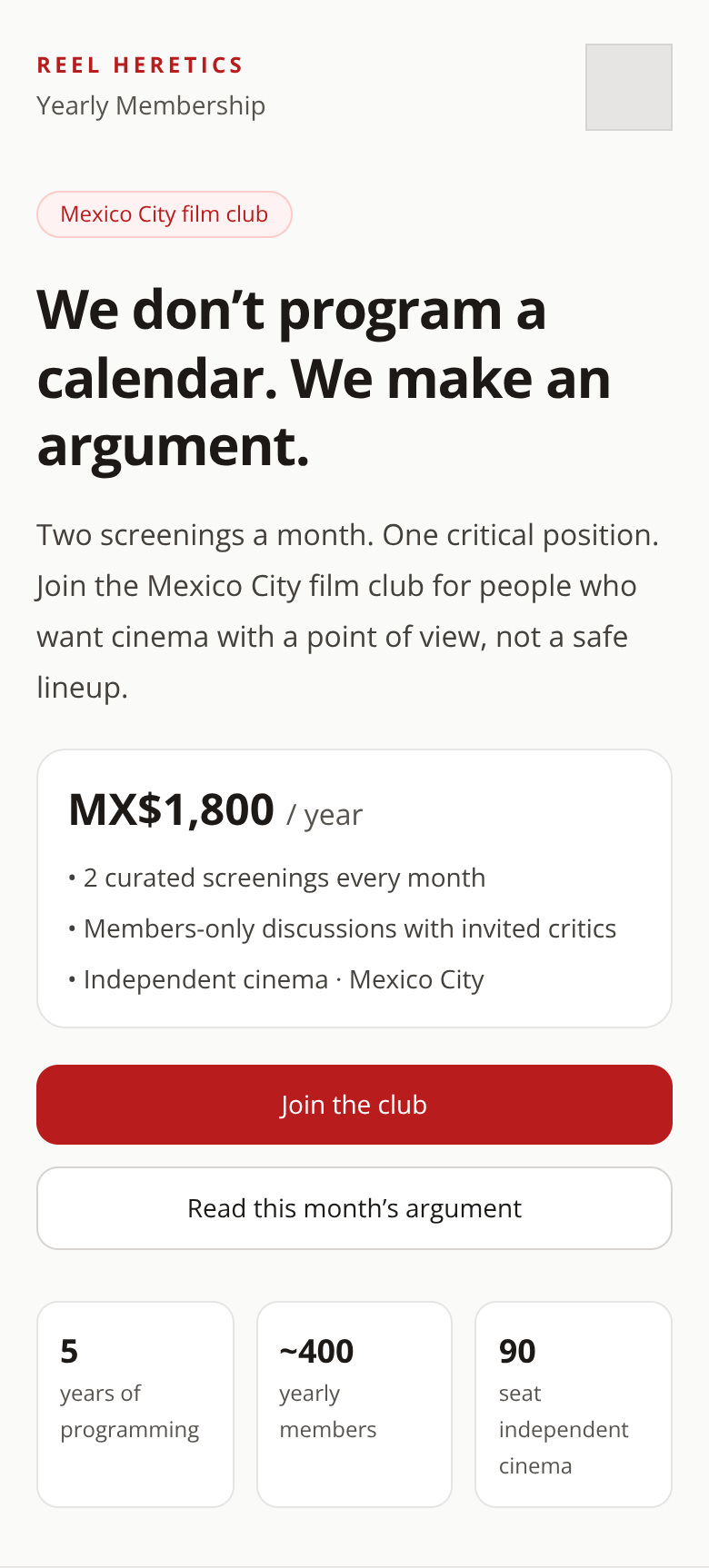
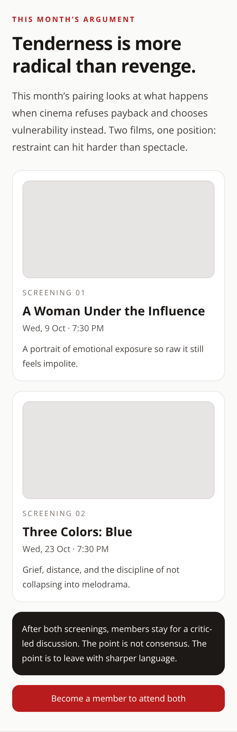
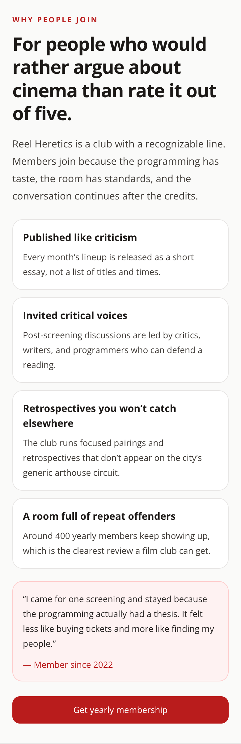
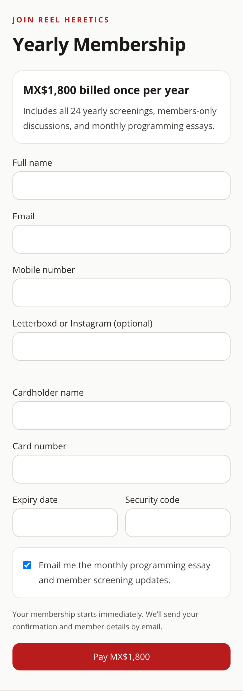
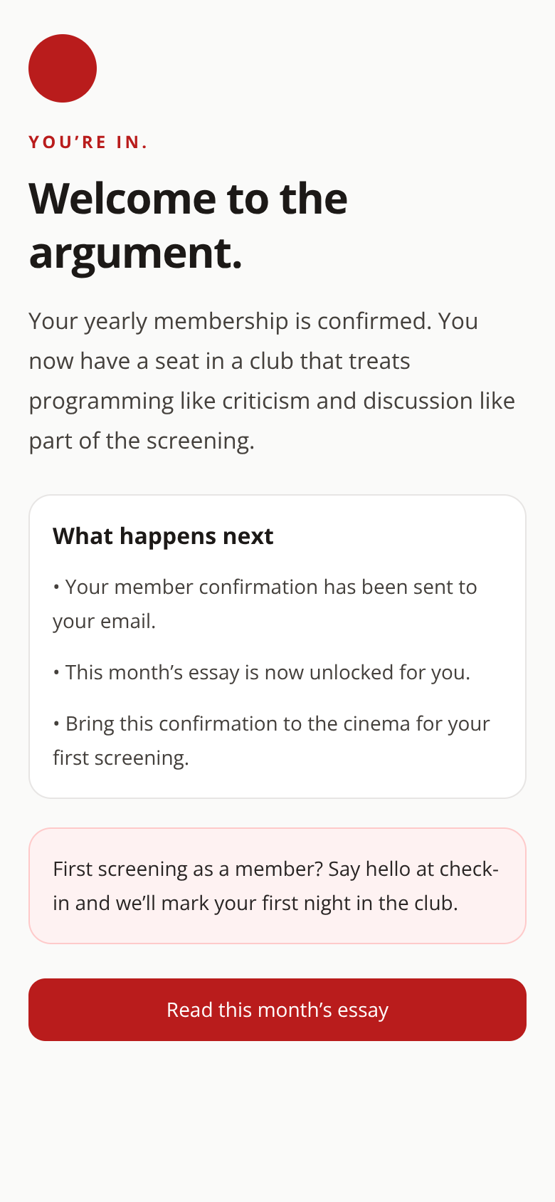
The behaviour design behind it
More 60-minute case studies
- UX case study: signup flow redesign for an indie game studio
Black Salt Games
- UX case study: booking page redesign for a boutique recording studio, by andres
Room 13 needed a booking page that did more than list hours, rates, and gear.
- UX case study: project page redesign for an architecture firm, by andres
UX case study: case study page redesign for an independent architecture firm