
UX case study: project page redesign for an architecture firm, by andres
Praxis Atelier · 114-minute redesign
UX case study: case study page redesign for an independent architecture firm
by andres ·
Open the prototype →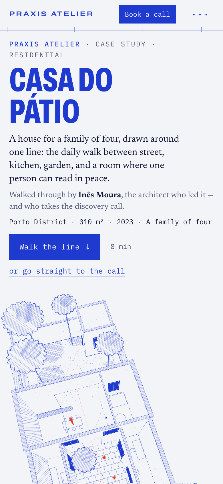
The approach
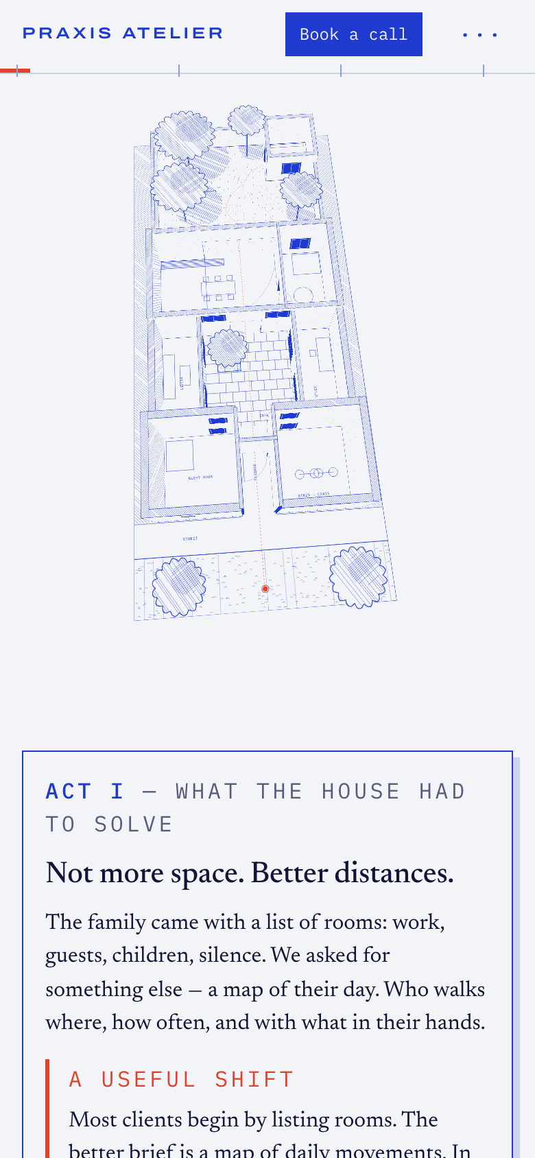
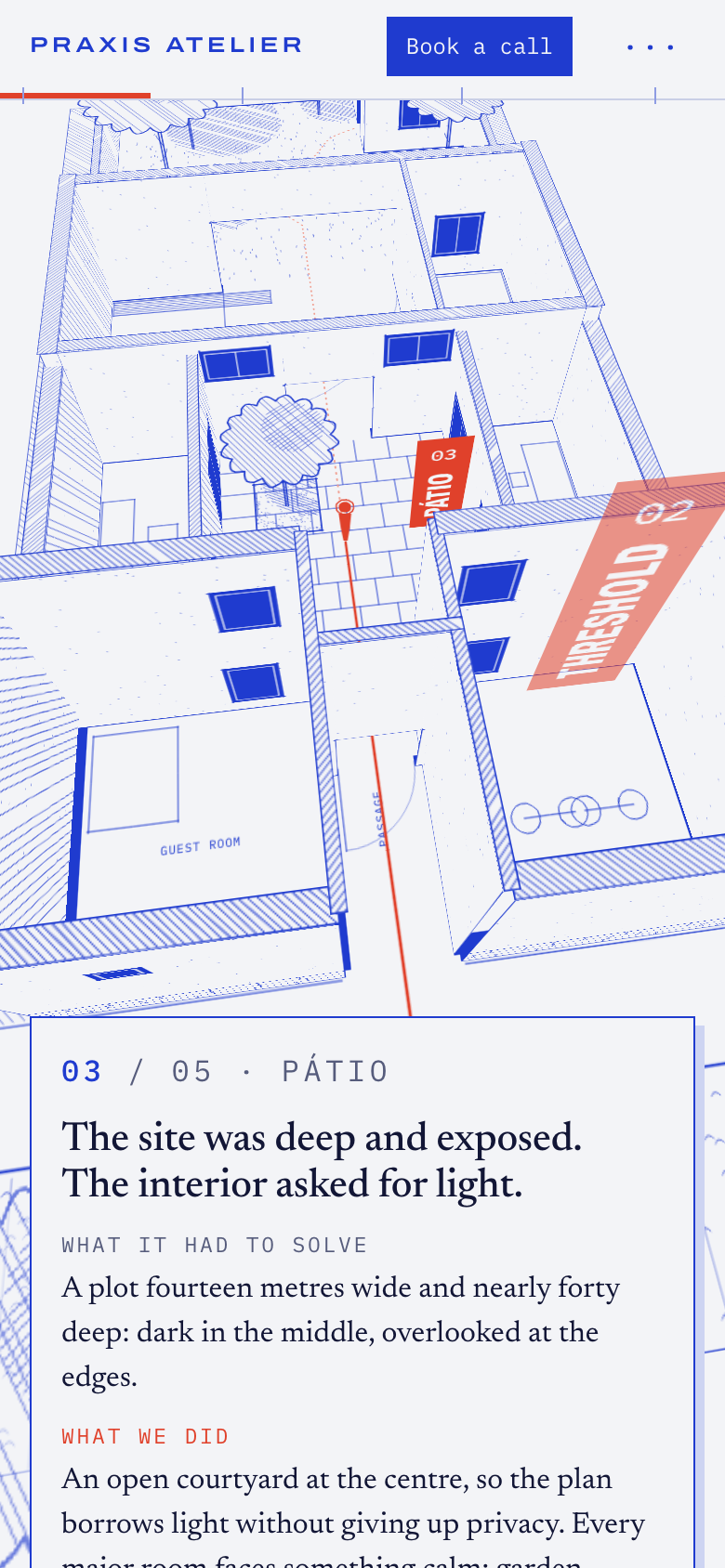
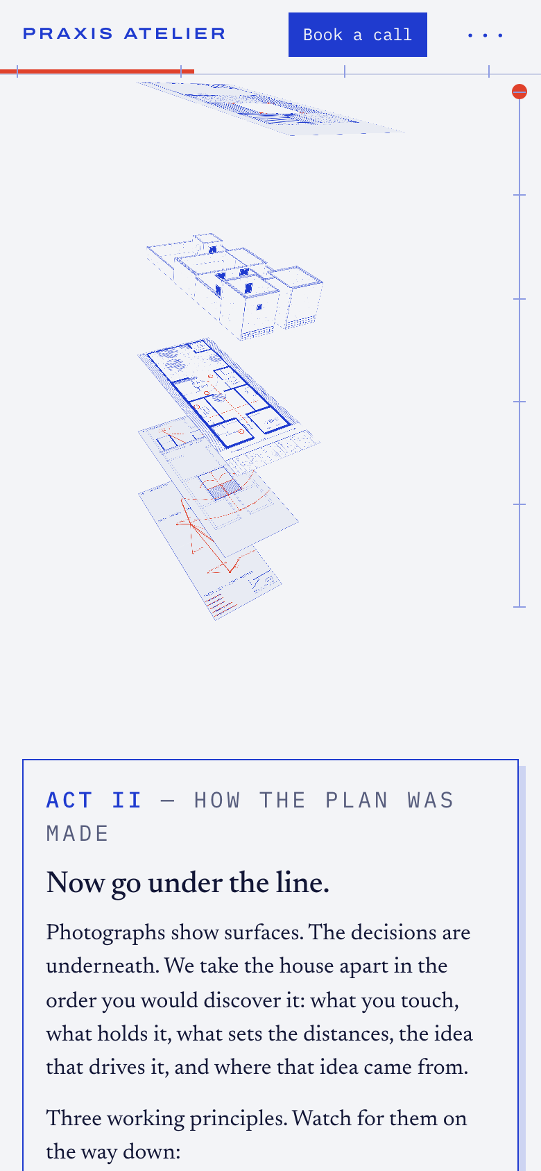
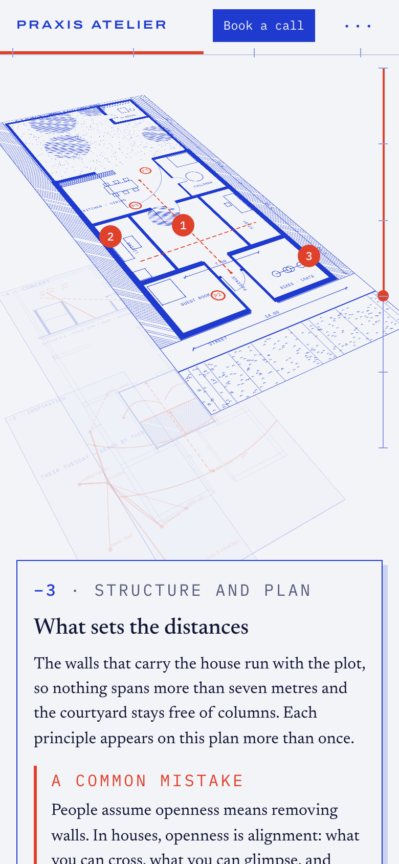
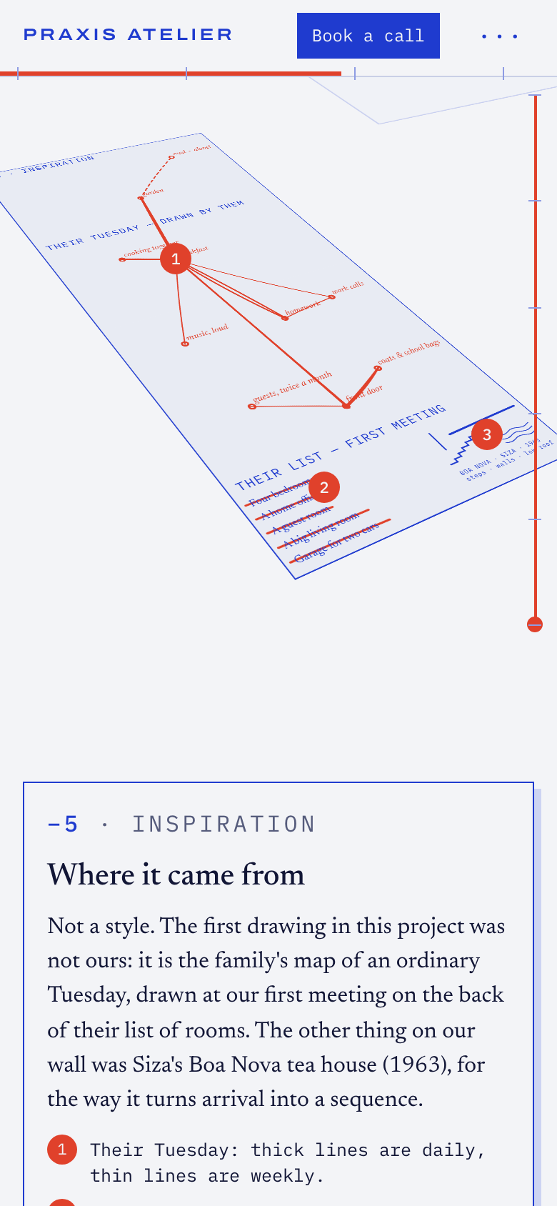
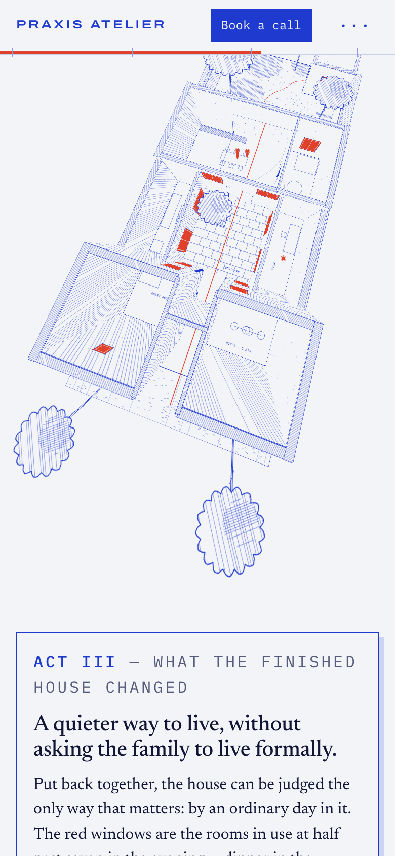
Praxis Atelier needed a project page that felt less like a property listing and more like a guided architectural narrative. The brief was to present one completed residential project in a way that communicates the firm’s thinking, so the visitor feels walked through the work by the architect rather than sold to by a brochure. I responded with an eight-screen structure, moving from Screen 1 through Screen 8 as a paced sequence rather than a single gallery of outcomes. That change was important because the core problem was not a lack of material but the framing of it. The page needed to elevate the project into a story of thought. Designing it as a sequence creates room for interpretation, progression, and emphasis, which supports a more editorial reading of the work. The intended behaviour is slower, more attentive engagement. Instead of scanning for finishes or square footage, the visitor should stay with the project long enough to absorb the firm’s perspective and design philosophy. The structure is meant to shift the experience from browsing a residential showcase to following an architect’s account of what was made and how it should be understood. The targeted skill that went undocumented was Insight.
The screens
The brief
Praxis Atelier — Independent Architecture Firm · Case study page presenting one finished residential project
The case study reads like a real estate brochure. It doesn't transmit the firm's thinking process or design philosophy.
Objective: Design a case study that elevates the work into a story of thought — make the visitor feel they're being walked through the project by the architect.
What the client already had
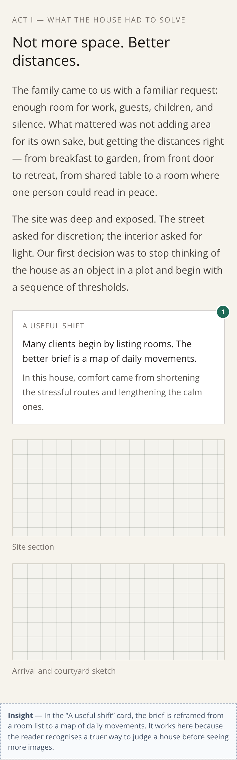
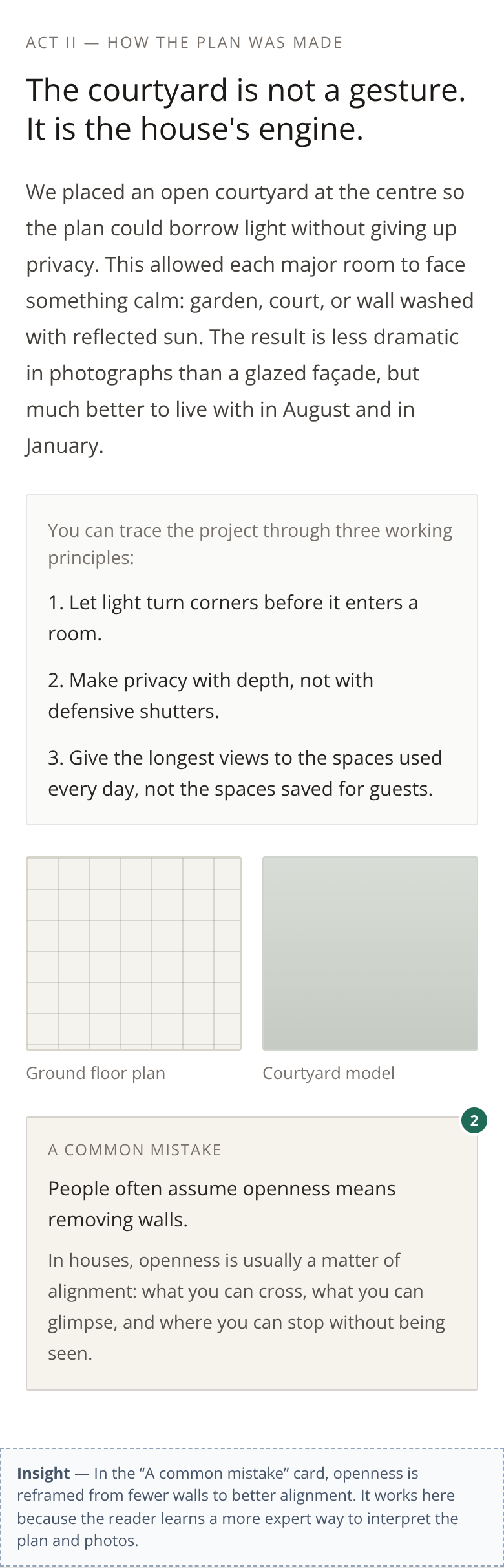
The first version their own LLM produced — the thing this redesign had to beat.

The behaviour design behind it
Insight
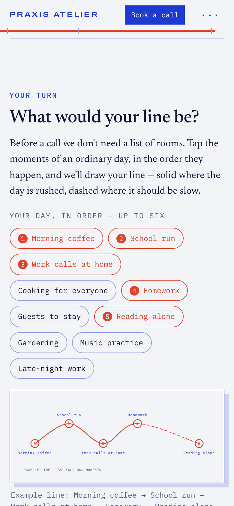
Elevation The page makes the reader better at judging a house. It teaches them to read a plan through its layers, a legend of two inks and principles that come back, so that by the third sheet they spot P1, P2 and P3 without being told. Feeling intellectually matched with an architect doesn't come from flattering copy. It comes from leaving the page with a sharper eye than you arrived with, and being able to use it on the next studio's site. That elevation rests on three other levers. Authority: the architect's first-person voice, drawings with real dimensions, sun angles computed for the site, one precise reference (Siza's Boa Nova tea house), and a call with the person who drew the plan. Insight: the client's two reframes stop being cards and become the experience. The reader walks the map of movements and sees openness as sight lines. Implicit prompt: "What would your line be?" is planted at the start of the walk and comes back at the end as the form itself, so the reader reaches the call already holding the answer. The share-with-your-partner option carries a question, because this reader decides at home, together. So the question stops being "is this a good-looking house?" and becomes "is this the person who should design ours?"
More 60-minute case studies
- UX case study: booking page redesign for a boutique recording studio, by andres
Room 13 needed a booking page that did more than list hours, rates, and gear.
- UX case study: drop page redesign for a sustainable streetwear brand, by andres
Halfwild came to me with a drop page
- UX case study: service page redesign for an independent print studio
We transformed a transactional printing page into a co-creation experience connecting the client with an artist, the studio, and their future audience.