
UX case study: booking page redesign for a boutique recording studio, by andres
Room 13 · 145-minute redesign
Room 13 needed a booking page that did more than list hours, rates, and gear.
by andres ·
Open the prototype →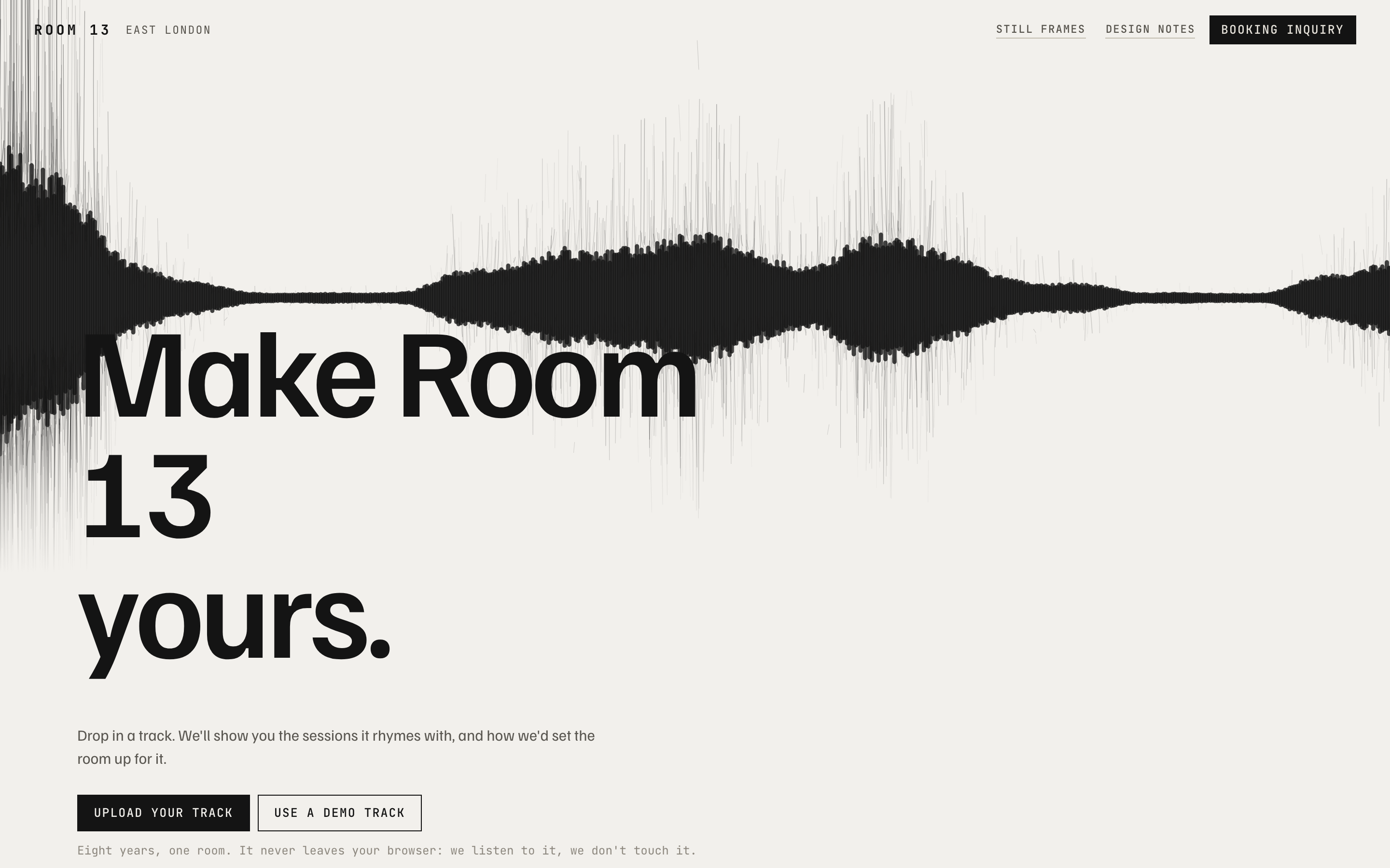
The approach
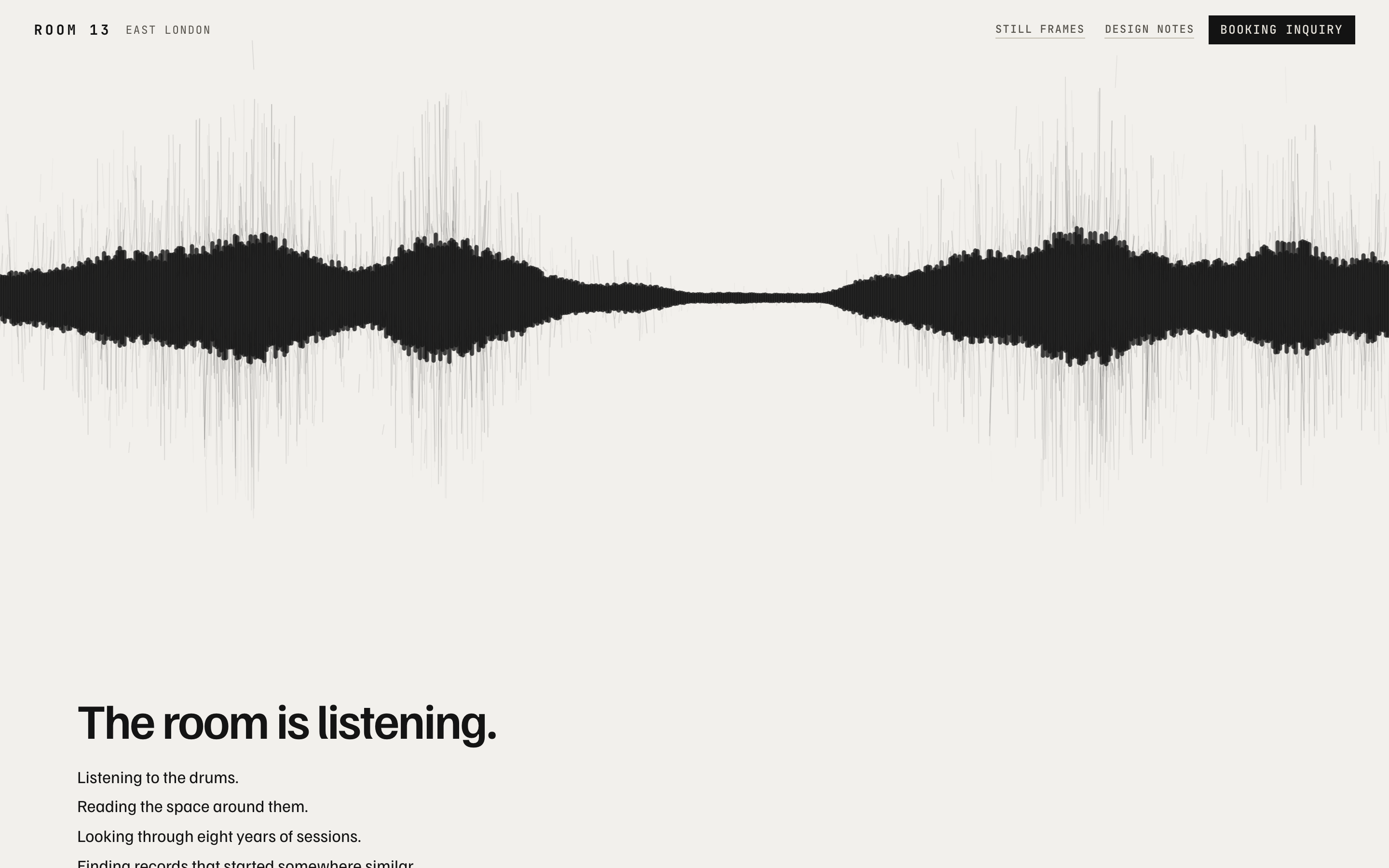
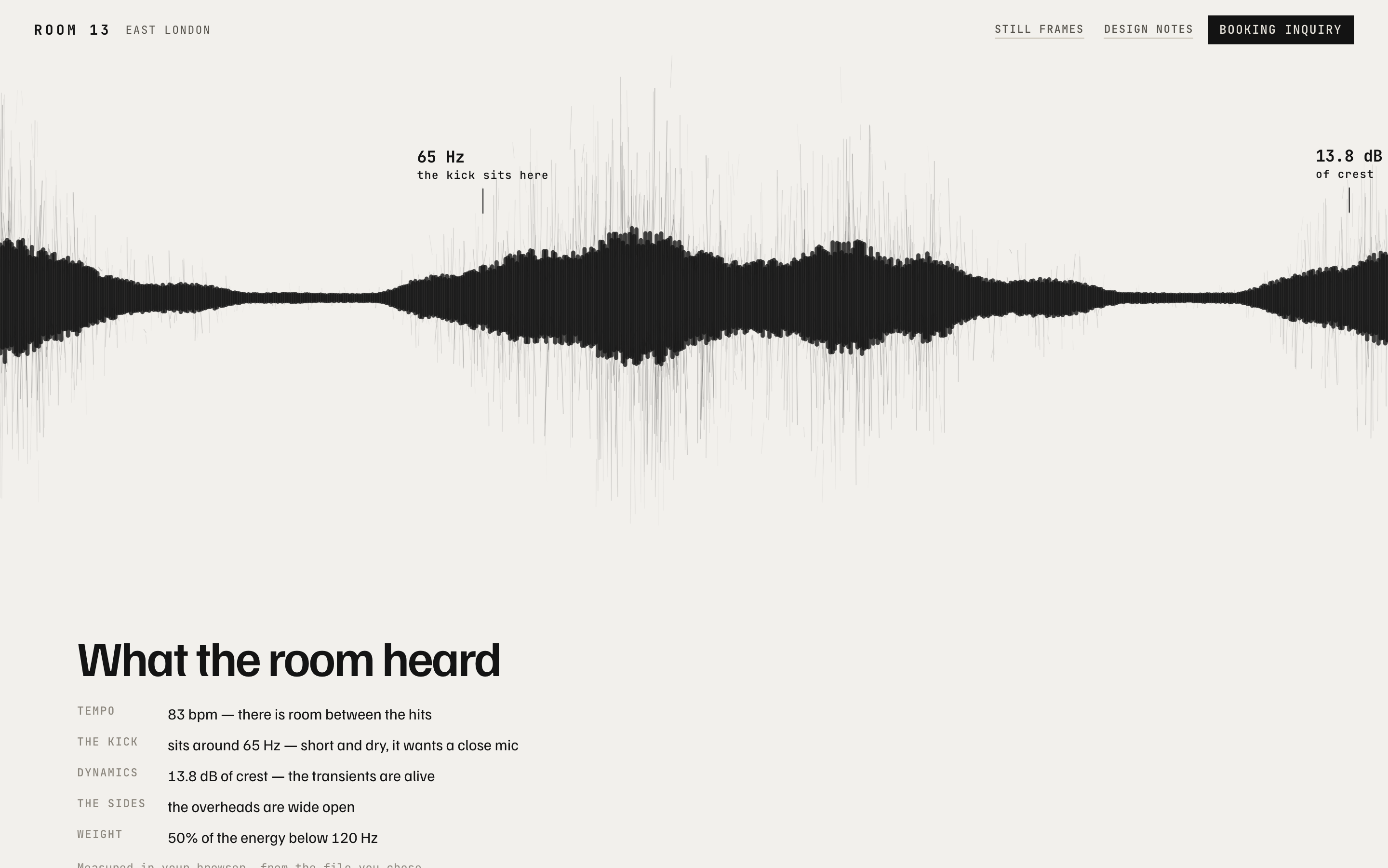
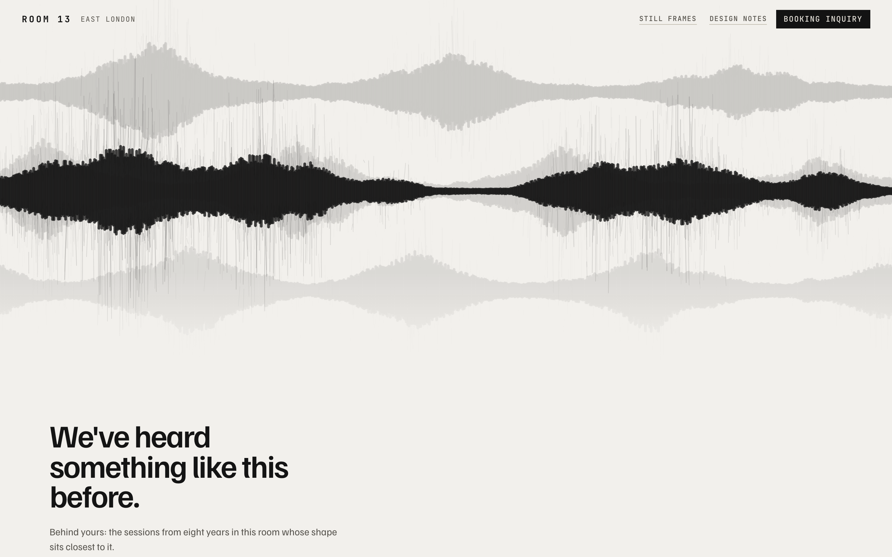
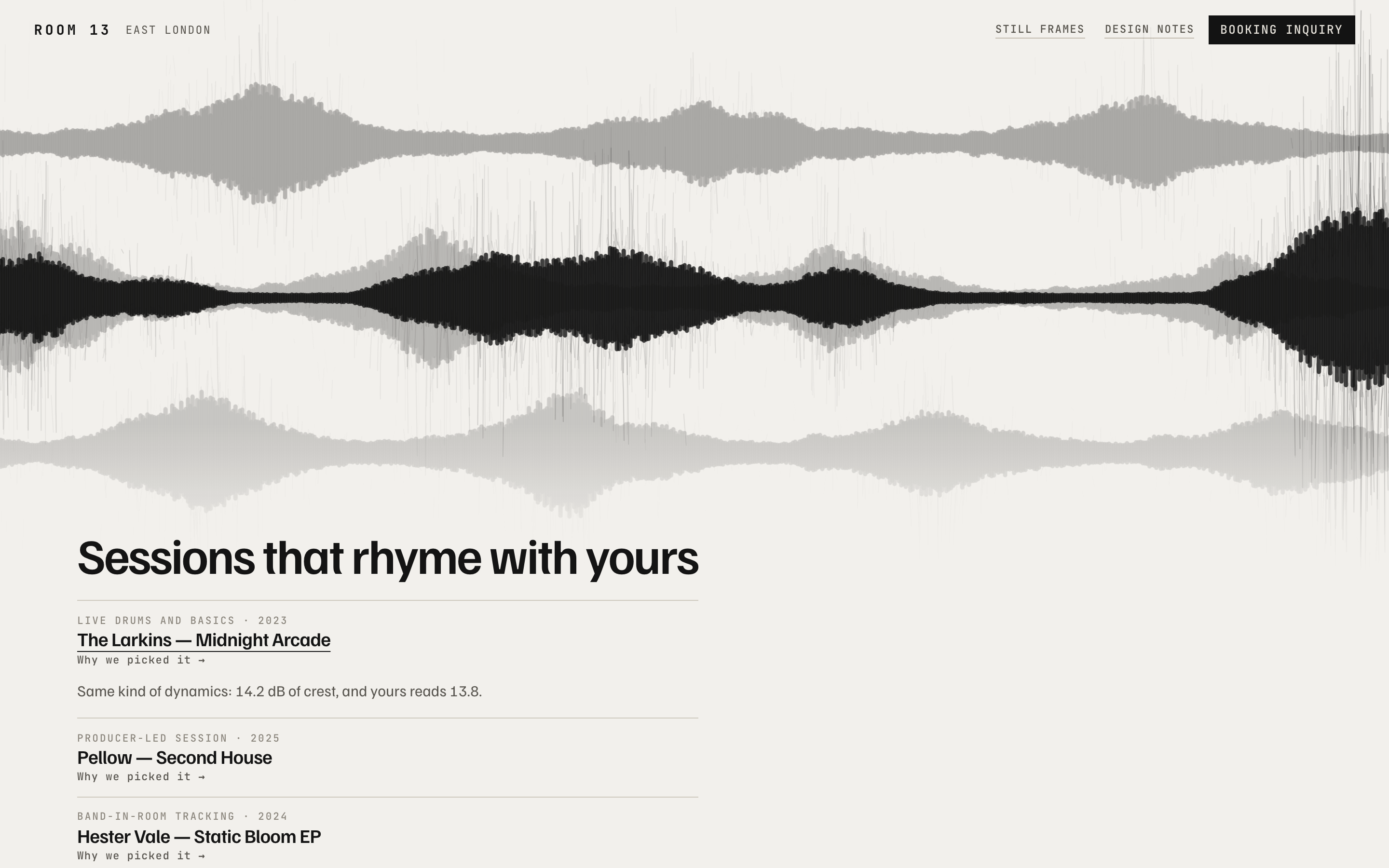
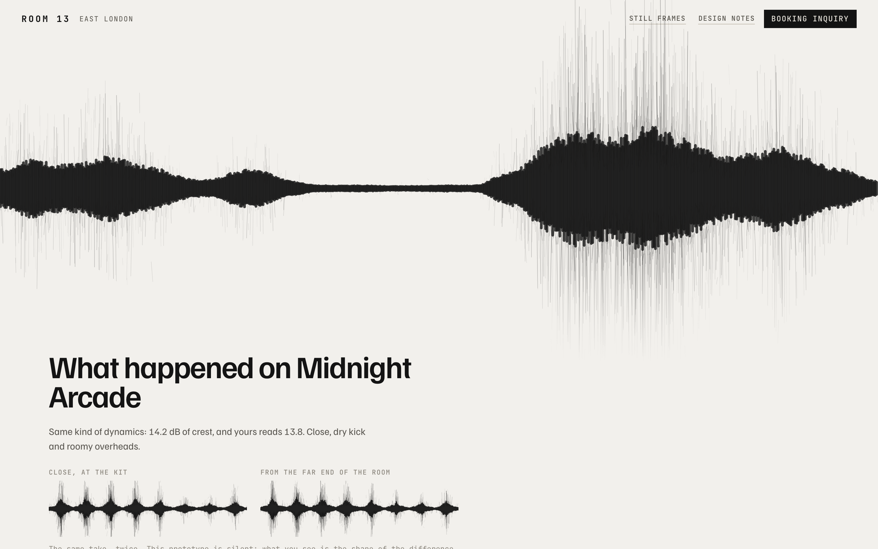
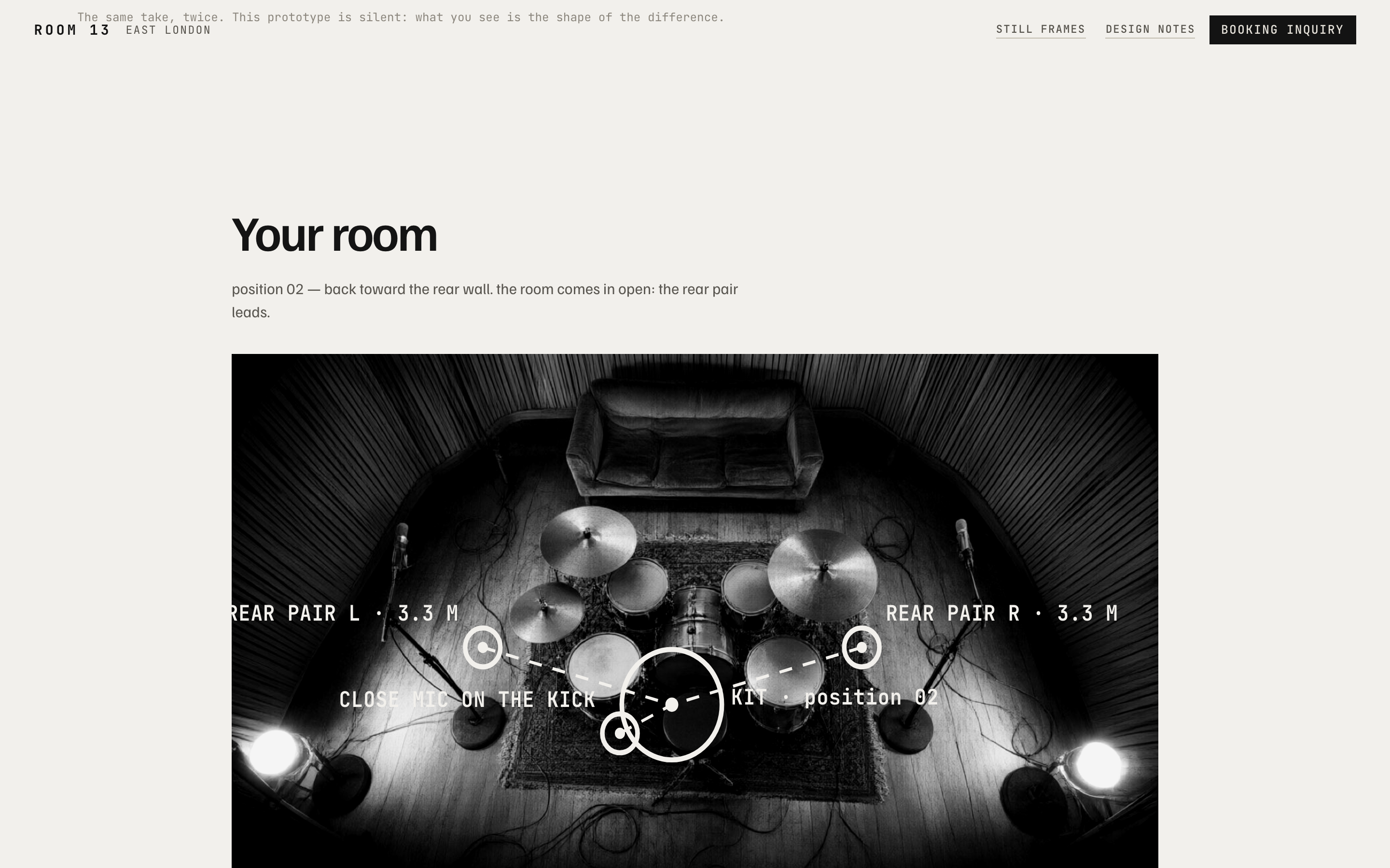
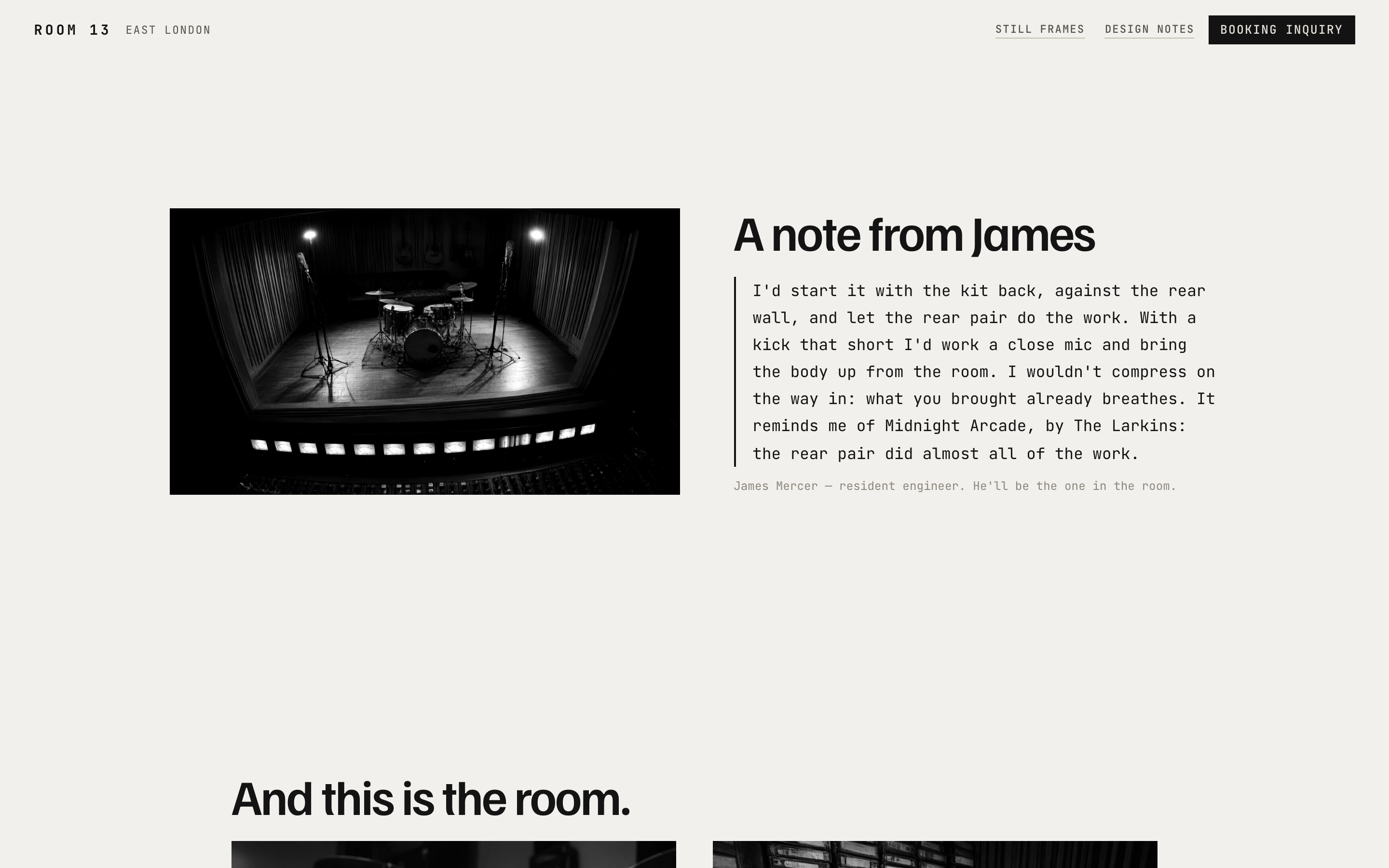
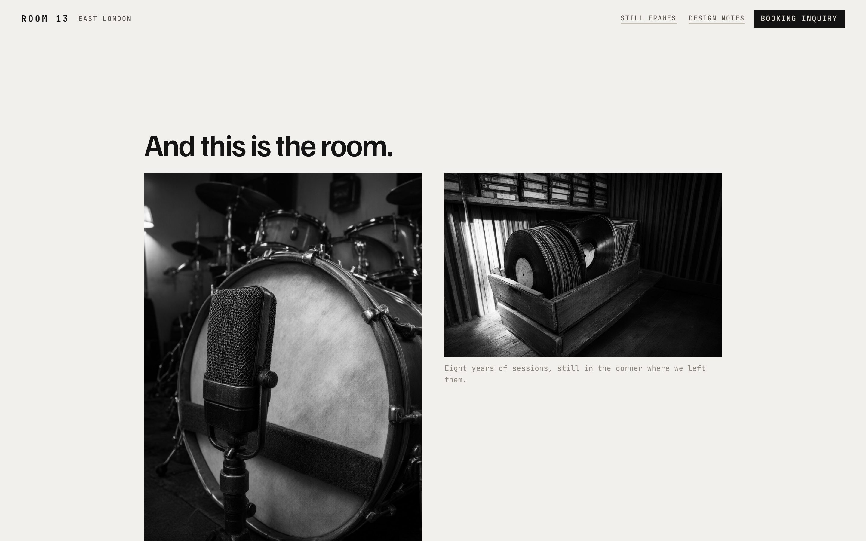
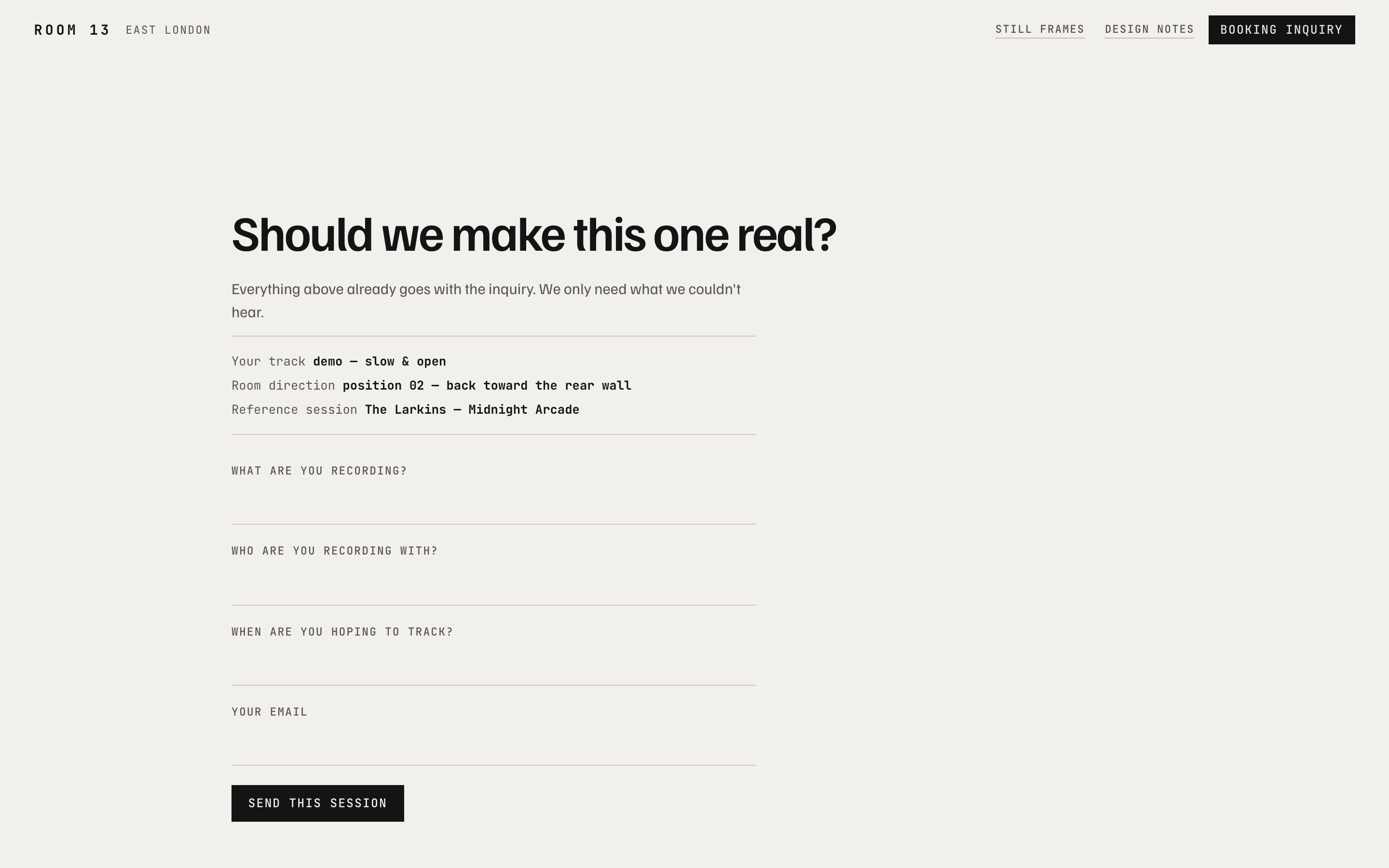
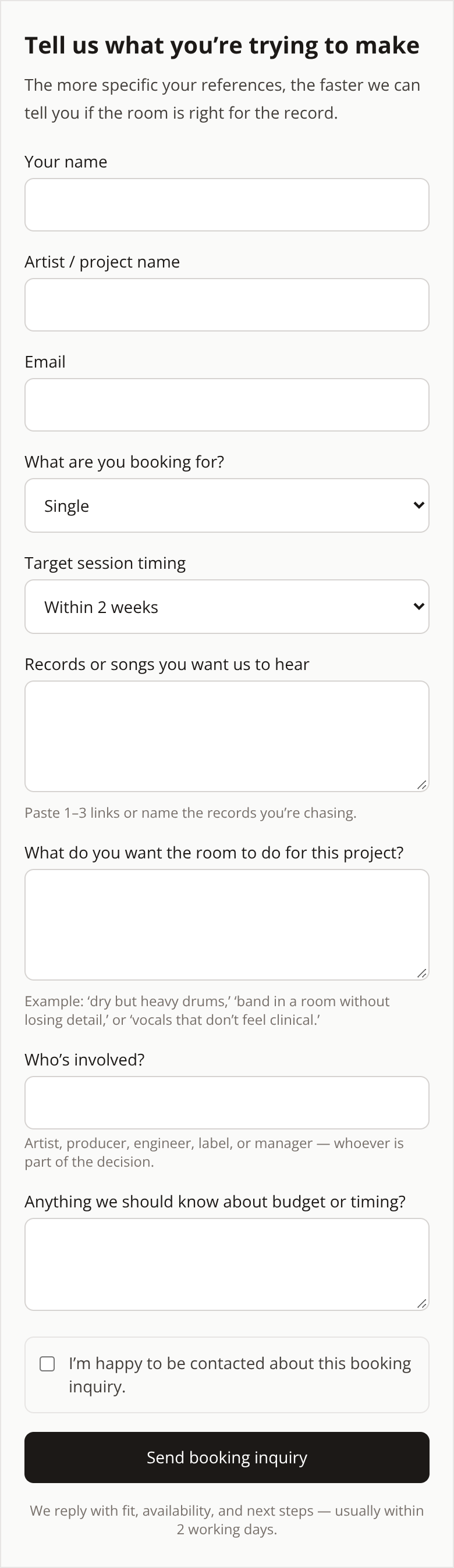
Room 13 needed a booking page that did more than list hours, rates, and gear. The problem with the existing framing was that it read like a service business, when the real decision for an artist is more personal: why this room, for this sound, over any other studio. The goal was to make the artist feel like the room was already theirs, while using past sessions as proof in a way that felt relevant to their own work. I changed the booking experience so the social proof is organised around the visitor’s own audio rather than around generic studio credibility. On Screens 2 through 9, the session file is reordered to compare each record against the visitor’s track across five measurements. Each card gives a specific reason for the match, such as “14.2 dB crest, and yours reads 13.8,” so the comparison is grounded in something arguable rather than in praise. I also used ghost waves from three past sessions behind the visitor’s own wave, so the resemblance is visible before it is explained. When one is opened, it is drawn over their own edit. That shifts the message from “good artists have recorded here” to “artists who do something like what I do have recorded here.” The behaviour this is meant to produce is a stronger sense of fit and ownership for the right artist, while quietly filtering out someone who is only comparing rates, without adding another field to the form.
The screens
The brief
Room 13 — Boutique Recording Studio · Booking landing page for artists to reserve studio time
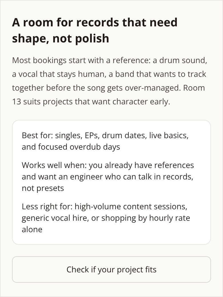
The page reads like a service business — hours, rates, gear list. It doesn't transmit why an artist would choose this room over another.
Objective: Design a booking page that makes the artist feel the room is already theirs — sonic identity, past sessions referenced as social proof.
What the client already had
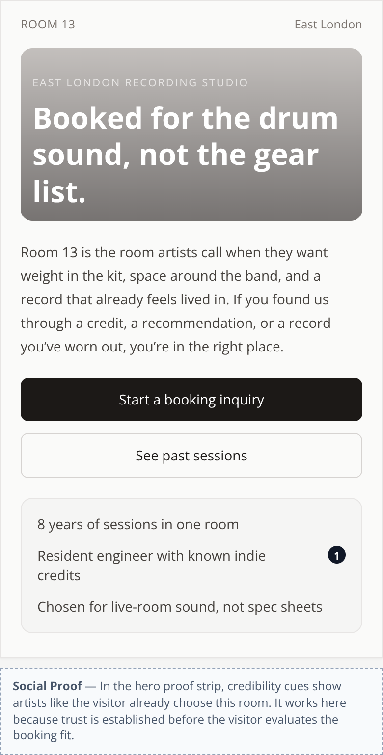
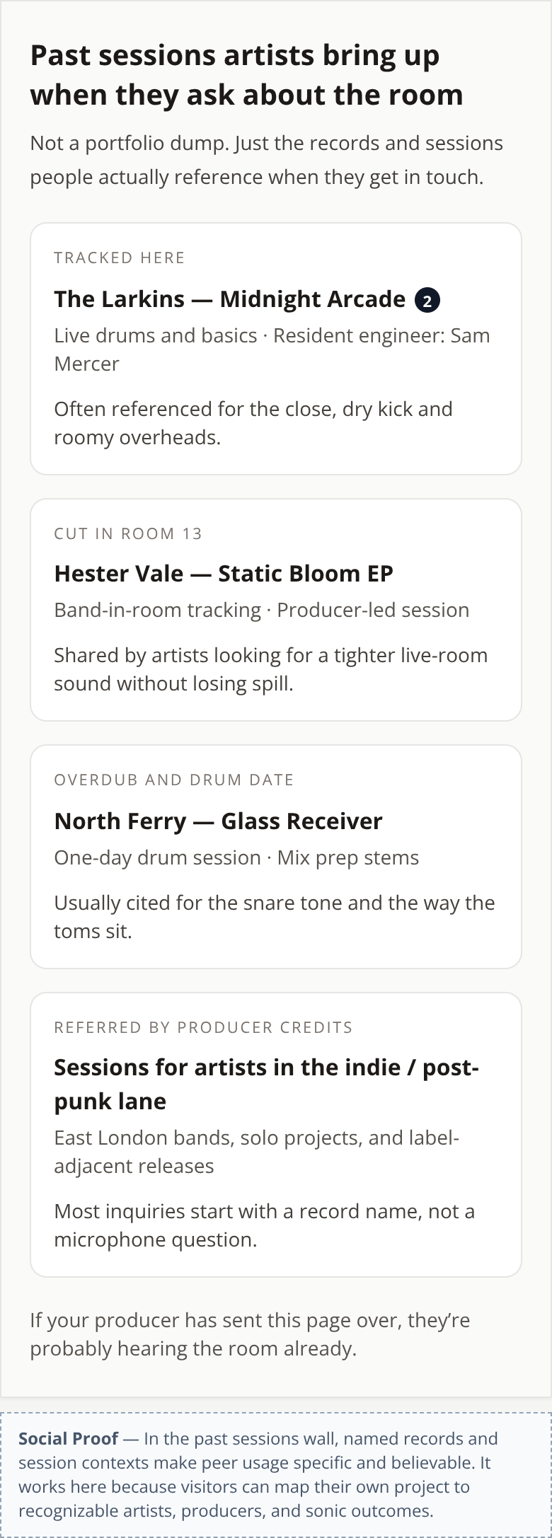
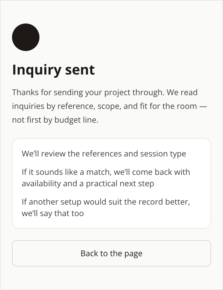
The first version their own LLM produced — the thing this redesign had to beat.
The behaviour design behind it
Social Proof
The session file is reordered with the visitor’s audio: each record is compared across five measurements and the card shows as the reason the dimension that most closely resembles —«14.2 dB crest, and yours reads 13.8»—, a figure that can be argued with, not a compliment. The three sessions appear as ghost waves behind their own, so the comparison is seen before it is read, and the one they open is then drawn over their own edit. It turns «good artists have recorded here» into «artists who do something like what I do have recorded here» — and along the way it filters out the one who was only comparing rates, without adding a single field to the form.
More 60-minute case studies
- UX case study: project page redesign for an architecture firm, by andres
UX case study: case study page redesign for an independent architecture firm
- UX case study: drop page redesign for a sustainable streetwear brand, by andres
Halfwild came to me with a drop page
- UX case study: service page redesign for an independent print studio
We transformed a transactional printing page into a co-creation experience connecting the client with an artist, the studio, and their future audience.