
UX case study: service page redesign for an independent print studio
Press Black · 73-minute redesign
We transformed a transactional printing page into a co-creation experience connecting the client with an artist, the studio, and their future audience.
by andres ·
Open the prototype →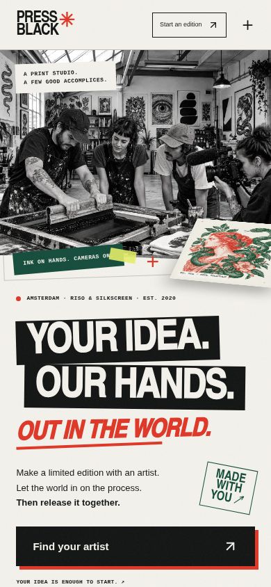
The approach
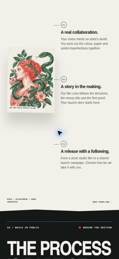
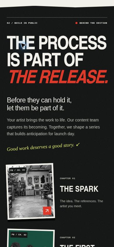
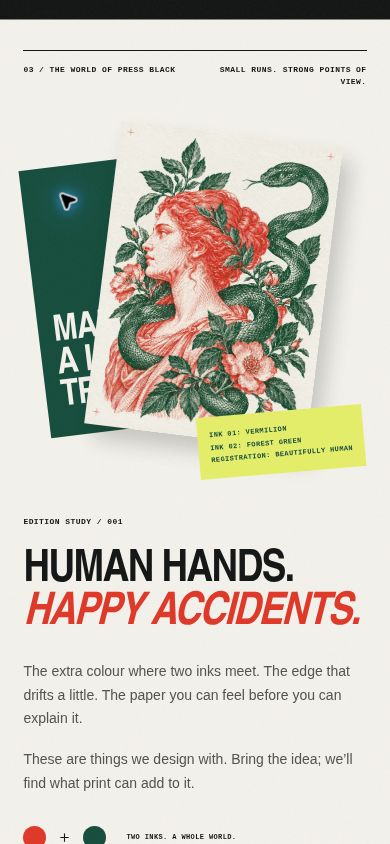
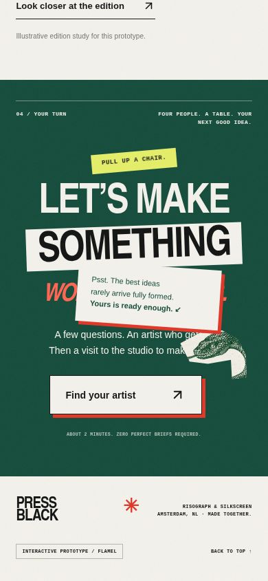
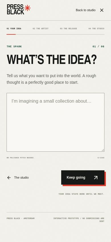
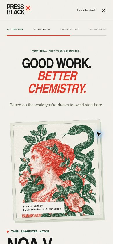
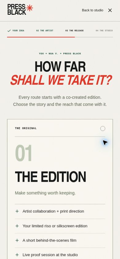
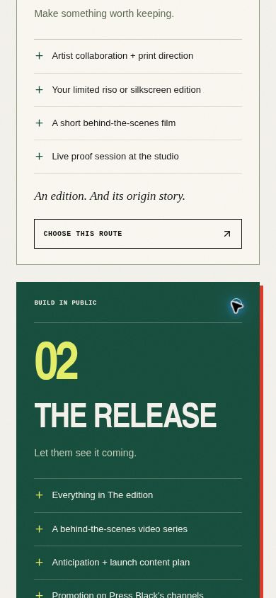
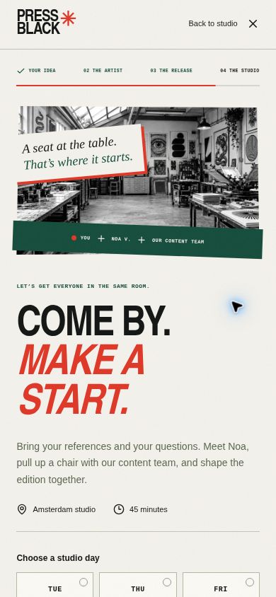
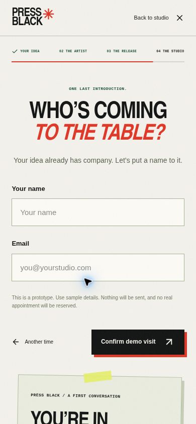
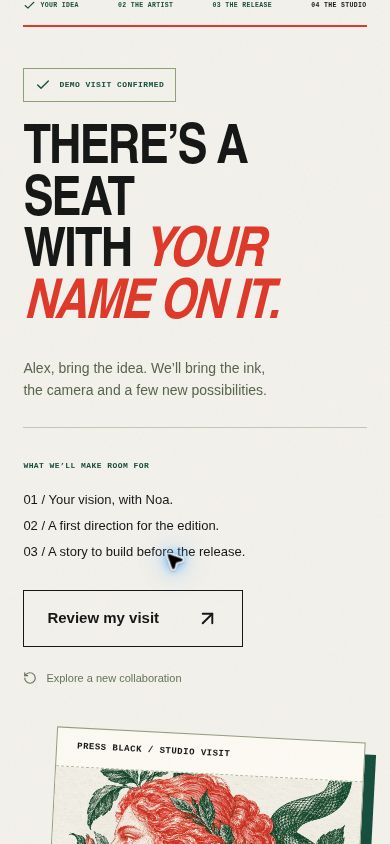
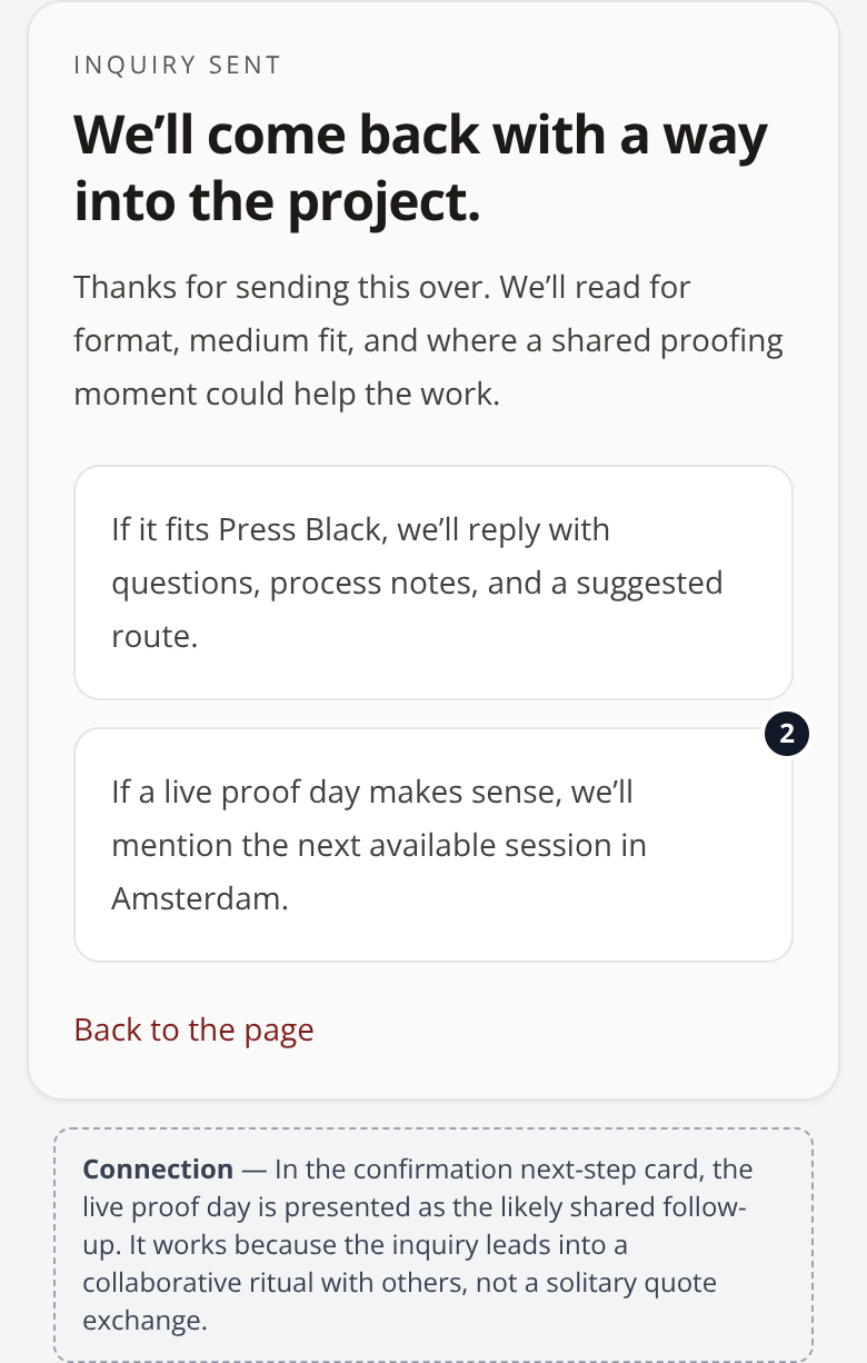
Press Black needed its service page to stop reading like a printer’s price list. Designers visiting the page couldn’t tell why they would choose this studio for a poster series, so I reframed the experience around collaboration, craft, and the joy of making something together. I changed the page from a transactional service description into a co-creation journey. Across the 12 screens, the story starts with the idea and vision for the collection, then moves into a recommendation of a compatible artist, three levels of collaboration, and finally a shared working session that brings the client, the artist, and Press Black’s content team together. On Screen 2 through Screen 12, I kept the artist, print team, and content team present throughout so the user never feels like they are simply uploading files and waiting. Language like “You + the artist + Press Black,” along with the live proof and the studio appointment, helps position the process as a shared ritual rather than a handoff. I also introduced a Build in public package so the audience can follow decisions, experiments, and the first print run before launch. The behaviour I want to create is a shift in how the service is evaluated. Instead of asking only what it costs to print, designers should start asking who they want to make and launch a collection with.
The screens
The brief
Press Black — Independent Print Studio · Service page for risograph and silkscreen printing commissions
The page reads like a printer's price list. Designers visiting can't tell why they'd choose this studio for their poster series.
Objective: Design a service page that elevates the studio as a creative collaborator — showcase craft, past collaborators, and the joy of the medium.
What the client already had
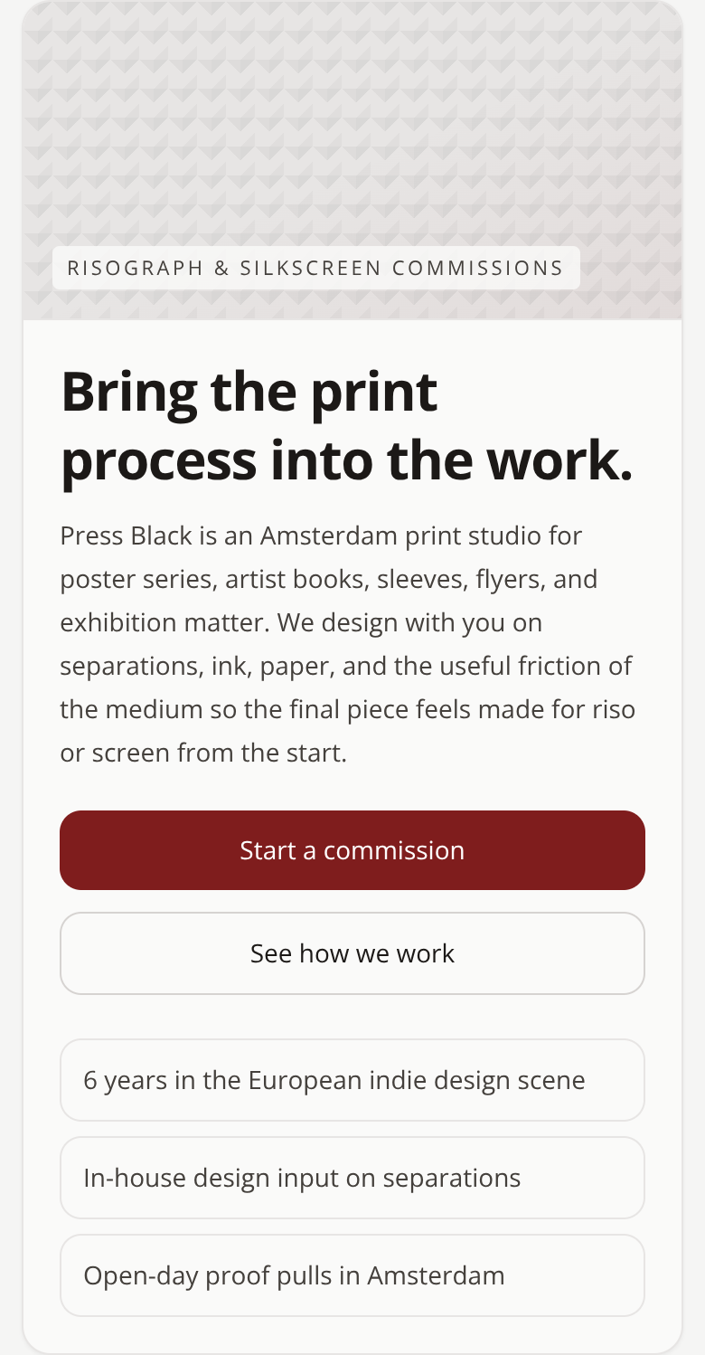
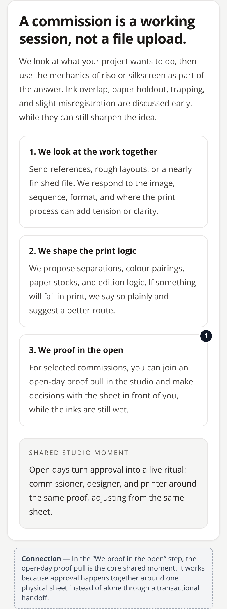
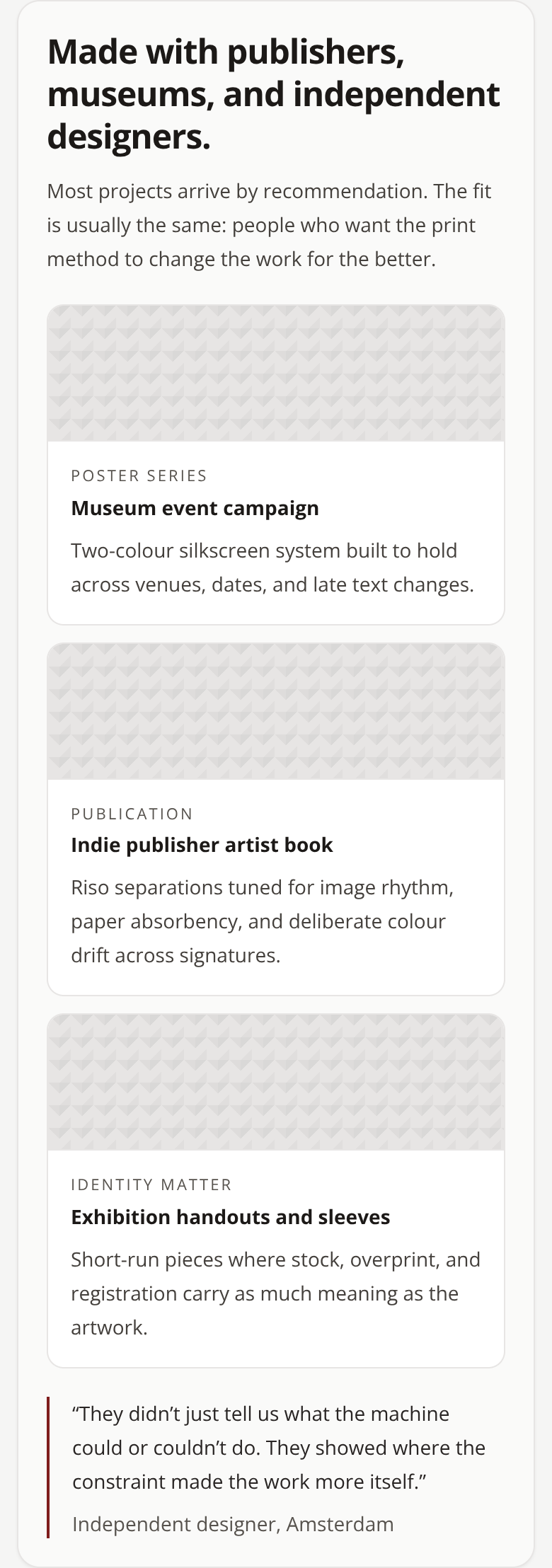
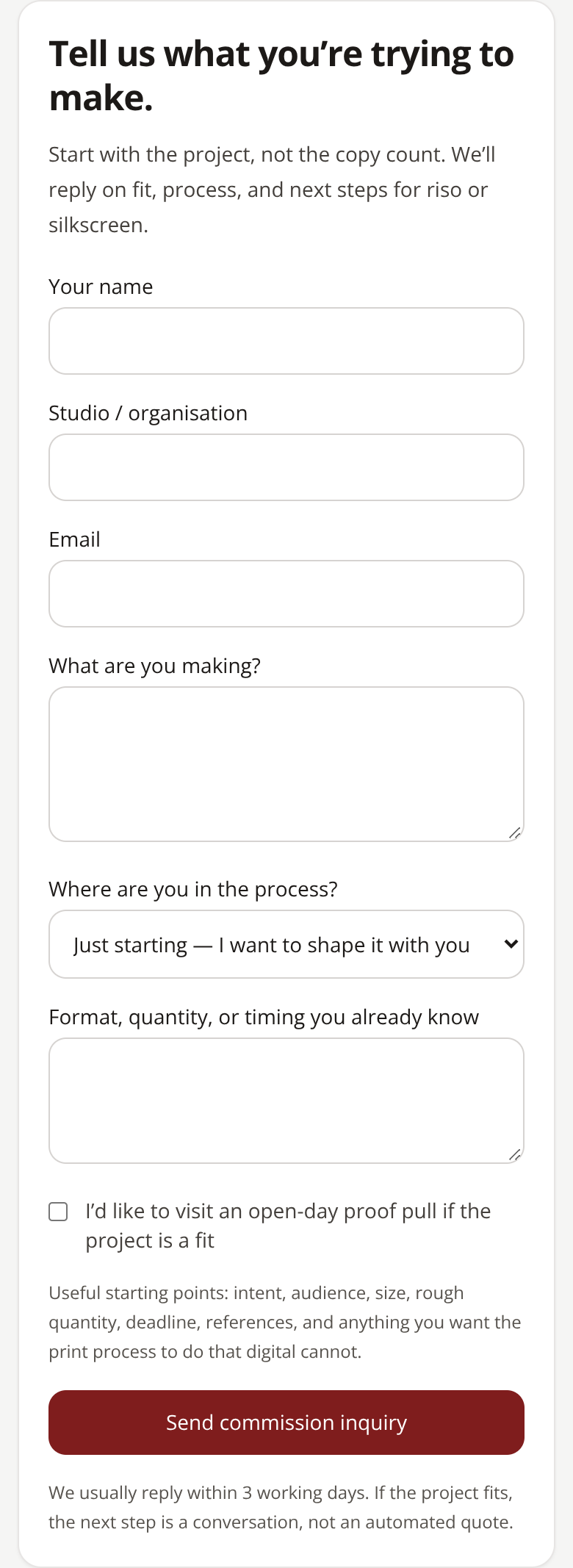
The first version their own LLM produced — the thing this redesign had to beat.
The behaviour design behind it
Connection
We elevate the experience by turning a transactional services page into a co-creation journey. The conversation starts with the idea and vision of the collection, continues with the recommendation of a compatible artist, presents three levels of collaboration, and ends by bringing the client, the artist, and the content team together around the same table. Press Black stops being perceived as a vendor that receives files and starts feeling like a creative studio you come to in order to build something with other people. The connection bias runs through the entire journey. The constant presence of the artist, the print team, and the content team ensures that the user never feels they are developing the project alone. Expressions like “You + the artist + Press Black,” the live proof, and the studio appointment turn the process into a shared ritual. The Build in public package extends that connection to the audience: people follow the decisions, the experiments, and the first print run before the launch, creating emotional involvement with the edition while it is still being built. Thus, the question stops being “how much does it cost to print?” and becomes “who do I want to create and launch this collection with?”.
More 60-minute case studies
- UX case study: booking page redesign for a boutique recording studio, by andres
Room 13 needed a booking page that did more than list hours, rates, and gear.
- UX case study: project page redesign for an architecture firm, by andres
UX case study: case study page redesign for an independent architecture firm
- UX case study: drop page redesign for a sustainable streetwear brand, by andres
Halfwild came to me with a drop page