
UX case study: drop page redesign for a sustainable streetwear brand, by andres
Halfwild · 145-minute redesign
Halfwild came to me with a drop page
by andres ·
The approach
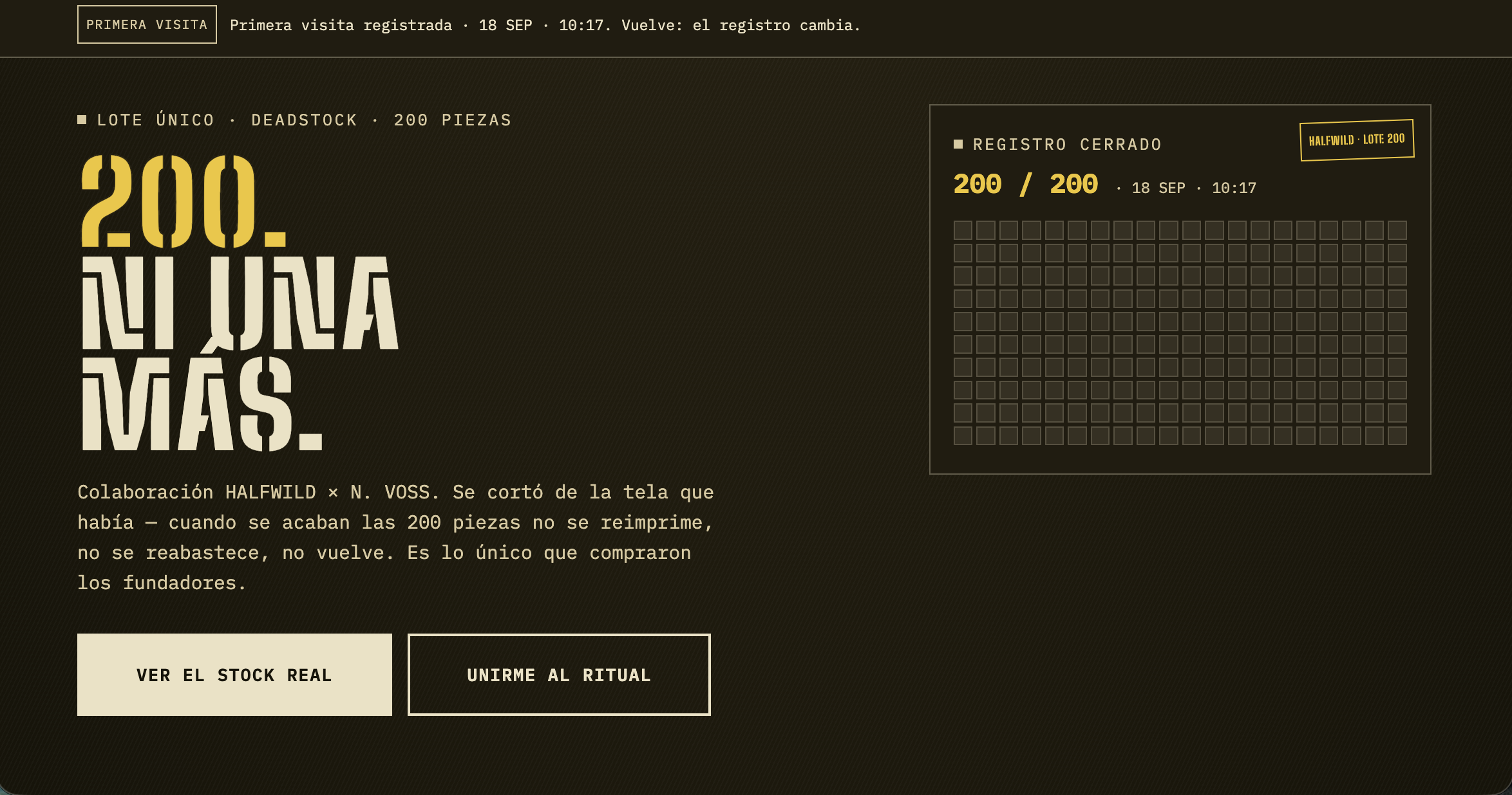
Halfwild came to me with a drop page that read like every other streetwear launch: 200 units, stated plainly, and nothing in the page that made you feel the number. Scarcity was announced but not experienced. There was no buildup, no sense of arriving at something. The brief asked for a ritual — countdown, scarcity texture, social proof arriving in real time. What I delivered is Screen 1, the cover. It sets the tone for the drop rather than the mechanics of it. The intent behind the cover is to make the page feel like an event you turn up to at a specific moment, not a product listing you browse. Everything on it is there to slow the visitor down for a beat before they scroll — the opposite of the standard drop page, which tries to get you to the buy button as fast as possible. The behaviour I am aiming for is anticipation: someone lands, understands there is a fixed moment and a fixed quantity, and returns to the page before the drop rather than discovering it after. That is the difference between a page that sells 200 units and a page that builds a crowd. I should be straight about the limits of this submission. There is no Figma file and no prototype, and only the cover screen exists, so the countdown, the scarcity texture and the real-time social proof are not yet shown in the work. Social proof in particular went undocumented — I did not explain how it functions.
The brief
Halfwild — Sustainable Streetwear Brand · Drop announcement page for a limited 200-unit collaboration
The drop page looks like every other streetwear page. The scarcity is announced but not felt. No ritual, no buildup.
Objective: Design a drop page that turns the launch into a ritual — countdown, scarcity texture, social proof rolling in real time.
What the client already had
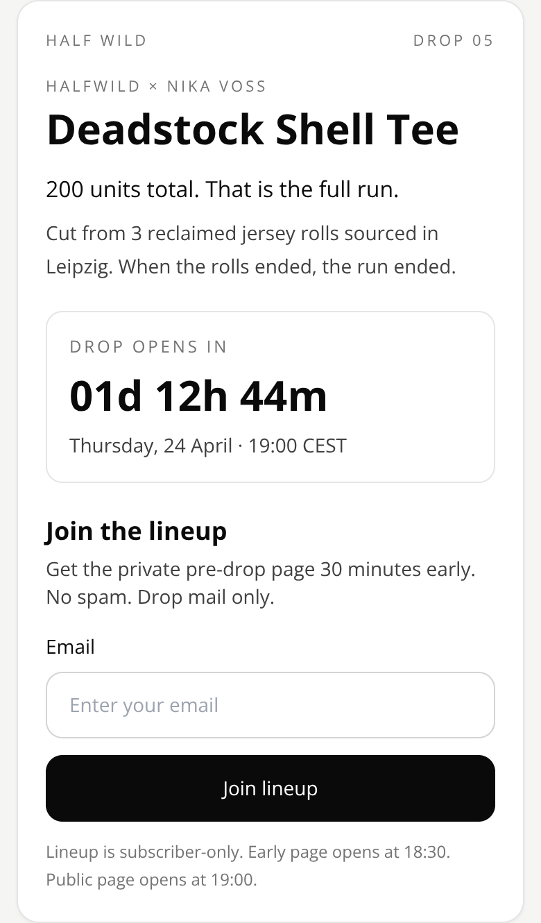
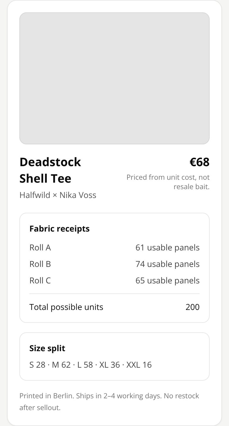
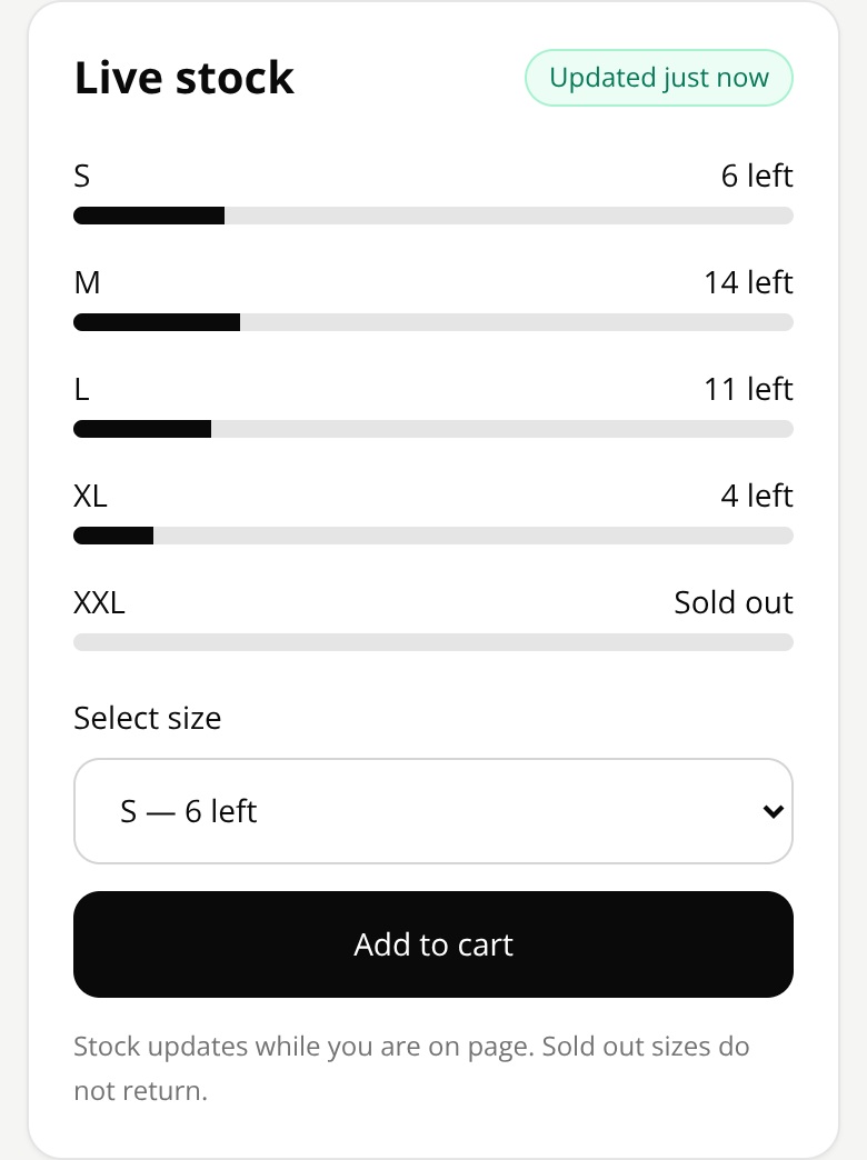
The first version their own LLM produced — the thing this redesign had to beat.
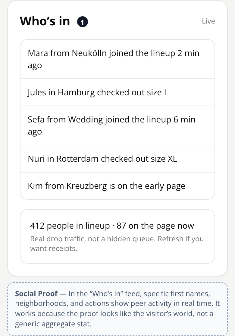
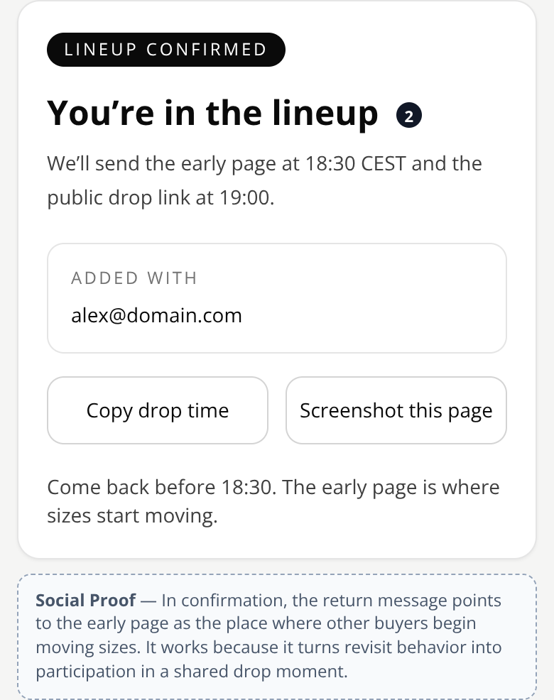
The behaviour design behind it
Social Proof
Colaboración HALFWILD × N. VOSS. Se cortó de la tela que había — cuando se acaban las 200 piezas no se reimprime, no se reabastece, no vuelve. Es lo único que compraron los fundadores.
More 60-minute case studies
- UX case study: booking page redesign for a boutique recording studio, by andres
Room 13 needed a booking page that did more than list hours, rates, and gear.
- UX case study: project page redesign for an architecture firm, by andres
UX case study: case study page redesign for an independent architecture firm
- UX case study: service page redesign for an independent print studio
We transformed a transactional printing page into a co-creation experience connecting the client with an artist, the studio, and their future audience.