
UX case study: onboarding redesign for a specialty coffee subscription
Origin Drift · 65-minute redesign
Replaced five abstract taste options with sliders between ingredients anyone recognises — a choice the body already knows how to make.
by Andrés Ossa ·
Open the prototype →
The approach
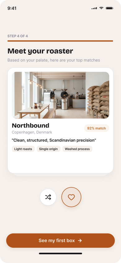
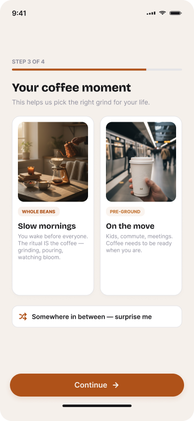
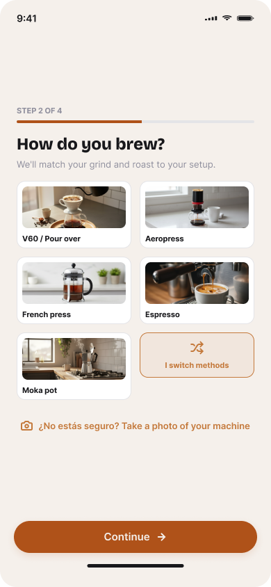
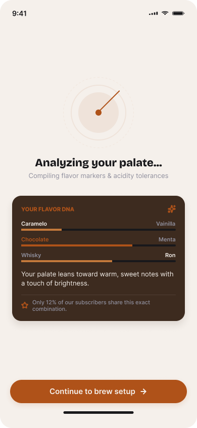
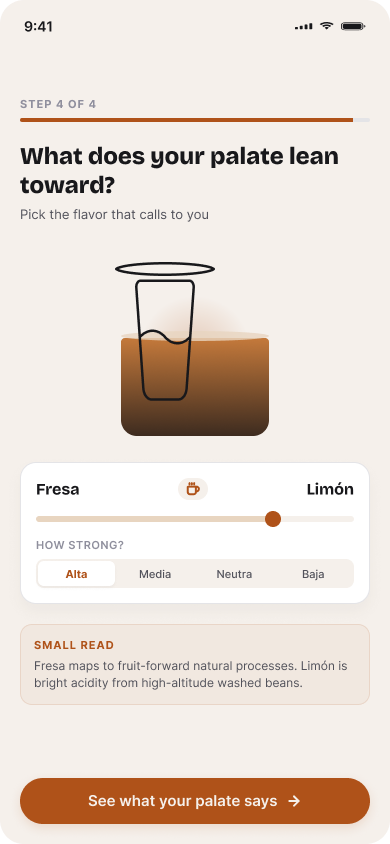
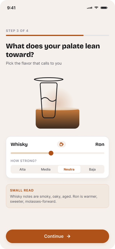
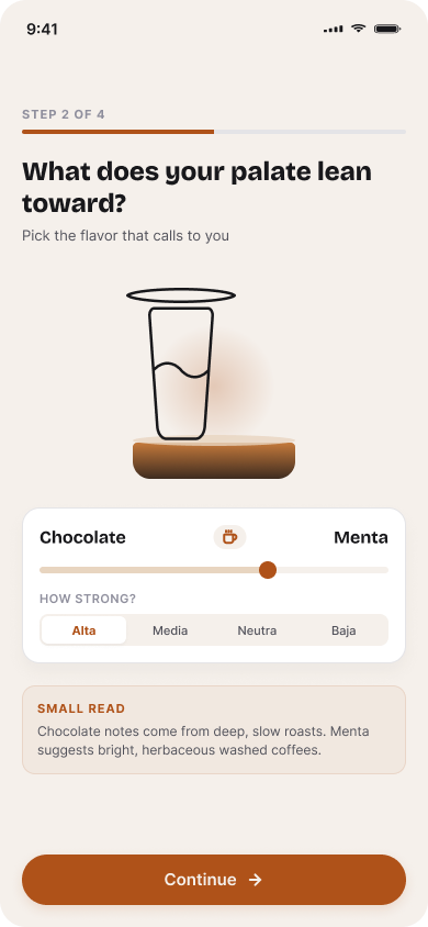
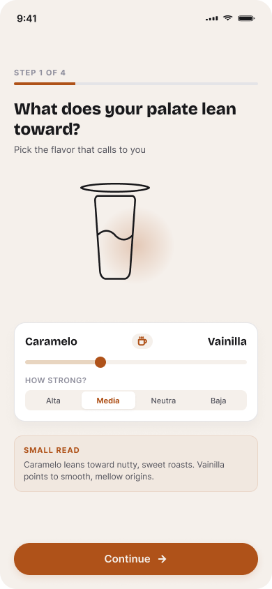
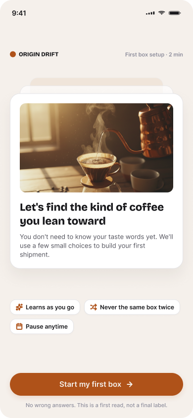
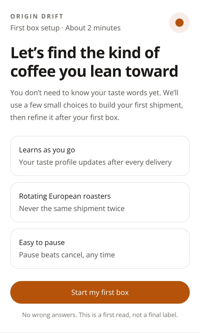
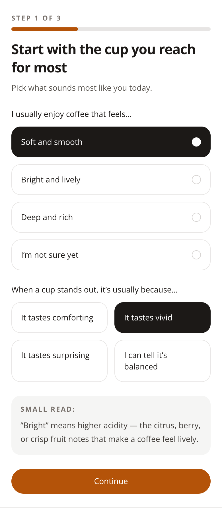
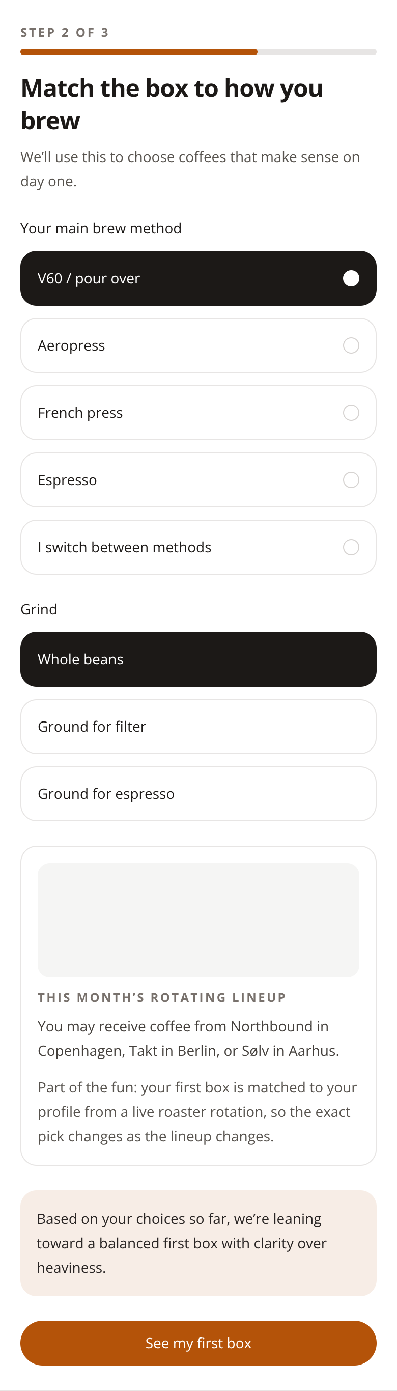
Origin Drift's onboarding read like a preference quiz — clinical, and using abstract language like "Deep and rich" or "Bright and lively" that assumes coffee knowledge. The taste discovery is the whole product, so I rebuilt the first selection as a journey that ends with the subscriber feeling understood. The core change is Screens 3 to 6, the flavor pairings. Instead of five abstract options, each screen is one slider between two ingredients anyone recognizes — Caramelo and Vainilla, Chocolate and Menta — plus an intensity adjustment. That's a decision your body already knows how to answer. A cup fills as they move each slider, so they're building something rather than answering questions, and each step makes leaving cost more. Screen 7 pays that off. The system holds up a mirror: their palate leans toward warm, sweet notes with a touch of brightness, and only 12% of subscribers share that exact combination. Insight becomes identity. On Screen 9, Coffee Ritual, I replaced grind terminology with two life scenarios, "Slow mornings" and "On the move," plus a "surprise me" default for anyone who doesn't see themselves in either. Screen 10 presents roasters as matches with compatibility percentages and a shuffle, so choosing feels like a hunt. Screen 12 makes it retrievable: name the set, tag it, save it, repeat or remix next shipment. The behaviour I'm after is a return visit to something they built.
The screens
The brief
Origin Drift — Specialty Coffee Subscription · Onboarding flow for a new subscriber selecting their first shipment
The onboarding feels like a typical preference quiz — clinical, flavorless. The taste discovery is the whole product but doesn't feel like discovery.
Objective: Design an onboarding that turns the first selection into a taste journey, ending with a confident feeling of 'they get me'.
What the client already had
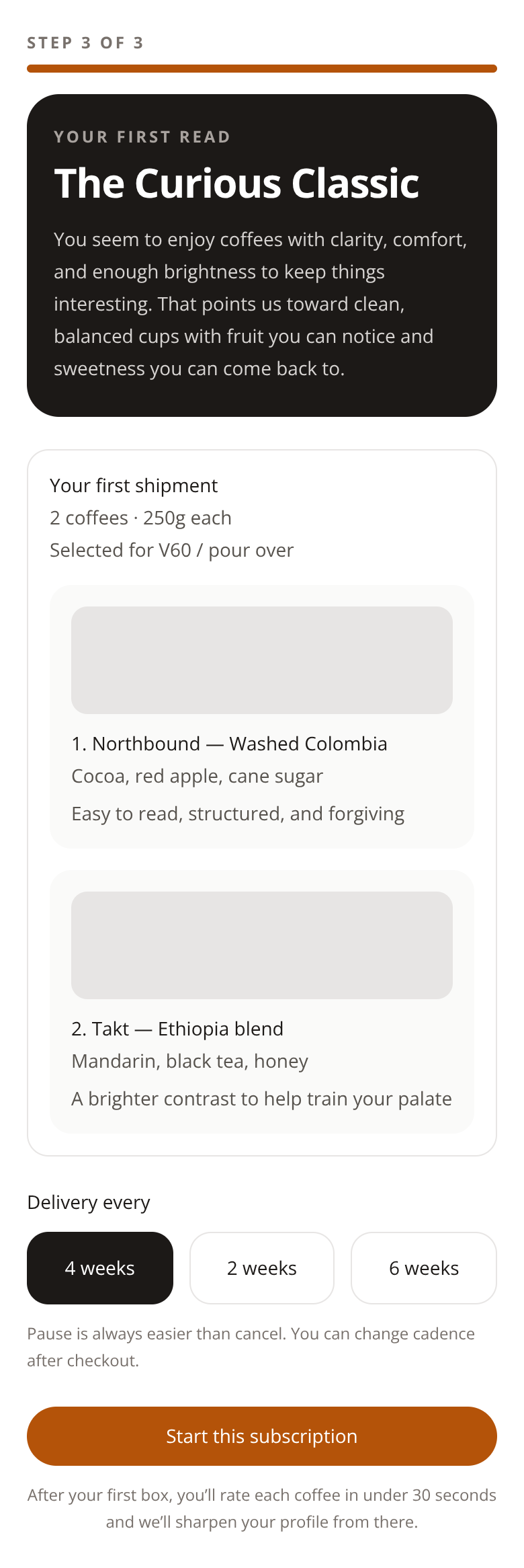
The first version their own LLM produced — the thing this redesign had to beat.
The behaviour design behind it
Variable Reward — Hunt
1. Variable Reward — Hunt (Eyal, Hooked Ch. 4) "The hunt is the experience, not the product itself." Where it's applied: Screens 3–6 (Flavor Pairing) + Screen 10 (Roaster Match) In the flavor pairing flow, the user doesn't know what profile will emerge from their choices. Each slider between two familiar ingredients (Caramelo ↔ Vainilla, Chocolate ↔ Menta) generates curiosity because there's no "correct" answer — only discovery. The cup that progressively fills reinforces the feeling that something is being built, but doesn't reveal what it is until the end. On the Roaster Match screen, we present roasters as "matches" with a compatibility percentage. The user can explore (shuffle) or let themselves be surprised — each new card is a variable reward because they don't know which roaster will appear or what percentage they'll get. The heart/shuffle mechanic turns selection into a hunt where discovery is more pleasurable than the decision itself.
Investment
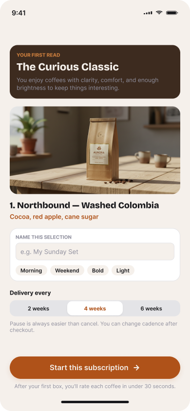
"Micro-moments where the user contributes, storing value they can only access by returning." Where it's applied: Screens 3–7 (progressive accumulation) + Screen 12 (saving and personalization) The cup that fills across the 4 flavor pairing screens is visual investment: each slider the user moves adds "liquid" to their personalized blend. They're not answering questions — they're building something. And each step makes abandoning more costly because they'd lose what they already created. The resulting Flavor DNA on screen 7 is the materialization of that investment: 4 decisions converted into a visual profile that belongs to them. This didn't exist before the user built it. In the Product Reveal, investment becomes permanent and retrievable: Naming the selection ("My Sunday Set") — turns an order into something personal with identity Tags (Morning, Weekend, Bold, Light) — categorizes their creation for future retrieval Save to favorites — stores value in the platform they can only access by returning "Repeat or remix this set on your next shipment" — this onboarding's investment yields returns on the next delivery, creating a return cycle The user didn't just complete a form: they created a palate profile, named their selection, tagged it, and saved it. All that value lives inside Origin Drift — and they can only access it by coming back.
Insight
"Moments where the user discovers something true about themselves." Where it's applied: Screen 7 (Flavor Insight) + Screen 12 (Product Reveal) The Flavor Insight screen is the flow's central moment of realization. After 4 steps choosing between flavors they already know (caramelo, chocolate, fresa), the system holds up a mirror: "Your palate leans toward warm, sweet notes with a touch of brightness." The user didn't know this about themselves before starting — and now they have language to describe something they always felt but never articulated. The social proof reinforcement ("Only 12% of our subscribers share this exact combination") transforms insight into identity: I didn't just learn something about myself, I'm unique in it. In the Product Reveal, the profile name "The Curious Classic" names their palate — gives them a taste identity they can save, name ("My Sunday Set"), and carry with them. The insight doesn't end at knowledge: it becomes something that belongs to them.
Mental Simplicity
"Reduce decisions, options, and copy density at the moment of decision." Where it's applied: Entire flow, especially Screens 3–6 and Screen 9 The most important design decision was replacing the original quiz (which used abstract terms like "Deep and rich" or "Bright and lively") with sliders between two ingredients any person recognizes. "Caramelo or Vainilla" is a decision your body already knows how to answer — it doesn't require coffee knowledge, it doesn't require thinking. Each pairing screen presents ONE single binary decision + an intensity adjustment. There aren't 5 options, there aren't explanatory paragraphs, there's no cognitive friction. The "SMALL READ" educational note is there for those who want to learn, but it never blocks progress. In Coffee Ritual, instead of asking "Do you want whole beans, ground for filter, or ground for espresso?" (terms many users don't command), we present two life scenarios: "Slow mornings" vs "On the move." The user chooses their life, not a technical term — and the system infers the correct grind for them. The "Somewhere in between — surprise me" option is a smart default that eliminates decision paralysis for those who don't identify with either scenario.
More 60-minute case studies
- UX case study: onboarding redesign for a plant & botanical shop
Turned a signup form into meeting a companion: the plant gets a personality and a name before it asks the customer for anything.
- UX case study: booking page redesign for a boutique recording studio, by andres
Room 13 needed a booking page that did more than list hours, rates, and gear.
- UX case study: project page redesign for an architecture firm, by andres
UX case study: case study page redesign for an independent architecture firm