
UX case study: onboarding redesign for a plant & botanical shop
Slow Roots · 75-minute redesign
Turned a signup form into meeting a companion: the plant gets a personality and a name before it asks the customer for anything.
by Andrés Ossa ·
Open the prototype →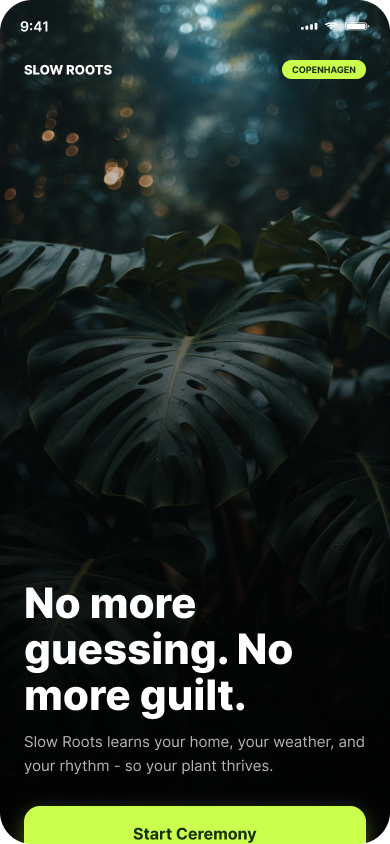
The approach
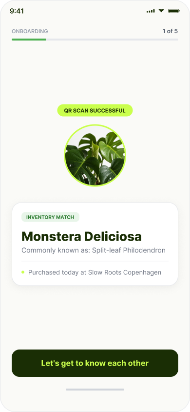
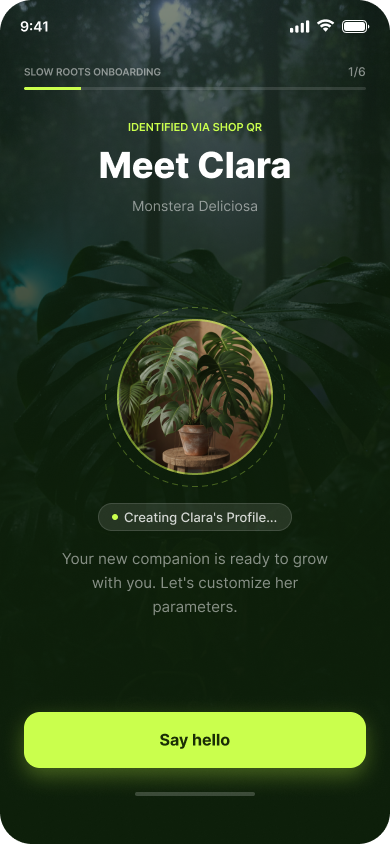
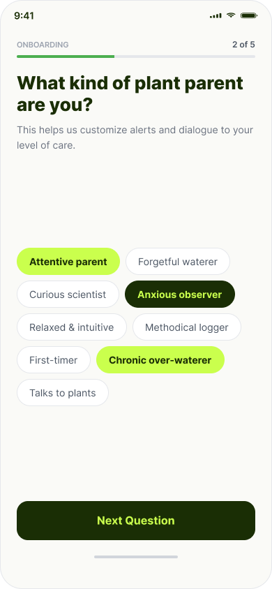
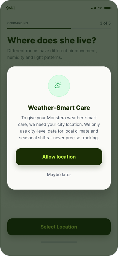
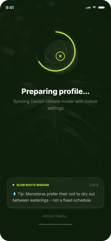
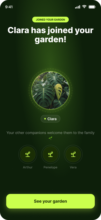
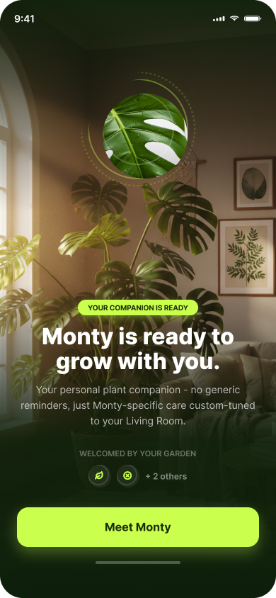
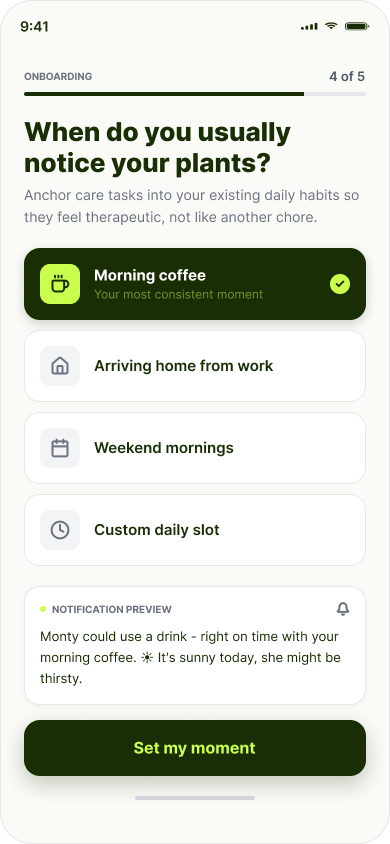
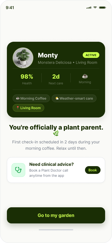
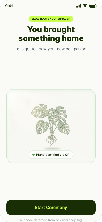
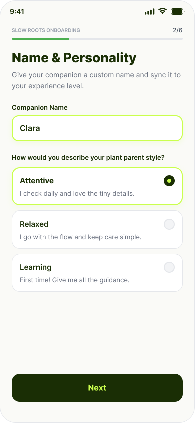
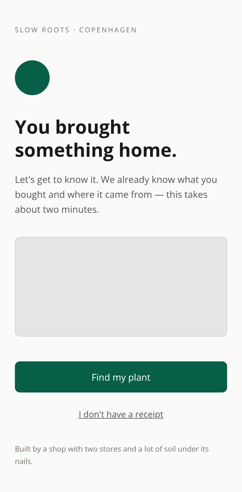
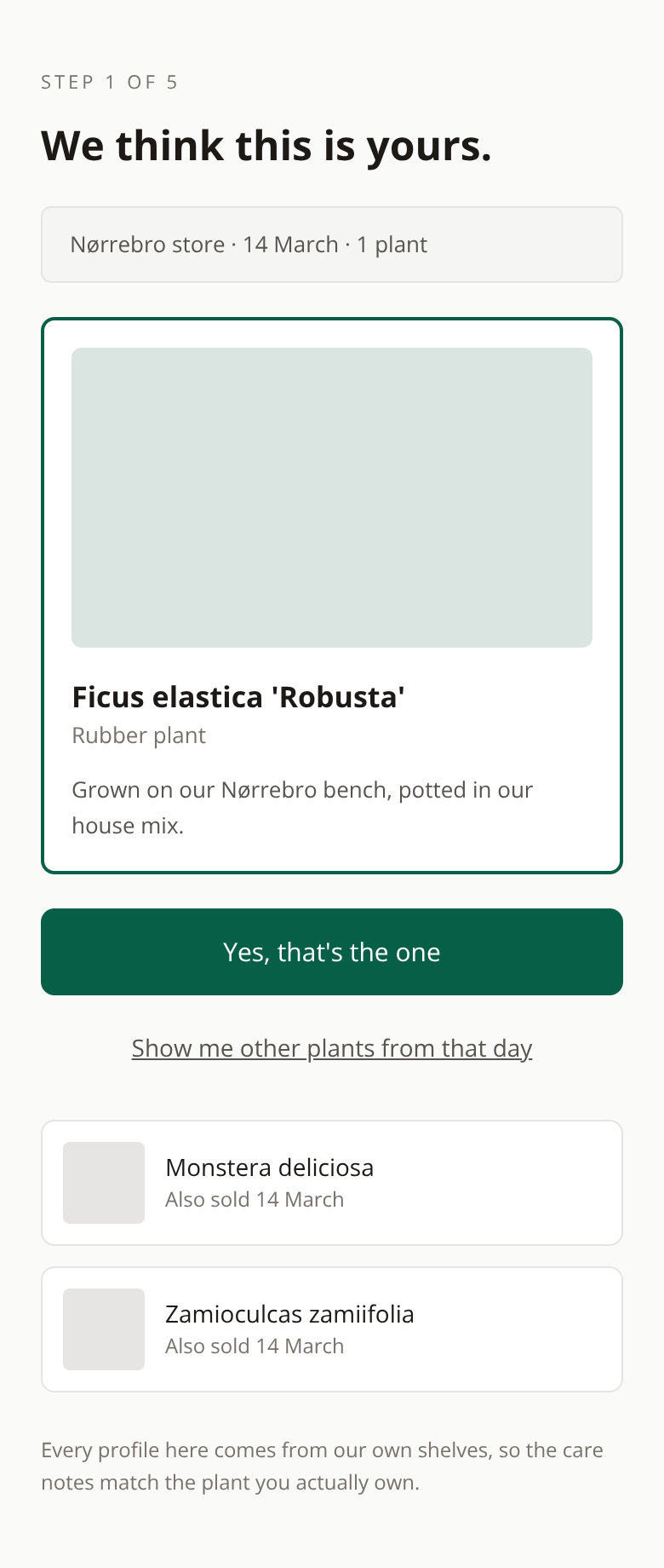
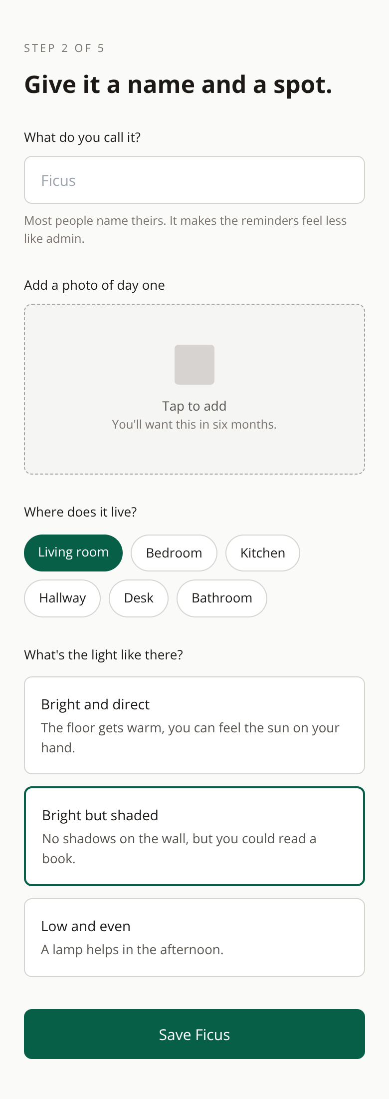
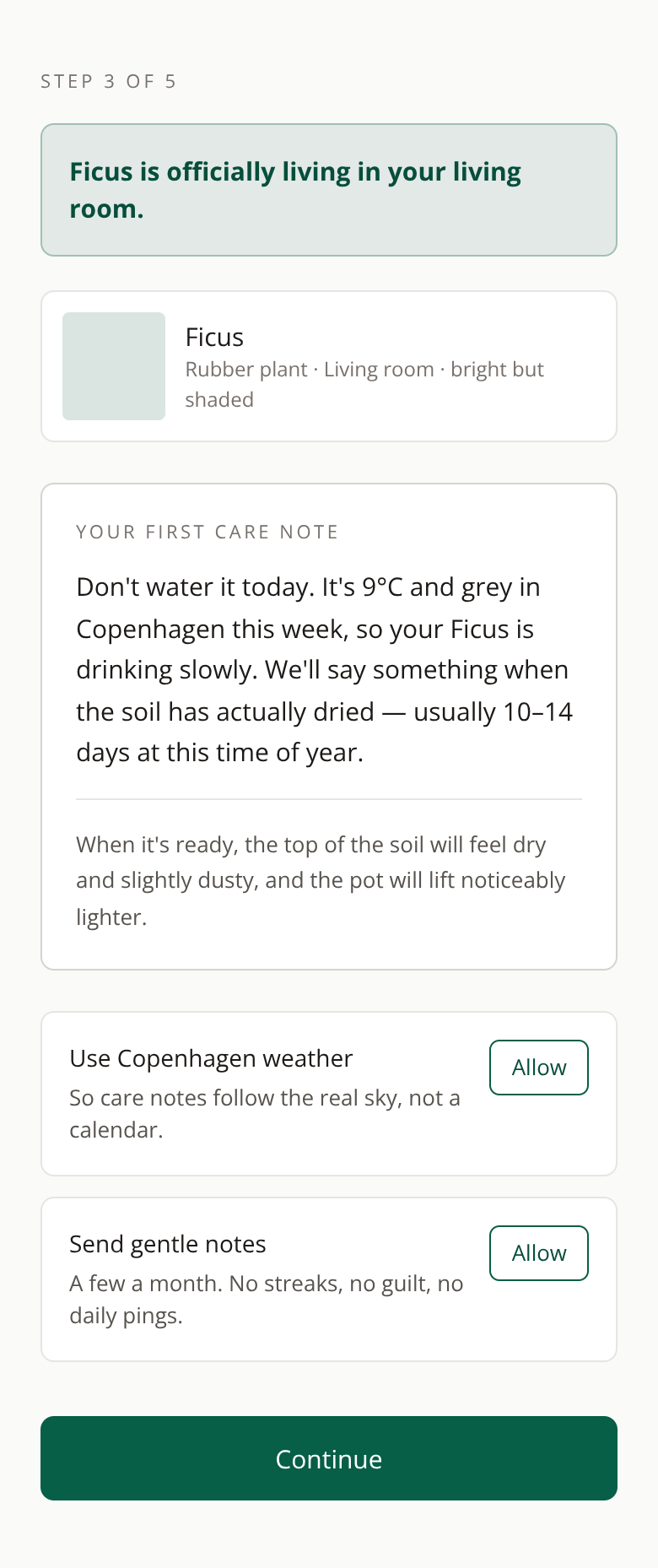
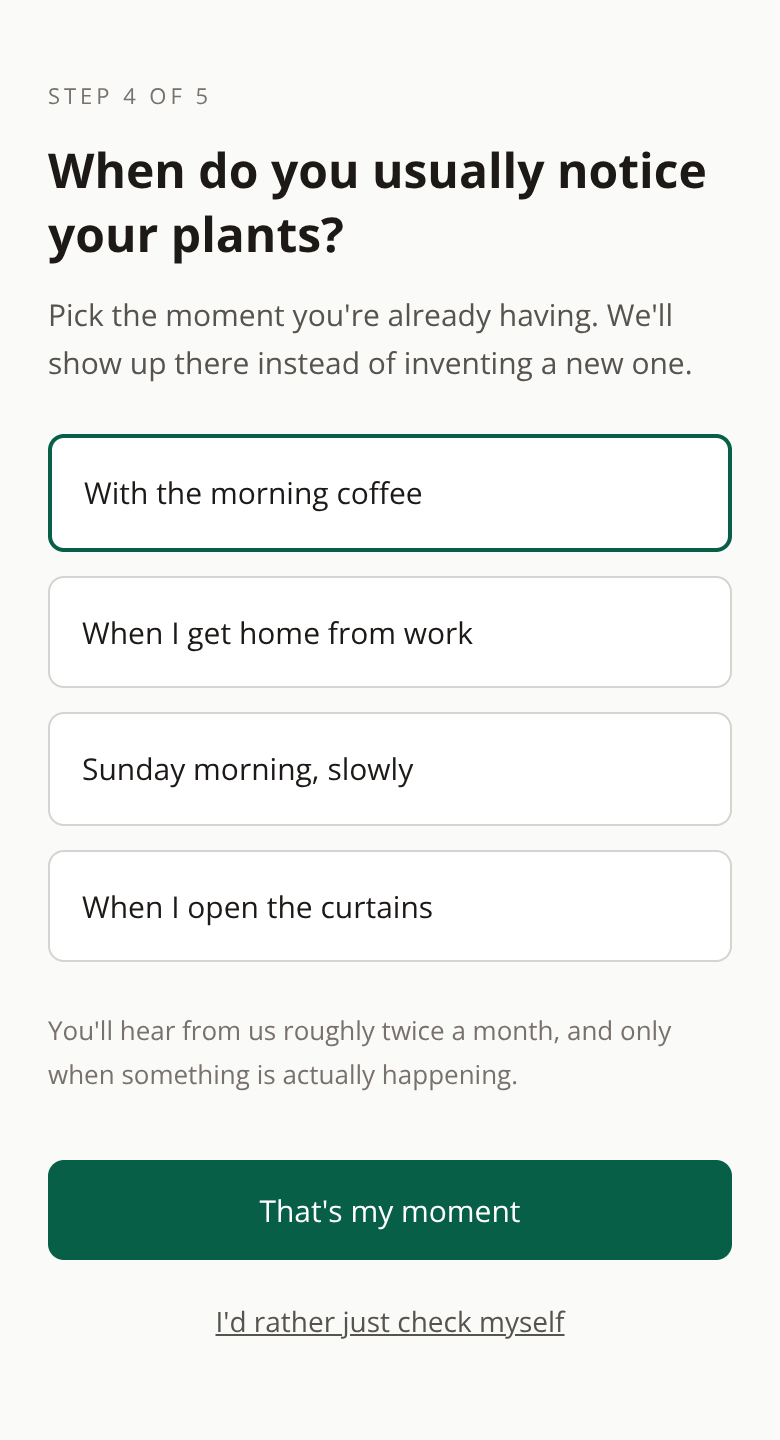
Slow Roots came to me with an onboarding that asked for plant names and shipment dates. It worked, but it was transactional — a form, not a beginning. Nothing in it made someone feel like a plant parent. So I rebuilt the flow around a companion instead of a record. Screen 1, the splash, states the app's value up front — "No more guessing. No more guilt" — so the aha moment lands before any input is requested. The user knows what they're getting before they give anything. From the QR scan and connection (Screens 2–3), the user goes straight to meeting their companion on Screen 4, then a personality test on Screen 5 and naming on Screen 6. Those steps are the investment (Eyal — Hooked): the user has already spent money and time on a real plant, so I ask them to name it, choose personality traits, and place it in their home. Each micro-decision stores value in the app that only exists if they return — Clara's personalized profile, her synced climate, her chosen care moment. The more they configure, the harder it is to leave. Screen 7 asks for location permission, and Screen 10 asks the user to attach care to a moment they already have — morning coffee, arriving home from work. That's the implicit prompt (Growth.Design — B=MAP): the notification doesn't say "water Clara" in the abstract, it says "Clara could use a drink — right on time with your morning coffee." The coffee becomes the trigger, not the app. No external reminder needed — the habit does the work. The pride beat is deliberately staged (Heath — The Power of Moments): the loading ceremony on Screen 8 builds anticipation with rotating care tips while a progress ring fills, the clan welcome on Screen 9 shows existing companions applauding the new arrival, and the companion reveal on Screen 11 is the emotional peak — "Monty is ready to grow with you." These aren't generic achievements. Each recognition moment celebrates exactly what the user just did: configured a living thing, joined a garden, became a plant parent. Throughout, the aesthetic handles sensation (Growth.Design — B=MAP): full-bleed monstera photography on the splash, dark moody greens on the ceremony screens, care tips that speak in tactile language — "prefers soil to dry out between waterings", "morning light is gentler than afternoon." The app feels like touching earth and watching something grow, not like receiving a notification. It smells like a plant shop, not like a SaaS product. Prototype: https://move-dairy-82032949.figma.site
The screens
The brief
Slow Roots — Plant & Botanical Shop · Plant care reminder app onboarding for a niche plant shop's customers
The onboarding asks for plant names and shipment dates. It's transactional. There's no plant parent identity being built.
Objective: Design an onboarding that turns new customers into plant parents — sensory triggers, pride moments, gentle implicit prompts tied to weather.
What the client already had
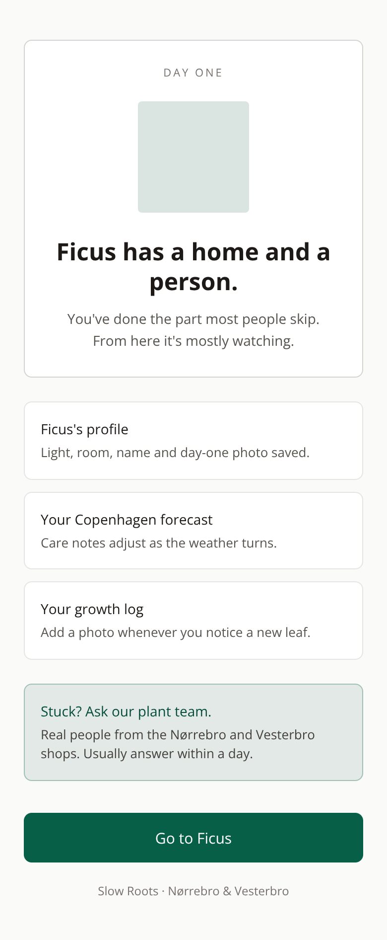
The first version their own LLM produced — the thing this redesign had to beat.
The behaviour design behind it
Pride
We created two specific moments: the loading screens before revealing the creation of the companion and the splash screen where we reinforce the aha moment, the app’s value proposition.
Implicit Prompt
We tie the prompting to the moment when we relate the user's everyday habit in which he notices his plants (for example, having coffee) to the moment when the notifications will arrive.
Investment
We try to make the onboarding process simple but still have the user invest in the personalization of their new plant, which they have invested money and time in, so that a bond is created with it.
Sensation
The entire aesthetic is built with a premium style.
More 60-minute case studies
- UX case study: onboarding redesign for a specialty coffee subscription
Replaced five abstract taste options with sliders between ingredients anyone recognises — a choice the body already knows how to make.
- UX case study: booking page redesign for a boutique recording studio, by andres
Room 13 needed a booking page that did more than list hours, rates, and gear.
- UX case study: project page redesign for an architecture firm, by andres
UX case study: case study page redesign for an independent architecture firm