
UX case study: product page redesign for an indie fragrance house
Olfactory Drift · 71-minute redesign
Olfactory Drift
by andres ·
Open the prototype →
The approach
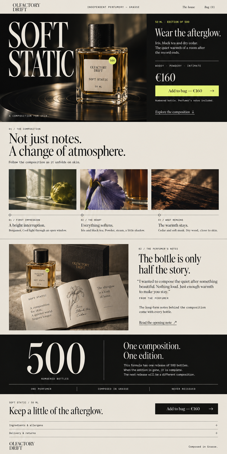
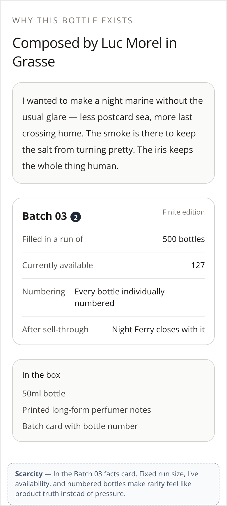
Olfactory Drift needed a product detail page for a single perfume that felt like perfume, not skincare. The problem was that the existing PDP had no narrative, no scent imagination, and no sense of the small-batch story. I focused on making the page communicate the perfume as a specific authored composition, while making its limited nature clear from the first screen. On Screen 1, I built scarcity directly into the hero with “50 ML · EDITION OF 500” placed next to the product and the purchase. That establishes from the beginning that this is a finite production, not an always-available item. I did not rely on scarcity alone, though. The narrative first introduces the aroma and the perfumer’s intent so that the limit feels meaningful: the 500 bottles hold a concrete vision from an author. On Screen 2, “One composition. One edition.” makes the limit irreversible. I used that section to clarify that once the edition is sold out, that composition is closed and the next one will be different. The numbered bottle and the perfumer’s notebook then make ownership tangible by identifying each bottle within the edition and linking it back to the creative process. The behaviour I want this to produce is desire with urgency: the visitor should be able to imagine the scent, understand why this specific composition matters, and feel that waiting could mean missing that exact work.
The screens
The brief
Olfactory Drift — Indie Fragrance House · Product detail page for a single perfume from a small-batch perfumer
The PDP feels like a generic skincare site. There's no narrative, no scent imagination, and the small-batch story disappears.
Objective: Design a PDP that lets the visitor smell the perfume through the page — sensory copy, narrative pacing, scarcity from small batch.
What the client already had
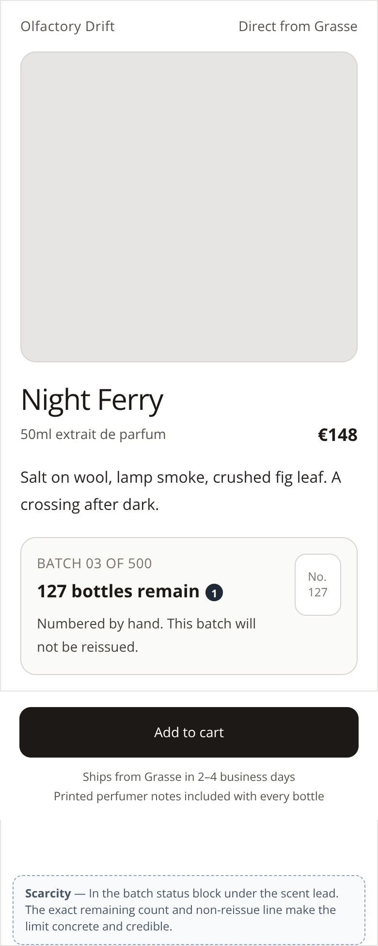
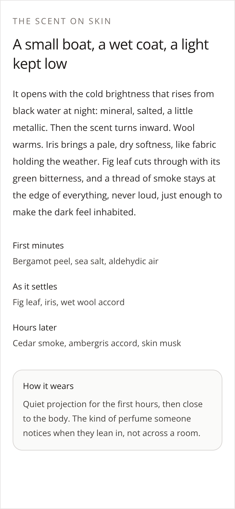
The first version their own LLM produced — the thing this redesign had to beat.
The behaviour design behind it
Scarcity
It is built in four moments: In the hero: it sets the limit. “50 ML · EDITION OF 500” appears next to the product and the purchase. From the beginning it is clear that it belongs to a finite production. In the narrative: it builds the value of what is limited. First we discover the aroma and the perfumer’s intent. Thus, the 500 bottles contain a concrete vision from an author: the visitor has reasons to desire that composition. In “One composition. One edition.”: it explains the irreversible. The text clarifies that, once sold out, the composition is closed and the next will be different. Waiting implies the possibility of losing that specific work. In the numbered bottle and the notebook: it makes ownership tangible. The numbering identifies each bottle within the edition; the perfumer’s notes add a connection with their creative process. This seeks to give it value as an object that is kept.
More 60-minute case studies
- UX case study: booking page redesign for a boutique recording studio, by andres
Room 13 needed a booking page that did more than list hours, rates, and gear.
- UX case study: project page redesign for an architecture firm, by andres
UX case study: case study page redesign for an independent architecture firm
- UX case study: drop page redesign for a sustainable streetwear brand, by andres
Halfwild came to me with a drop page