Key takeaways
- Judge AI-generated UI by the missing bet under a real constraint, not by polish or novelty.
- Write the decision, the alternative and the smallest proof before you look at a single pixel.
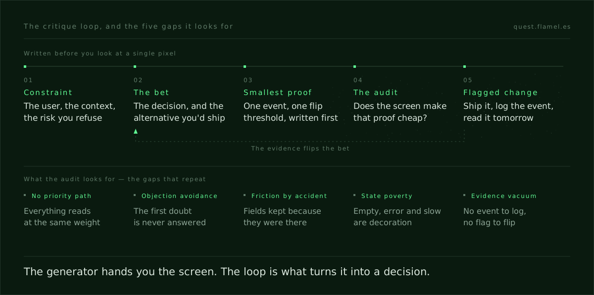
- Five gaps repeat: no priority path, objection avoidance, friction-by-accident, state poverty, evidence vacuum.
- Read one edge case under stress; errors, empties and slow states reveal whether the design owns its stakes.
- Turn every gap into a flagged change with one event to log and a next-day read.
To critique AI design, ignore the polish and look for the missing bet. A generated screen is correct in everything and decisive in nothing: it arranges the options instead of choosing one. Your job is to name the absent decision — the hierarchy that ranks a goal, the objection answered at the commit point, the friction removed on purpose — and the smallest proof that would change your mind.
What to look for first: the missing bet
Write the decision the screen should force under its constraint, then trace the visual and copy hierarchy to see whether it pays that decision first. If the path from the first glance to the primary action does not embody the goal, the screen is arranging, not deciding. You are not hunting defects; you are naming the intended trade-off and checking that the interface spends its attention on it.
Then scan the copy for an objection answered at the moment it arises. Find the commit point and read it as a skeptic would. If everything is equally plausible, nothing is testable; if every element could belong to any product, the design has refused to bet. Your critique is to call that refusal out loud and propose the smallest proof that would settle it.
The common gaps in AI-generated UI
Start here. These holes show up first and cost the most tomorrow.
- No priority path: primary, secondary and nice-to-have all read the same, so the user has to decide before the product does. That is exactly what the Mental Simplicity skill exists to train.
- Objection avoidance: benefits abound, but the first doubt a real user has is never confronted near the commit point.
- Friction-by-accident: extra fields survive because the structure was preserved, not because they earn a reduction in risk.
- State poverty: empty, error and slow states are decorative or missing, so the failure modes quietly leak cost.
- Evidence vacuum: nothing hints at the event to log or the flag to flip, so the team admires a render instead of shipping a check.
When this frame applies
Use it the moment a generator hands you a first pass, whether that is a Figma exploration, a code seed or a published stub. If a stakeholder asks you to evaluate AI design output without naming a metric, write the flip threshold first and the critique turns specific, fast and fair. When the screen is shaping persuasion or risk, read it alongside the persuasion principles for product designers, which name the mechanisms you are looking for.
A one-minute frame before you comment
A short ritual before you speak saves a week of argument later. Write, then look.
- State the constraint in one line: the user, their context, and the risk you refuse to take.
- Write the decision claim, and the strongest alternative you might ship instead.
- Name the smallest proof you would accept, plus the single event and the flip threshold.
- Re-read the screen only for what makes that proof cheap: copy that commits, affordances that rank tasks, paths that make the metric likely.
Turn critique into a testable change
Translate each missing bet into a change you can ship behind a flag and judge within a day. Replace "looks cluttered" with "move the secondary actions into overflow and read primary click-through on cold traffic." If the tool returned code or a deployable stub, route your notes into the rollout described in the product designer's AI workflow, so the next artifact is evidence instead of another render. Ask that every component arrive with its three key states and one event you will actually log.
If you cannot name the flip, you are grading style, not a decision.
Edge cases are the fast reveal
AI-generated UI fails first at the edge: the empty cart, the failed payment, the slow response, the revoked permission. Pick one and read the screen as that user under stress. Anything unclear in that moment is tomorrow's support ticket, and making the unhappy path first-class is the quickest way to see whether the design owns its stakes.
Ask whether the copy pre-empts the error, whether the interface preserves progress, and whether the recovery path outranks the decoration. A model can catch a missing affordance; it cannot hold a stake for you. The judgement that does is trainable, and the drills for it sit in the Quest skill library.
Make it a weekly habit
Bake the critique into your cadence: two opposing directions on the same claim, one edge case, one flip threshold, one event to watch the next day. Commit all four in writing before you look at any pixels, then grade the artifact on whether it makes gathering that proof cheap. Run the loop twice a week and you train the muscle the tools do not have — naming the decision, and naming the evidence that would change your mind. That second half is what the Insight skill drills.
You are a product design reviewer using the "missing bet" frame to critique AI-generated UI. Ask me for: the screen (link or description), the binding constraint (user, context, the risk I refuse), my decision claim, the strongest alternative, the smallest proof, the flip threshold, the target event, and one edge case to simulate. Then produce a one-page critique with these sections: 1) The constraint in one line. 2) Decision against alternative. 3) The smallest proof, with its event and flip threshold. 4) An audit of hierarchy, copy, states and events, judged only on whether they make that proof cheap tomorrow. 5) The edge case read under stress. 6) Three to five testable changes, each behind a flag, each with the event that would settle it. 7) What breaks if none of them ship. Constraints: second person, short sentences, no style talk. Name the moment, the mechanism and the check. Where information is missing, state the assumption and mark it as one. Do not invent numbers: leave any threshold I have not given you as a blank for me to fill.
Frequently asked questions
What does "the missing bet" mean in a UI critique?
It is the trade-off the screen should have chosen in order to win its goal under a real constraint. You name the decision the interface ought to force, the strongest alternative, and the smallest proof that would flip you. If hierarchy, copy, states and events do not spend their attention on that proof, the design has refused to bet and stays generic.
What is a flip threshold?
It is the line at which you change your mind, written down before you look. You pair one event with one metric and fix the value that would make you ship or stop. Writing it first is what stops a critique from drifting into taste, because it turns "I would prefer" into a claim that the next day's data can settle.
When should I use this frame to critique AI design?
At the first pass, and at every later pass that arrives without a metric attached: a Figma exploration, a code seed, a live stub. Write the constraint and the flip before you look at pixels, then grade whether the UI makes that proof cheap to get. To route the notes into build steps, follow the product designer's AI workflow.
How do I turn a vague critique into a testable change?
State the decision, pick one edge case, then name the event, the metric and the flip. "Cluttered" becomes a ranked-action change behind a flag with a next-day read. The mechanism you are reaching for usually has a name already, and the persuasion principles for product designers is where to find it.
Which edge cases expose AI-generated UI fastest?
The empty, the failed, the slow and the revoked. Read the screen as that user under stress and check four things: whether the copy pre-empts the error, whether progress survives, whether recovery outranks decoration, and whether anything fires an event you could diagnose from. If it is unclear there, you have found tomorrow's support ticket.