Key takeaways
- On a product page, the photo rarely stops the sale. The question the buyer cannot answer does, and on a ring that question is the size.
- A size dropdown charges two bills: the physical work of finding the number off the screen, and the fear of getting a €400 ring wrong.
- On the Cold Join brief the size goes before the photo: find it on the page, and say what happens if it does not fit.
- Defend the order with drop-off at the size step on mobile, read across visits, with resizing requests as the side effect to watch.
- Before you polish the gallery, mark the first question the page cannot answer and design that first.
Most product page design time goes into the photo: the light, the angle, the order of the gallery. On a page that sells something people cannot try on, the photo is rarely where the sale stops. It stops at the question the buyer cannot answer, and on a ring that question is the size. Answer it on the page, say what happens if they get it wrong, and the photo finally gets to do its job.
That is a design decision, not a content tweak, and you can defend it with a number: how many people reach the size step and leave. The skill behind it is physical simplicity, and it is easy to skip, because here the effort happens off the screen.
Why the photo gets the hours
The photo is the most visible thing on the page, so it is where review comments land and where a generator does its best work. Ask for a better product page and you get a cleaner gallery, a larger hero and a softer background. All of that can be right. None of it touches the moment where a nervous buyer stops, because that moment is not visual. It is a question with no answer on the screen.
The useful habit is to find that question before you open the gallery. Read the page as the buyer does, top to bottom, and mark the first point where they would need something the page does not give them. For anything people usually try on in a shop, it is rarely the image. It is a size, a fit, a compatibility or a delivery date: a fact about their own life that the page asks for and cannot supply.
Worked example: a €400 ring and a size dropdown
Cold Join is one of the practice briefs on Quest: a one-bench jewellery studio, four years old, that makes rings and cuffs held together without heat. No solder and no glue, only tension, rivets and friction. Pieces come in batches of forty, with the batch number stamped inside the band. The brief is the product page for a single 18ct-and-steel ring at €400.
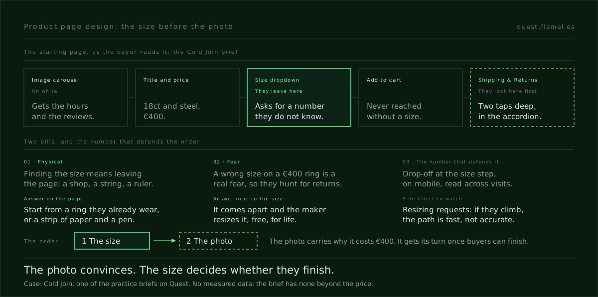
The starting design is the one every marketplace uses: an image carousel on white, the title, the price, a size dropdown, Add to cart and an accordion with Description, Materials and Shipping & Returns. The buyer arrives from an Instagram Reel, on a phone, in the evening. They have never bought jewellery they could not try on. They will open the page about three times over a week, and the first thing they look for is the returns policy.
The brief names where it breaks. People abandon at the size selector. The dropdown asks for a number they do not know and offers no way to find it, so they leave meaning to come back, and they do not.

The size is two bills, not one
In the terms of the four kinds of friction, the size question charges two bills at once. The first is physical. To answer the dropdown, the buyer has to leave the page and do something with their hands: find a shop, wrap a string round a finger, measure a ring they already own. That is still physical effort, only it happens off the screen, where no tap count or funnel shows it. Taking that work out of the path is exactly what physical simplicity is for.
The second bill is fear. A wrong size on a €400 piece is not a small mistake for someone who has never bought a ring online, and it is why they look for the returns policy before anything else. That is the cost kind of friction: not the price itself, but the uncertainty around it. Removing the first bill and leaving the second gives you a buyer who knows their size and still does not trust it.
Cold Join holds the answer to the second bill in its own construction. Because nothing is soldered, every piece can be taken apart, so resizing is free for life. The skill page states the rule plainly: the easier an action is to take, the easier it must be to undo. Here the undo already exists. The page just never says so where the fear is.
Move the size up, and off the dropdown
The decision is an order: the size goes before the photo. Not necessarily above it on the screen, but first in the work, and first in what the page answers. Three changes do it.
- Let the buyer find their size without leaving the page. The dropdown becomes a short path that starts from what they have: a ring they already wear, or a strip of paper and a pen. Each step asks for something they can do on the sofa, in the evening, on a phone.
- Say what happens if they get it wrong next to the size, not in the accordion. One plain line: if it does not fit, it comes apart and the maker resizes it, free, for as long as you own it.
- Put the returns answer where they look first. They will hunt for it on every visit, so it should take one glance, not two taps into Shipping & Returns.
None of these makes the page prettier. All of them make it easier to finish. To see the format these briefs come in, the sample brief shows a complete one, with its starting design to beat and the skills it targets.
The photo still has a job
This is not an argument against the photo. On Cold Join the photo carries the reason for the price: the joins, the rivets, two metals sitting together, the marks of one bench. The brief asks for that too, along with making the batch of forty felt without a countdown or a fake stock counter. Both belong to the next pass.
The order matters because the two jobs fail differently. A weak photo leaves a buyer unconvinced. A convinced buyer who cannot answer the size still leaves. Removing friction is almost always cheaper than manufacturing desire, and fixing the photo first manufactures desire for a ring they still cannot buy. Fixing the size first means every later gain from the photo lands on someone who can finish.
How to defend the order with one number
In a review, the photo wins on taste, because everyone can see it. The size step wins on evidence, if you bring it. The number is drop-off at the size step: of the people who open the size control, how many leave without adding to cart. Segment it by device, as the skill page advises: physical cost is mostly a mobile problem, a desktop average hides it, and this buyer is on a phone.
Two details keep the number honest. The buyer opens the page about three times before buying, so read the step across visits, not per session, or one buyer who comes back on day three looks like two failures and a success. And watch what follows: if resizing requests climb as abandonment falls, the path is fast but not accurate, and the skill page is explicit that accuracy beats speed where it matters.
Said as one sentence: the size goes first, because the brief says the page loses people at the selector, and success is fewer people leaving at the size step on mobile with no rise in resizing requests. That is a mechanism you can name, which beats a preference you have to win.
Train the question before the gallery
A model will draw you a better gallery in seconds, and a better dropdown too. What it will not do is notice that the dropdown is the wrong control, because that depends on knowing who arrives, from where, and what they cannot answer. That noticing is the trained part of product page design, and it keeps its value as screens get cheaper.
The practice is short. Take the product page you work on, or any page for something people usually try on in a shop. Read it as a first-time buyer on a phone and mark the first question they cannot answer from the screen. Name its two bills, physical and cost, and write the one line that answers each. Then work a brief with a starting design to beat: the sample brief shows the format, and physical simplicity has the patterns, the failure mode and what to measure.
You are a senior product designer reviewing a product page with me. Ask me, one at a time, for: [the product and its price], [who arrives on the page, from where and on what device], [the page as it is today, section by section] and [what the brief or the analytics say about where people leave]. Then: 1) read the page as a first-time buyer and name the first question they cannot answer from the screen; 2) split that question into its physical cost (what they must do, on or off the screen, to answer it) and its fear (what happens if they get it wrong); 3) propose one change for each, in words a buyer would read; 4) say where on the page each answer goes and what it replaces; 5) give me the one number that would prove it worked, how to segment it and the side effect to watch. Do not suggest changes to the photo until that first question is answered.
Frequently asked questions
What is product page design, beyond the photo?
It is deciding what a page has to answer before someone buys, and in what order. The photo answers what the thing looks like. The questions that stop a sale are usually about the buyer's own life: their size, fit, compatibility or delivery date. Find the first one the page cannot answer and design that before polishing the gallery.
Why do shoppers abandon at the size selector?
Because a size dropdown asks for a number most first-time buyers do not know and gives them no way to find it. Finding it means leaving the page for physical work, and a wrong guess on an expensive piece is a real fear. In the terms of the four kinds of friction, one bill is physical and the other is cost.
How do I measure whether a size guide works?
Track drop-off at the size step: of the people who open the size control, how many leave without adding to cart. Segment it by device, since physical effort is mostly a mobile cost. Read it across visits rather than per session, and pair it with resizing or size returns, so a fast but inaccurate path does not pass for a win.
Is physical simplicity only about taps and typing?
No. On a screen it is taps, typing and reach, but the effort a page demands can also happen away from it: finding a shop, measuring a finger, digging out a document. Physical simplicity is about removing that work from the path, and its ethical rule applies too: the easier it is to commit, the easier it must be to undo.
Does the product photo still matter?
Yes, for a different job. The photo carries why the product costs what it costs, and that is what convinces the buyer. The size step decides whether a convinced buyer can finish. Fix the step that stops people first, then the photo, so every gain from a better image lands on someone who can complete the purchase.