Key takeaways
- Compare AI design tools by where they enter your week and the testable asset they return, not by pretty renders.
- Strong tools force a decision and give evidence you can judge tomorrow; weak ones flood options and preserve indecision.
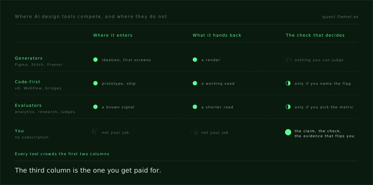
- Generators speed first screens inside systems; code-first tools ship tests; evaluators help only when you preselect the event and the flip threshold.
- Measure cost as downstream rework and edge-case fallout, not subscription price or demo beauty.
- Fill a brief, run a one-hour proof on a real decision, and pay only for tools that move judgment onto rails.
Most roundups of “best AI tools for UX designers” grade the demo screen, not the work it replaces. That is why they blur together. The honest comparison is simpler and harder: where the tool enters your process, and what it hands you back that you can ship or judge. Most compete to generate the first screen; almost none help you decide. That is the only lens that holds past this quarter.
If you are here to pick a tool for real work this week, test it against a decision you already owe, not an open canvas. Start from the eight fields in this sample brief and name the smallest proof you need before you open the app.
What to compare: entry point and return
You cannot compare a UI image generator with an analytics summariser on looks. You compare them on the job they start and the asset they hand back: a static image, editable components, production code, copy that fits, or evidence you can defend. The cost is not the subscription; it is the rework the tool creates downstream.
- Where does it enter: research synthesis, ideation, wireframing, high-fidelity, prototype authoring, publishing, or experiment analysis.
- What does it return: an image, a component tree, code, a deployed artifact, a structured critique, task success data, or nothing you can measure.
- What does it force you to decide: a claim and a check, or a style and a layout.
- What breaks without it: pace, quality, or the ability to judge the work under a constraint.
The stronger tools pinch you into a choice and give you a testable output, even when that output is ugly. The weaker ones flood you with plausible options and leave the burden of judgment untouched. That is not a sin if you need velocity today; it is a trap if you measure progress as bets checked.
Generators of first screens, graded honestly
Figma is the gravity well, and in 2026 it is really two products. First Draft turns a prompt into wireframes and component-based explorations on your own tokens, genuine leverage when you already live inside that system. Figma Make, on the paid plans, goes further and returns code. The gap is the one it started with: it hands back a render or a repo, rarely a reason.
Google Stitch is the honest surprise of the year, and it is where Galileo AI went after Google bought it. It runs free inside Google Labs, it exports both Figma layers and HTML and CSS, and since the March update it builds app flows on an infinite canvas. If your objection to prompt-to-UI tools was the price or the dead-end export, that objection is gone. What has not changed is that nothing in it tells you which of the six screens deserves to exist.
Framer AI sells a different bet: prompt to published. It returns a real site, on a real domain, with content you can edit in a CMS and performance you do not have to fight for. That is a gift for small launches where speed to something indexable beats perfect fit. It drifts when you need fidelity to a design system with complex states and deep domain logic.
The plugin layer around Figma sits in the same bracket: it removes the cold start and leaves the judgment untouched. If your bottleneck is buy-in or momentum, that speed is real leverage. If your bottleneck is judgment under a constraint, you will decorate your indecision in higher fidelity.
Tools that return components or code
v0, Webflow’s AI and the code-first assistants move from prompt to React or to production HTML and CSS. The promise is not the first image; it is a working seed you can hand to an engineer or deploy yourself. v0 now imports Figma files and builds against your own design system, which makes the seed less of a guess. Used well, they turn a decision into a running experiment. Used loosely, they harden a guess into technical debt.
The right question is not whether the code is clean. It is whether the code reflects a claim you can test, a flag you can flip and events you can read the next day. If you cannot write the check, what ships is a demo with a URL. They are excellent for internal tools and controlled traffic; for complex auth, payments or hostile traffic they grow teeth fast.
Locofy, Anima and the design-to-code bridges fill a different gap: translating Figma components into code within a narrow target. They do well when your variants are explicit; they thrash when naming is loose and the interaction logic lives in a designer’s head. The trap is counting a successful export as learning. What you learned is that the export ran, not that the design works.
Tools that help you evaluate, the rarest category
Most AI design tools still avoid the hard part: evaluation against a claim. There are exceptions. Analytics assistants — Amplitude’s natural language queries, Hotjar’s AI summaries, explorations in GA — compress reading, which is worth real money when you already know the event that matters and the horizon that decides. They do not choose the event, and they do not pick the threshold that flips you.
Research platforms add model-powered highlights, topic clustering and sentiment: Dovetail, UserTesting’s automatic insights, Maze. They make a long watch short and a long read scannable. They also turn a thin study into confident prose if you never said what a passing result looks like. The tool writes the certainty; you still owe the check.
Model judges that score comprehension and task success on a prototype are good pre-filters: they catch unclear copy and invisible affordances before you burn a panel. They are not a proxy for a novice under stress or an expert with real stakes. Use them as a spellcheck, not as a verdict. The verdict is a pass you run yourself, and critiquing the generated screen is the frame for it: audit the thing for the bet it refused to make.
The pattern is the same across all of them: the value appears once you have pre-selected the metric and defined the flip. If you cannot say what movement would change your mind, the assistant will gladly narrate motion as progress. The fix is a better brief, not a smarter summary.
“figma ai vs your design system” is the wrong fight
The question is not whether Figma AI can out-design your system; it cannot and does not try. The question is whether your tokens and components are explicit enough for any assistant to use without inventing states you never named. If the canvas is faster than the system, the system is vague, not old. Tighten the system; do not ban the assistant.
When in doubt, trade novelty for time simplicity: the move that cuts the number of parts you have to hold in your head right now. Fewer paths through a decision, a smaller testable slice, a shorter loop to evidence. That is where AI helps most, compressing a path you have already framed. It hurts when you ask it to choose the path.
A buyer’s checklist that does not age in a month
You do not need a feature table; you need a few hard questions you can run on any tool. This is the AI UI generator comparison that survives a release and a demo video.
- What decision does it force you to make, and what would change your mind?
- What is the smallest proof it returns: three states you can inspect, or an aesthetic you can like?
- What happens on the edge state, and who handles the fallout: you, the tool, or production?
- How do you judge success tomorrow: one event moving, one task completed, one warning read?
If the tool closes the decision under a constraint and names a check you can run, it is worth money even when the output is coarse. If it gives you volume with no way to tell right from wrong, it is a toy. Write down when not to use it before you subscribe, and run the checklist again a month later: once the novelty wears off, the missing return becomes visible.
A one-hour proof plan, from brief to check
Test on a real decision, not on a blank prompt. In one hour: write the binding constraint, the decision claim, the strongest alternative and the smallest proof you need to see. Ask one tool to produce each side under the same tokens. Then run a model judge for comprehension and name the event you will watch tomorrow.
For a cadence that holds across a week, use the walkthrough in this product designer AI workflow: two opposite directions on the same trade-off, one edge case, one check tomorrow, one threshold that flips you. Keep a log of what you accepted and why.
The work does not need to be invented to be real practice. Pick a constraint that already pinches in a scenario that exists and drill the habit there. These realistic briefs have the constraint baked in, so you can skip the fiction and test the skill.
Designers keep asking for the one tool because the demos make the process look coherent. It is not; it is a series of decisions taken under constraints. The best AI tools for UX designers are the ones that force you to name the decision and hand back something you can judge tomorrow. Stating the claim and naming the evidence that would flip you is the part no tool takes off your hands, and the part you can train. Create your account and practise it on a real brief with every tool you trial.
You are a senior product design decider and AI collaborator. Your job: force one decision under a constraint and return only testable outputs I can ship or judge tomorrow. Inputs: [describe the design decision], [binding constraint], [design tokens/system], [tools being considered], [target user/traffic], [target metric and time horizon], [critical edge case]. Produce, in this order: 1) Brief: binding constraint, decision claim, strongest alternative, smallest proof, flip threshold, entry point in the week, expected return asset, “when not to use” note. 2) Two opposite directions under the same tokens: list components or code targets, the decision each forces, and the exact asset returned (image, components, code, deployed artifact). 3) Check: a model-judge script to test comprehension and task success on the edge case, the passing criteria, and the single event to watch tomorrow. 4) Ship plan: the feature flag name, events to log, rollout scope, and a 60-minute step list. Be concise. No decoration. No generic advice.
Frequently asked questions
Are AI UI generators worth it for real products?
Yes, when your bottleneck is momentum or stakeholder buy-in; they create fast visuals inside constraints so people can react. They are weak at judgment. Pair them with a written check and a flip threshold so you do not accept pretty movement as progress; start by filling the eight fields in the sample brief to define the proof before you generate.
Figma AI vs Framer AI for a small launch?
Pick by entry point and return. Use Framer AI when you need prompt to published and a real, indexable site tomorrow for marketing or docs. Use Figma when you need fast explorations tethered to your system and components you can iterate on. If the next step is a public URL, Framer wins; if it is internal iteration, Figma wins.
Is Galileo AI still available in 2026?
Not as a standalone product. Google acquired it and the technology now ships as Google Stitch inside Google Labs, free with a monthly generation cap, exporting both Figma layers and HTML and CSS. If a roundup still lists Galileo AI as a separate subscription, that roundup has not been updated and you should distrust the rest of it.
When should I avoid code-first assistants like v0?
Avoid them when your system is implicit, your events are unnamed, or the flow involves complex auth, payments or hostile traffic. They make the wrong thing fast and then harden it. Use them when you can name a flag, define events and plan a check; this product designer AI workflow shows how to frame decisions so code returns become tests, not debt.
What does a one-hour proof plan with AI look like?
State the binding constraint, the decision claim, the strongest alternative and the smallest proof. Generate two opposite directions under the same tokens. Run a model judge on the edge case. Write the flip evidence. Name the event and the flag you will ship and watch tomorrow. For scaffolds and cadence, see these realistic briefs and the product designer AI workflow.