Key takeaways
- In a limited drop, checkout UX is an ability problem: the drop page created the wish, and the pay step decides who keeps a piece.
- Show the full total, with shipping and tax, next to the size picker; a fee added on the last step is drip pricing.
- Design the time to pay to fit well inside the cart hold, and state the hold once, in plain words.
- Cut typing on mobile: wallet payment first, guest checkout, autofill, and details saved before the drop opens.
- Leave urgency, social proof and upsells on the drop page; on the pay step each one is a new cost.
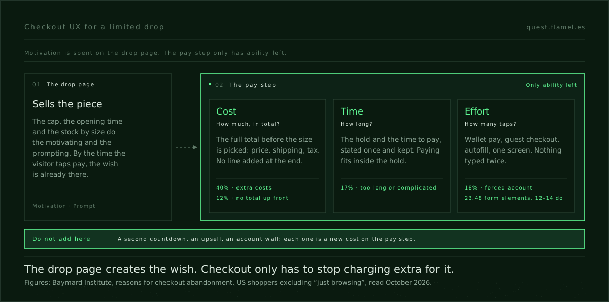
Checkout UX is the design of everything between “add to cart” and a paid order, and in a limited drop it is a simplicity problem, not a layout problem. The drop page has already done the motivating. At checkout, the only thing left to design is ability: what paying costs in money, in time and in effort. Cut those three and the piece goes to whoever wanted it first.
Take Halfwild, one of the practice briefs on Quest: a Berlin streetwear brand releasing a 200-unit collaboration, capped because the deadstock fabric ran out. The drop page makes that cap legible with live stock by size and an honest open time. Then a visitor on a phone, refreshing on launch day, picks a size and taps pay. From that tap on, scarcity stops being a story and becomes a queue: 200 pieces, and the pay step decides who keeps one.
The pay step has only ability left
BJ Fogg’s Behavior Model says a behaviour happens when motivation, ability and a prompt meet at the same moment, and that when it does not happen, one of the three is missing. On the drop page, the design work is motivation and prompt: the cap, the proof, the open time. By the pay step, motivation is not the question. Someone who picked a size during a 200-unit drop wants the piece. If they do not finish, it is almost never because the wish faded. It is because paying got harder than it had to be.
That is why the persuasion principles for product designers send you to Fogg first when people are not converting, and why the reflex fix is usually wrong. Teams add motivation at checkout, and none of it makes paying easier. It only raises the pressure on someone who has already decided.
Fogg breaks ability into six simplicity factors. Four kinds of friction separates four of them as costs you can name and cut. At the pay step of a drop, three of them decide the outcome: cost, time and physical effort.
The general data agrees. Baymard Institute’s research on why shoppers abandon checkout, leaving aside the ones who were just browsing, finds 40% left because of extra costs such as shipping, tax and fees, 18% because the site wanted them to create an account, 17% because the process was too long or complicated, and 12% because they could not see the total up front. None of those is a complaint about layout. Every one of them is a bill.
Cost: the total before the size
Cost simplicity is not about the price being low. Halfwild’s price is tied to the actual unit cost, on purpose, and a discount is not what a drop buyer is waiting for. It is about the number being certain. A headline price that grows with shipping, tax and a service fee on the last step is drip pricing, and in a drop the surprise costs more than usual: the buyer finds out under time pressure, with no room to compare, and the brand that sells on receipts over slogans has just shown a slogan.
The fix is placement, not persuasion. Show the full total, with shipping to the visitor’s country and tax included, next to the size picker, before anyone taps pay. Say what is excluded as plainly as what is included. The cost simplicity page gives the check to run afterwards: track abandonment at the exact step where the total changes, because that delta is the price of your presentation, and read refunds next to conversion.
Time: the hold and the time to pay
A drop checkout runs on two clocks. The first is the cart hold: a few minutes, sourced from the server, tied to the inventory lock, and shown only after the size is in the cart. The second is how long paying actually takes. If the second clock is close to the first, you have designed a lottery: the visitor can lose the piece while typing a card number, and the error will read as their fault.
Time simplicity asks you to say how long something takes and then keep the promise. Here that means stating the hold once, in plain words, and designing the pay step to fit comfortably inside it. The number to watch is the gap between the hold you state and the median time it takes to pay. If people are abandoning at the first step, before typing anything, the problem is perceived length: the step looks long, so make the end visible. And if a hold does run out, keep every field filled, so that a retry costs one tap and not a second form.

Effort: taps on a phone, under a clock
Halfwild’s buyer is on mobile, often refreshing the page when the drop opens. Every field typed on a phone keyboard under a running hold is physical effort, and errors cost time twice. Baymard’s checkout benchmark puts the average US checkout at 23.48 form elements shown by default, while their usability testing finds that an ideal flow can be as short as 12 to 14.
Cut the typing before you restyle anything. Put wallet payment first, so most buyers never see a card form. Let people check out as guests: 18% of the abandonments in that research cite the account wall on its own. Autofill the address, set the keyboard to match each field, and keep the whole step on one screen. The patterns are on the physical simplicity page.
The best move for a drop is to take effort out of the timed window altogether. Halfwild already runs a pre-drop lineup for subscribers. That is where the address and the payment method belong: saved the day before, when nothing is ticking, so that at open the only thing left is to confirm a size.
What not to add on the pay step
Everything that raises motivation belongs on the drop page. On the pay step it is a cost. A second countdown on top of the hold is time pressure with no new information. Live viewer counts and rolling purchase notices are social proof aimed at someone who already decided. A tote bag offered between the size and the payment is an extra decision in a 200-unit queue. A pre-ticked newsletter box is a check the buyer has to find and undo.
The honest version also covers the failure state. If a size sells out while someone is in checkout, say so at once and release them, before they type a card number. Making someone pay for a piece that is already gone costs them time, and it costs the brand the next drop. As the friction post puts it, if you cannot name which cost you cut, you did not simplify; you rearranged the bill.
Why the layout debate misses
One page or three steps, accordion or sections, sticky summary or not: these are layout questions, and they are what most checkout UX case studies in a portfolio show. A one-page checkout can still add a fee at the bottom. A three-step checkout can still be quick if the steps are prefilled and the total never moves. Layout follows once you know which cost is binding for this buyer, on this device, inside this hold.
A generator can lay out a clean checkout in seconds. It will not decide that the account wall goes, that the address moves to the day before, or that a fee has to sit next to the size picker. Those are calls you make by naming the cost.
Practise it one screen past the brief
Quest’s Halfwild brief stops at the drop page. Take it one screen further. Before you draw anything, write three numbers: the total the buyer sees next to the size picker, the hold length against your target time to pay, and the number of fields on a phone. Then design the pay step to keep all three. Then decide what you would measure: abandonment where the total changes, median time to pay against the hold, refunds in the first week. The sample brief shows the format a full brief comes in, if you want to write the rest yourself.
Cost and time are the two simplicities this kind of work trains least, because they do not show up in a screenshot. Train them on the cost simplicity and time simplicity pages, and keep the rest of the ability levers within reach in the skill library.
You are a senior product designer reviewing the checkout of a limited drop. Ask me first for: [describe the product, the unit cap and why it exists], [the price and every cost added after it: shipping, tax, fees], [the cart hold length and how it is enforced], [the current checkout steps and fields on mobile], [the payment methods offered]. Treat the pay step as an ability problem, not a layout one. Produce: 1) the full total the buyer should see next to the size picker, and any line that is added later; 2) the hold length against a target median time to pay, and what happens when the hold runs out; 3) a count of fields and taps on a phone, with the cuts that bring it down (wallet first, guest checkout, autofill, details saved before the drop); 4) everything on the pay step that adds motivation instead of ability, to move back to the drop page; 5) three numbers to measure: abandonment where the total changes, median time to pay against the hold, refunds in the first week. Never suggest fake urgency or an extra countdown.
Frequently asked questions
What is checkout UX?
Checkout UX is the design of the steps between adding an item to the cart and a paid order: the total, the delivery details, the payment method and the confirmation. Its job is ability, not persuasion. The buyer has already decided, so good checkout UX removes the cost, time and effort that stand between that decision and the payment.
What are checkout UX best practices for a limited drop?
Show the full total, with shipping and tax, before the buyer taps pay. Hold the item on the server for a stated time and make paying fit comfortably inside it. Put wallet payment first, allow guest checkout and autofill the address. Leave urgency and upsells on the drop page. The patterns behind each are on the cost simplicity and time simplicity pages.
Is a one-page checkout better than a multi-step checkout?
Not on its own. A one-page checkout can still add a fee at the bottom, and a three-step checkout can be quick if the steps are prefilled and the total never moves. Decide first which cost is binding for this buyer, on this device: money, time or physical effort. The layout follows from that answer, not the other way round.
Why do people abandon checkout?
In Baymard Institute’s research, leaving aside shoppers who were just browsing, the top reason is extra costs such as shipping, tax and fees, cited by 40%. Being asked to create an account (18%), a long or complicated process (17%) and not seeing the total up front (12%) follow. All four are costs the design can cut. Four kinds of friction shows how to name each one.
How long should a cart hold be in a drop?
Long enough that a buyer on a phone can pay comfortably inside it, and no longer than your inventory lock. Measure your median time to pay first, set the hold well above it and state it once in plain words. If the hold runs out, keep the fields filled so a retry costs one tap. Countdown timer UX for a real drop covers how to show it honestly.