
Key takeaways
- Order a multi-step form by commitment: identity and intent first, what the choice needs next, payment last.
- Every ask should agree with the yes the person gave a minute ago; asks grouped by system break that thread.
- Keep the earlier choices visible, validate in real time, and put an honest undo next to the payment button.
- Read exits step by step, especially at step two, and pair lift with regret before you call it a win.
- In review, defend the order with the funnel and one sentence: we only ask what the next step needs.
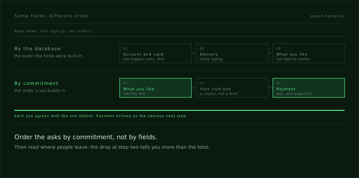
Most advice on the multi step form is about progress bars and field counts. The order of the asks matters more. A sign-up keeps its momentum when each step agrees with the yes the person gave a minute ago, and it loses it when the asks follow the database that will store them. The rule is commitment before convenience: identity and intent first, what the choice needs next, payment last. You will know it works by where people leave, especially at step two.
The mistake to avoid is grouping asks because they share a table or a system owner. The person filling in the form does not care who owns the API. What matters to them is whether the next ask fits the choice they just made. That gives you an argument that survives review, because it rests on behaviour and on the funnel, not on taste.
Order by commitment, not by fields
Every early ask should make people more certain of what they chose, never more aware of your stack. "What are you here for?" builds meaning; "Add your card" is a risk that belongs at the end, once the goal is clear. You earn the card by confirming who they are and what they want first.
In practice: ask for the choice before the logistics. Plan or pack size goes before the address, and the address appears only when there is something to deliver. Map the asks as verbs rather than tables: choose, confirm, pay. Then test the order with a colleague and a timer: do they say "of course" at each step, or stop to ask why you need this now? The commitment and consistency skill trains exactly this sequencing.
A form keeps its momentum when each yes agrees with the last one, and loses it when the asks announce your systems.
What commitment and consistency look like on a screen
Commitment and consistency is not a trick. People make a choice, and the flow honours it. On screen, the first step names the offer and asks only for what makes that choice personal: the plan, a name, an email. The button says the choice out loud.
The second step is the consequence of the choice: shipping for a physical pack, a handle for a profile. The earlier choice stays visible as a summary at the top, so the second yes feels like a continuation, not a new deal. The third step is closure: payment, phrased as the last step and paired with a summary people can check.
This sequence is measurable. If exits cluster at step two, a heavy ask arrived too early or the value was hidden too late. If payment fails at step three, the problem is mechanics, not psychology: fix the errors and retries before you reorder anything.
The brief: Pet-Nat Society's three-step sign-up
Pet-Nat Society is a natural-wine club tied to a Barcelona wine bar, and its Quest brief is a three-step membership sign-up. The starting point puts the plan, the address and the card on one screen, all competing for attention, so the work appears before the club does. The target in the brief is specific: move payment to the last step and halve the drop-off at step two.
Step one is identity and intent: "Join Pet-Nat Society", the pack size, a name, an email and the monthly terms in plain words ("You can pause any time before the 25th"). No billing, no address, just the decision to become a member and a clear promise.
Step two is what the choice needs: shipping. The pack summary sits at the top and stays there, followed by the address and a delivery window. Any field the carrier does not need is gone; if a phone number is required, the form says why.
Step three is the commitment: card details, a compact order summary, the next charge date and a calm "Start membership" button, with the undo in the same frame: "You can pause or cancel in one click before the 25th." If you want to try this ordering yourself before reading on, the sample brief gives you a comparable sign-up to redraw in an hour.

Placement that earns each yes
In step one, the offer is the hero and the main button states the choice. Privacy and unsubscribe promises sit within reach, and the terms are linked next to the checkbox, not buried below. Optional profile questions stay out: if you need them later, you can earn them later with a reason and a thank-you.
In step two, fields follow the order of a real address, and nothing else is mixed in: no marketing preferences, no profile trivia. Errors are plain and inline. If everything is required, nothing is labelled optional.
In step three, the screen shrinks to trust and completion: summary, charge date, undo, card fields and button in one frame. Validation is instant and never resets the form. If the sign-up creates an account, the password can wait until the end or arrive as a magic link with the receipt.
Measure the drop at step two
Decide the order, then measure the consequence. For lift: completion from start to finish, conversion at each step with a close eye on step two, time per step, and payment success on the first attempt. For regret: cancellations in the first seven days, support tickets that say the card came "too early", failed payment retries and address corrections.
Write the hypothesis and the stop-loss before you redesign: "Ordering identity, then shipping, then payment will raise step-two completion with seven-day cancellations flat." If cancellations or "card too early" tickets rise above their current level, restore the old order and keep the better labels and validation. Log the step number, the time on each step and the last field touched, so an exit points to a cause and not just to a page.
The line in review: refuse field-first sequencing
You will be asked to put payment first "to qualify leads", to add marketing fields "because legal wants them", or to group asks by the team that owns each system. Say this early: "We order by commitment, not by fields. The card comes last, when the value is clear, and we only ask what the next step needs." Then offer the honest path: one intent question up front if qualification matters, and consent placed next to the exact use if legal needs it.
When someone says "it's only a couple more fields", bring the funnel and the principle: the exits at step two, the time added, the support cost. The persuasion principles for product designers give you the vocabulary, and dark patterns vs persuasive design draws the ethical line: you earn sign-ups by ordering the asks the way decisions are made, not by tiring people out.
Practise it this week
Start with a one-page brief: the number, the timeframe, the population and the failing moment. Pick the lever, order by commitment, and write the copy for the top of each step and for each button ("Join Pet-Nat Society", "Continue to delivery", "Start membership"). Cut every field that does not unlock the next step, and move optional extras to the welcome email. The sample brief is the quickest way to rehearse it.
Your edge is not a trendy progress bar. It is ordering the asks to match how people commit, and being able to defend that order with a number. AI can generate the fields and wire them up; it will not decide which ask earns the next yes.
You are a senior product designer coaching a team on reordering a multi-step signup to maximize commitment and reduce regret. Use the commitment-before-convenience rule. Ask me for context, then produce the artefact. Context to collect: [product and offer], [physical or digital], [current flow steps], [where users exit], [required legal or fraud asks], [baseline metrics], [top user complaints]. Output: 1) A three-step flow spec with exact top copy, field list per step, and button labels; 2) A rationale mapping each ask to the prior yes; 3) An instrumentation plan (events, step stamps, last-focused-field, metrics, thresholds, and a stop-loss); 4) A short “defend the order” script for review; 5) Risks and mitigations. Constraints: identity+intent only in Step 1; consequence/logistics in Step 2 with a sticky summary; payment last with honest undo and real-time validation; no extra fields that don’t unlock the next step; label why for any sensitive ask; propose alternatives for legal/fraud without front-loading friction.
Frequently asked questions
What if payment must happen before access for compliance or fraud control?
Keep identity and intent first, then place payment as the final step before provisioning, not the first screen users see. Use a clear summary of value, pre-auths or deposits only if required, and real-time error handling. Add alternative methods and retries. If fraud is the concern, push verification behind rules that trigger only on risk signals, not for everyone. State the why near any sensitive ask and avoid scare tactics that create regret.
How do I know if step two is the problem and what to move?
Instrument a per-step funnel with time-on-step, last-focused-field, and error counts. If exits cluster at step two, inspect which field users touched last and how long they stalled. Move heavy or low-trust asks (phone, detailed address, handles) to the consequence step only when needed, or defer them until after value is clear. Validate with a timed hallway test and compare conversion and time deltas by device after the change.
How do I defend this order when engineering or legal want fields grouped by system?
Bring the funnel and the principle: show step-two exits, time lost to cross-system fields, and support costs. State the rule: order by commitment, not by tables; collect only what unlocks the next step. Offer targeted consent lines beside the exact use and defer enrichment with a reason and a thank-you. Reference https://quest.flamel.es/skills/commitment_consistency and https://quest.flamel.es/blog/persuasion-principles-for-product-designers to ground the rationale.
What exact labels should I use for the three step buttons?
Make each button say the choice out loud. Step 1: “Join [Offer]” or “Start [Plan]”. Step 2: “Continue to delivery” for physical or “Continue to setup” for digital. Step 3: “Start membership,” “Start subscription,” or “Place order,” paired with next charge date. Keep copy calm, declarative, and specific; avoid hype. Match the step title and summary so each click feels like continuity, not a new deal.
How do I measure regret and set a stop-loss after reordering?
Track first 7-day cancels, “card before I decide” tickets, failed payment retries, and address correction tickets. Declare hypotheses and thresholds before shipping and include a rollback. Example stop-loss: if cancels rise by 1 point or “card too early” tickets exceed 0.5% of joins, restore the previous order while keeping better copy/validation. Use the framing in https://quest.flamel.es/sample-brief to set numbers, timeframe, and population.