Key takeaways
- The line between dark patterns and persuasive design is not the technique; it is whether the claim is true and checkable at the moment of choice.
- Scarcity works on a lie as well as it works on the truth, which is exactly why the lever itself cannot be where the line is.
- Three moves make a nudge checkable: disclose where the claim comes from, keep an honoured undo, and put both where attention already is.
- Measure lift alongside refunds and cancellations in the same window; a nudge that raises both has moved revenue forward, not created it.
- A generator can write the countdown, but deciding whether the deadline is real, and defending that call, stays with you.
Most debates about dark patterns vs persuasive design ask whether a technique is good or bad, as if the widget had ethics baked in. It does not. The same scarcity banner is honest persuasion on one site and a lie on another, and nothing in the pixels tells you which. The line is not in the tactic; it is in the information asymmetry at the moment of choice: whether the claim that moves the user is true, and whether they could check it right there. That is a judgement, not a style, and it is exactly the kind you cannot hand to a generator. What you can do is make it repeatable: write the claim, name the check, and measure whether the nudge lifts the decision without lifting regret.
Where the line actually is
Persuasion changes a decision by giving someone a fact they were missing. A dark pattern changes it by exploiting a blind spot, often one the interface created. The test is whether the claim you use to move behaviour is true and verifiable where the decision happens. If it is, you are offering clarity. If it is not, you are smuggling a falsehood behind a familiar component.
So the question is never “urgency or no urgency”. It is whether you use only urgency the user could have discovered without you, or invent some and hide the test. The same lens works for social proof, defaults and commitment: each has a defensible form and a dark twin, and what divides them is the truth of the premise and the user’s ability to check it.
Run it as a test, not a mood. What exactly is the claim? Could a reasonable person verify it without leaving the flow? Does the interface make that check easier or harder? Would the user decide differently if they knew the claim was false? Ask those four on every nudge and you find the line while you are still writing the copy, not after the complaint arrives.
A dark pattern often does one more thing: it loads the way out with the kind of friction it removed from the way in. The component can be identical to the honest one. The difference is whether you would let the user catch you if the claim were wrong.
The mechanism: what the user could check at the moment of choice
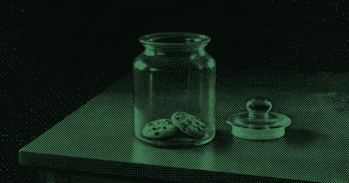
Start with why the technique works at all. In Stephen Worchel’s 1975 cookie-jar experiment, people rated identical cookies as more desirable when they came from a nearly empty jar than from a full one, and rated them highest of all when the jar went from full to nearly empty during the session. Nothing about the cookies had changed. Loss aversion and the urge to reclaim a freedom being taken away run on the signal, not on the fact.
That is the whole ethical problem in one jar. The lever works on a lie exactly as well as it works on the truth, so the lever cannot be where the line is.
“Verifiable at the moment of choice” sounds abstract until you name the moment and the check. The moment is where intent crystallises: the seat map before checkout, the plan picker before a trial, the consent screen before sharing contacts. The check is whatever a reasonable user could do right there to test your claim without abandoning the flow.
Three design moves make a claim checkable: disclosure, reversibility and proximity. Disclosure says where the claim comes from and how much it can drift. Reversibility means a mistaken click has an undo that is honoured. Proximity puts both where attention already is, not in a footnote or a help page three layers down. These moves do not weaken persuasion; they are what makes it persuasion.
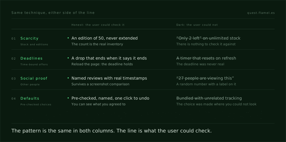
Take scarcity. “Only two seats left at this price” is honest if the count comes from the real inventory, says how fresh it is, and the price actually moves when those seats go. Add a refresh and, where the business allows it, a short fare hold or a price watch, and the user decides under real pressure with a way back.
Defaults run on the same mechanism. A pre-checked “email me product news” box is defensible when it says what product news includes and every email carries a one-click unsubscribe that works. It is not when the content is vague, the unsubscribe is a maze, or the box is bundled with unrelated tracking. The checkbox is not the line; consent the user can see and revoke is.
Social proof is the easiest to cross by accident. A count is credible when it names its population and timeframe and survives a refresh without jumping. “27 people are viewing this”, produced by a random function, is a lie about other people’s behaviour, and the Social Proof skill puts the test bluntly: if a number cannot survive a screenshot comparison, do not ship it.
Regulators have drawn the same line. Fabricated urgency, from timers that reset on refresh to “only 2 left” on unlimited stock, is named as a deceptive pattern in EU and UK consumer protection guidance, which is why the Scarcity skill treats a fake countdown as a false statement about the world rather than clever copy.
If the premise of your nudge is not true and checkable where the user stands, it is not persuasion. It is a trap.
One case: an honest seat count and an engineered one
Picture a travel app that wants more same-session bookings. A test shows lift from “Only 2 seats left at this price”, but cancellations and “price changed” support contacts rise with it. Then legal points out that the count comes from a cache that can lag the airline’s inventory, so the two seats are sometimes twenty and sometimes none.
Name the pieces. The moment is fare selection, before card entry. The success event is a completed booking in that session. The bad events are cancellations soon after booking and support contacts that cite the price. The mechanism is the problem: the banner turns a probabilistic cache into the certainty of “only 2 left” and offers no check except leaving to compare prices somewhere else.
That is engineered panic by information asymmetry. The honest variant changes the posture, not the pressure: “Fares can change. Seat count last checked 3 minutes ago”, a visible refresh, and a ten-minute hold if the business can offer one. If it cannot, a “watch this fare” alert that survives the session gives the same reason to act without pretending to know a number the system does not know.
Instrument both variants against the same bad events. Expect the honest one to lift bookings less on the day and cost you less afterwards, because it stops converting people who would have cancelled. A banner that lifts bookings and doubles the regret signals has not created revenue; it has borrowed it. Every time-limited, stock-linked or popularity-framed nudge has a claim like this underneath it, and the few that cannot be made checkable are the ones you retire.
Dark patterns examples, each with its honest twin
- Hidden costs vs total price up front: fees revealed at the last step exploit the effort already spent. The total, taxes included, on the product page sets an expectation the checkout keeps.
- Confirmshaming vs a neutral opt-out: “No, I hate learning” uses shame to force a yes. A plain “No thanks” with the consequence stated lets the offer win on its merits.
- Forced continuity vs an honest trial: auto-renewal with the terms buried bets on forgetting. A trial that names its renewal date, emails before charging and cancels in one click earns retention by fit.
- Pre-checked tracking vs earned opt-in: toggles bundled into sign-up ride on inattention. An opt-in offered at the moment of value, with a preview of what you will send, keeps the list honest.
- Fake low stock vs stated inventory: “Only 1 left” that never changes is theatre dressed as data. A count with its source and its age is a fact the user can act on.
- Roach motel vs an honoured exit: one tap to join and a phone call to leave traps people and moves churn to support. Leaving should take the same effort as joining.
- Misleading hierarchy vs honest emphasis: a “skip” dimmed to near invisibility bets on mis-taps. A secondary action that is visible but subordinate makes the content do the converting.
- Buried limits vs transparent tiers: limits hidden in footnotes steer by omission. Limits stated inside each tier let people choose the plan they will not regret.
The pairs are not a style guide; they are the three tests applied. The honest twin makes the truth testable where the user stands, keeps the undo inside the same experience, and puts the disclosure where the eye already is.
For the principles behind them, persuasion principles for product designers sets out each one with its mechanism. And the Duolingo streak teardown asks the same questions of one of the best-known commitment loops in consumer software, finds the honest part, and says where its line is.
What you train, and how you measure it
The skill here is not knowing a list of dark patterns; any model can recite one. It is knowing which mechanism you are invoking, why it works, and what claim it rests on. That is product psychology, and it is trainable: learn each principle with its ethical line attached, and the boundary stops being a matter of taste.
The second skill is defending the call. When a stakeholder wants the fake timer back because it tested well, “it feels manipulative” loses the meeting. “The claim is false, regulators name it, and the refund rate ate the lift” wins it. That is the shape of how to defend a design decision: name the mechanism, attach a consequence, and survive the attacks that come next.
The third is directing the tools. A generator will happily produce ten variants of a countdown; it has no idea whether the deadline is real. Deciding whether a claim is true, and whether users should be pressured at all, belongs on the list of what never to let AI decide. Write the premise, the check and the risk you will tolerate into the prompt, and make the tool work inside them.
Measurement is where teams drift. Count only the immediate lift and the dark pattern wins every test, because its costs arrive later as cancellations, chargebacks and support contacts. The Scarcity skill’s rule is the right default for any nudge: track conversion lift alongside refund and cancellation rates in the same window. Scarcity that raises conversion while raising returns has moved revenue forward, not created it.
So write hypotheses that carry the claim, the moment and the risk you expect to stay flat: “Showing verified stock with its age and a refresh will raise same-session add-to-cart, with no rise in returns or item-not-as-described tickets.” Commit the lift you would call a win before the test runs. And if someone objects to naming a bad event, remember that users who catch one reset timer discount every claim you make afterwards, true or not.
An audit you can run on one flow this week
- Pick one decision moment where you already nudge: plan selection, trial start, a time-limited offer.
- Write the claim behind the nudge in one sentence, with its source and what a reasonable user could do to verify it without leaving the flow.
- List the undo for a mistaken click. If it is not close and honoured, change that first.
- Name the success event and the bad event that expresses regret, and commit the lift you would accept with the bad event flat.
- Build two variants: the nudge with disclosure, check and undo added, and a version with no nudge that invests in clarity instead.
- Ship both behind a flag to a representative slice and keep only the one that lifts with risk flat. If neither does, change the mechanism, not the tone.
Every step turns mechanical once you accept that the line is in the information, not the widget. If you cannot state a credible check without derailing the flow, cut the nudge.
To practise the call before it matters, open the sample brief. It asks you to apply scarcity to an early-access window and to show a growing tribe count on a release page: the two nudges this post is about, on one screen. Decide what makes each of them true before you draw anything.
AI will not draw this line for you
A generator can write “Only two left” in ten tones and tuck a countdown under the button. It cannot tell you whether the number is real, whether a refresh belongs there, or whether a hold beats an alarm. You can prompt for style. The premise, the check and the risk budget are yours to supply.
Directing AI as a design skill means asking for the timestamp and the refresh because verifiability is non-negotiable, and rejecting anything that moves the check off-screen. Leave the line to taste and it gives way in the first growth meeting where the fake timer tests well.
Every skill in the Quest skills library carries its own ethical line next to the mechanism: what it gets you, why it works, when not to use it, and where it turns into a lie. Read the line before the pattern. Quest’s own session timer is one worked answer: it counts down from 60 minutes and, at zero, keeps going in overtime. Nothing locks, but the number is honest.
Keep the version you would defend to a user’s face. That is the real line, and you can draw it.
Act as a UX lead who reviews nudges for honesty before they ship. First ask me for: [the decision moment], [the nudge I plan to use], [the exact claim it makes and where the data comes from], [how fresh that data is], [the current UI], [my success event] and [the bad events that would signal regret, such as refunds, cancellations or support tickets]. Then give me a one-page review: 1) the claim in one sentence and whether it is true as stated; 2) what a reasonable user could do to check it without leaving the flow, and how to make that check visible; 3) the undo for a mistaken click and where it sits on screen; 4) an honest rewrite of the copy that keeps the pressure only if the pressure is real; 5) a no-nudge alternative that invests in clarity instead; 6) a hypothesis with the lift I should expect and the bad events that must stay flat; 7) the conditions under which I should cut the nudge entirely. Flag any claim you cannot verify from what I told you instead of assuming it is true.
Frequently asked questions
Are countdown timers a dark pattern?
Only when they are false. A timer counting down to a real deadline gives the user accurate information to decide with. One that resets on refresh, or counts down to nothing, is fabricated urgency, and EU and UK consumer protection guidance names it as a deceptive pattern. The test is simple: reload the page and see whether the deadline holds. The Scarcity skill sets out the honest versions.
Is persuasive design ethical?
It can be, and most good product design persuades. It is ethical when the claim doing the persuading is true, the user could check it where they stand, and a mistaken click can be undone. It stops being ethical when it works only because the user cannot see what you know. The principles and their limits are in persuasion principles for product designers.
What are some examples of dark patterns?
The common ones are hidden costs revealed at checkout, confirmshaming opt-outs, forced continuity on free trials, pre-checked tracking consent, fake low-stock counts, roach-motel cancellation flows, dimmed skip buttons and plan limits buried in footnotes. Each has an honest twin built on the same mechanism: the total price up front, a neutral “No thanks”, a trial that names its renewal date, a count with its source.
How do I argue against a dark pattern that tested well?
Change what the test measures before you argue about ethics. Put refunds, cancellations and support contacts in the same window as the lift; a nudge that raises conversion and returns together has borrowed revenue, not made it. Then name the mechanism and the false claim it rests on, as in how to defend a design decision, and propose the honest variant to test against it.
How do I practise spotting the line?
Take a brief with a real nudge in it and decide, before you design, what would make each claim true. The sample brief asks for scarcity on an early-access window and a growing tribe count, which is exactly the kind of call this post is about. Write the claim, the check and the undo for each one, then design.