Key takeaways
- A practice project trains judgement only when it brings a brand with constraints, a specific user in a specific moment and a number to move.
- Unsolicited redesigns give you screens with nothing to be wrong about, and they reward reinventing patterns users already know.
- Every option trains something: prompts build craft, your own idea builds ownership, real clients bring real constraints, structured briefs bring repetition.
- With AI drafting the screens, the exercise is reading a correct, generic draft against a brief and deciding what to change and what to keep.
- Before you start, name the constraint you did not choose, the user's moment and the number. If one is missing, fix the brief or pick another.
Search for UX design projects and the results split in two: galleries of finished work on Behance and Dribbble, and lists of project ideas you could pick up this weekend. Both answer the question of what to make. In 2026 that is the cheap half, because a model will draw a competent version of any of those screens in minutes. The part worth practising is the decision: what to change, for whom, and which number it should move.
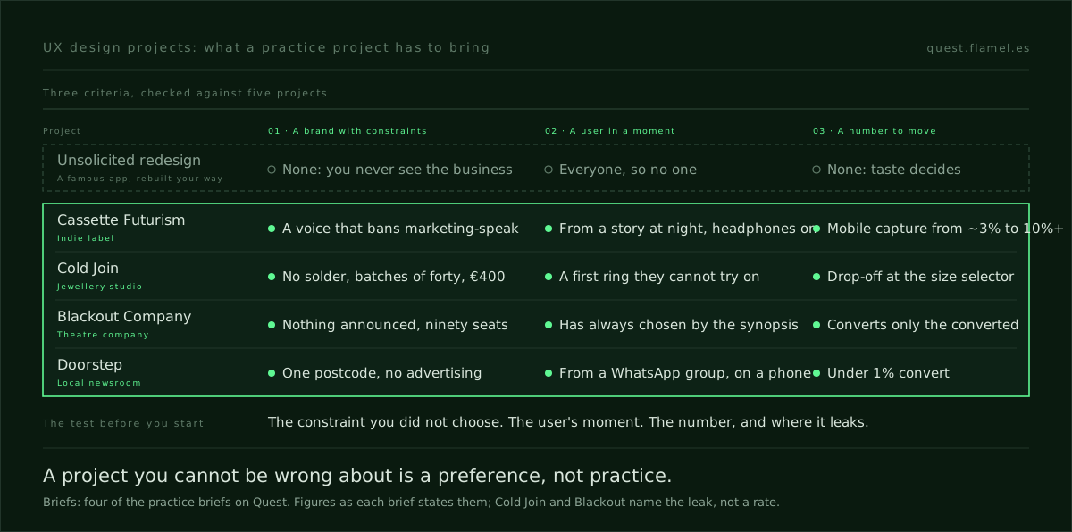
A practice project trains that decision only when it brings three things: a brand with constraints you did not choose, a specific user in a specific moment, and a number the work is supposed to move. Below are the projects designers usually weigh, what each gives back and when to skip it, then four briefs that carry all three. Quest writes briefs for a living, so read the comparison with that in mind.
To see the criteria on a page first, open the sample brief: a complete brief for an indie label, readable without an account.
What a practice project has to bring
A project earns its hours when it gives you enough to be wrong. Three things do that.
- A brand with constraints. Age, size, money, tone and what the company refuses to be. A label funded by Bandcamp sales cannot do what a streaming platform does, and its voice rules out half the copy a generator would write. A choice that cannot be wrong is only a preference.
- A specific user in a specific moment. Someone on a phone, at a time of day, arriving from somewhere, with a reason to leave. The moment decides what the first screen has to do.
- A number to move. The metric the work answers to, ideally with a baseline. Without it the review becomes a contest of taste, and nobody can tell a good decision from a pretty one.
The design brief template breaks the same idea into eight fields. These three are the minimum: drop any one and the project still produces screens, but you stop learning from it.
Unsolicited redesigns: plenty of screens, nothing to be wrong about
The easiest UX design project to start is the redesign nobody asked for: a famous app, rebuilt your way. It gives you something. A reviewer understands the piece at a glance, and you get honest practice at visual craft. What it cannot give you is any of the three criteria, because you know nothing about the business, the user's moment or the number, so every choice falls back on taste.
That is the argument in unsolicited redesigns teach nothing, and AI has made it sharper: a polished alternative to a famous screen now costs a prompt. There is a quieter cost too. A redesign rewards visible change, so it pushes you to reinvent navigation and gestures that millions of people already know how to use.
The Practice skill names what that throws away: familiarity is borrowed ability, and novelty at the interaction layer is a cost the user pays. A real brief usually arrives with a starting design, and deciding what to keep from it is half the job. A redesign trains you to keep nothing.
The other options, and what each one gives back
None of the usual alternatives is useless. They train different things, and the honest way to choose is to know which.
- Daily prompts. A short prompt every day, such as a sign-up screen. They build consistency and visual range, but rarely carry a user, a constraint or a check, so they train execution; the 30-day Daily UI alternative adds those three to the same routine.
- Your own product idea. You own every decision and can follow it for months. The catch is that you are also the client, so the constraints bend quietly whenever they get in the way.
- Real work for a nonprofit or a friend's business. When you can get it, the best option on the list: real constraints, a real user, sometimes real data. It is also slow, hard to find and scoped by their needs, and the numbers rarely reach you.
- Structured briefs. A written brief with a brand, a user and a number, usually with a timebox. Quest is one of these. You get repetition, a new decision every day instead of one every few months. You give up the live result: the brands are written for practice, so you never see the number move.
Four briefs that show the criteria at work
Most lists of UX design practice projects stop at the idea. Four briefs on Quest, from four very different businesses, show what carrying all three criteria looks like.
Cassette Futurism is a four-year-old indie label from Lisbon, run by two ex-musicians and releasing six to eight records a year. Its voice is lowercase and slightly conspiratorial, and it refuses to say "subscribe for updates". The user lands from an Instagram story at night, on a phone, with headphones on. The number is stated: 70% of visitors scroll once and bounce, and mobile email capture has to rise from about 3% to 10% or more.
Cold Join is a one-bench jewellery studio that makes rings without solder, in batches of forty. The page has to sell a €400 ring to someone who has never bought jewellery they could not try on, and who opens the page three times in a week. The brief names where the number leaks, the size selector, without giving a rate. That still helps: you know what to measure before you know the baseline.
Blackout Company is an eleven-year-old theatre company with a ninety-seat room, staging five productions a year and announcing none of them. Its membership page has to sell a season of unnamed plays to someone who has always chosen by the synopsis, and today it converts only the already-converted. With no titles to show, the decision is what to sell instead: the company's record, and a smaller first step than a full season.
Doorstep is a four-person newsroom covering a single postcode, funded entirely by subscriptions. The reader arrives from a neighbourhood WhatsApp group, on a phone, and will not create an account to read. Under 1% convert, and most of those who do never come back after the first week. Its voice bans "support local journalism", which is exactly what the current wall says.

What the brief changes about the work
Take the brief away and the four projects collapse into familiar exercises: a launch page, a product page, a membership page, a paywall. A model drafts all four in minutes, and the drafts look like the starting designs these briefs ship with: a dark hero with a countdown, a carousel with a size dropdown, three tiers with feature ticks, an article that fades out behind a modal. None of them is wrong in general. Each is wrong for this brand, this user and this number, and saying why is the exercise.
That is what to practise when AI does the screens: reading a correct, generic draft against a brief and deciding what to change, what to keep and what you expect to move. A timebox keeps the work on the decision rather than the polish, and how to run a 60-minute design challenge sets out the phases.
When a practice project is the wrong move
A practice project fills a gap in repetitions. In three cases it is the wrong tool.
- You already have real work with constraints and numbers. Write that up first: one shipped decision with its number does more for you than ten exercises.
- Your gap is craft: type, layout, a tool. A contained craft exercise with a clear quality bar trains that faster than a brief.
- You need proof of outcomes. A practice project can show the decision and how you would measure it, never a result, and inventing one is worse than leaving it out.
Choose the next one in five minutes
Before you start any project, answer three questions in writing. What constraint did you not choose? Where is the user, and what are they doing, when they meet your screen? Which number is the work supposed to move, and where does it leak today? If you cannot answer one, fix the brief or pick another project.
Then try the three questions on the sample brief. The answers are on the page: a label that refuses marketing-speak, a listener with headphones on, a capture rate of about 3% that has to reach 10%. That is the standard to hold any project against, whoever wrote it.
If you have already decided that daily briefs are the practice you want, create an account on Quest. It is free to start: a new brief every day, a starting design to beat and sixty minutes on the clock, scored on how you applied the skills the brief targets rather than on how the screen looks.
You are a senior product designer helping me choose and set up my next UX practice project. Ask me, one at a time, for: [the project I am considering], [the gap I want to close: judgement, craft or proof of outcomes] and [the time I have each week]. Then: 1) check the project against three criteria, a brand with constraints I did not choose, a specific user in a specific moment and a number the work should move, and say which are missing; 2) if one is missing, rewrite the project as a brief that carries all three, without inventing results; 3) if my gap is craft or proof of outcomes, tell me a practice project is the wrong tool and say what to do instead; 4) describe the generic first draft a model would produce for it, and list what in that draft is wrong for this brand, this user and this number; 5) give me a 60-minute plan that ends with a written rationale.
Frequently asked questions
What makes a good UX design project for a portfolio?
A good project shows a decision, not just screens. It needs a brand with constraints you did not choose, a specific user in a specific moment and a number the work is meant to move. With those, a reviewer can see what you changed, why, and how you would know it worked. Without them, every choice reads as taste, however polished the result.
Are unsolicited redesigns worth doing?
They are worth it for visual craft, and a reviewer recognises the product at a glance. They are weak for judgement: you know nothing about the business, the user's moment or the metric, so nothing you decide can be wrong. The argument is laid out in unsolicited redesigns teach nothing. A brief with real constraints trains the part employers ask about.
Is real client work better than a practice brief?
Usually, yes: a nonprofit or a small business gives you real constraints, a real user and sometimes real data. It is also slow, hard to find and scoped by their needs rather than what you want to train. A written brief gives you more repetitions, a decision every day instead of one every few months, but you never see the live result.
Can a practice project replace shipped work in a portfolio?
No. A practice project can show how you read a brief, what you decided and how you would measure it, which is what a reviewer probes in an interview. It cannot show an outcome, and inventing one is worse than leaving it out. Use practice to fill a gap in repetitions, and lead with real work when you have it.
How long should a UX practice project take?
Shorter than most people think. An hour is enough to read a brief, commit to one angle, build against a starting design and write down why, and twenty one-hour sessions give you twenty full decisions. The protocol in how to run a 60-minute design challenge splits the hour into phases with hard boundaries.