Key takeaways
- Visual repetition trains execution. To practice product judgment, add a brief, a constraint, and a check that could change your decision.
- AI can draft screens; your advantage is reasoning that ties a decision to a user, moment, task, and trade-off.
- Run a timeboxed loop: brief, constraint, decision with a strong alternative, smallest screens, and a measurable next check captured in a decision note.
- Track five pass-fail checks, cycle time, and decision clarity, then review weekly to tighten constraints and raise the quality bar.
- Use the 30‑day plan to rehearse problem → decision → check with small flows; raise fidelity only when it strengthens your claim.
Daily UI looks like repetition, but it is not the kind of practice that changes your judgment. If you are searching for a daily ui alternative, name the skill you want to develop: making a defensible decision under constraint, with a clear way to check if it helps a user. AI can already produce passable screens; you must train why a change deserves to exist.
Daily UI offers interface challenges and encourages participants to interpret and share their designs. That can build visual craft and consistency. The gap appears when a screen becomes the whole exercise: without a user, a task, or a testable claim, you cannot tell whether your decision helped. The missing practice is product judgment, not drawing itself.
What Daily UI misses, and why it matters now
An open-ended interface prompt does not, by itself, supply a product brief, a consequential constraint, and evaluation against a user need. You can add those yourself; this plan makes them mandatory. A beautiful result is still worth making, but visual quality alone cannot tell you whether you chose the right problem. That is the distinction behind the title.
This is not an aesthetic complaint; it is a career safeguard. As models improve, execution speed will not be your differentiator, and that is already visible in teams that rely on AI for first drafts. What appreciates with AI are decisions, not decorations. See the analysis in skills that appreciate as AI improves to focus your effort on the parts whose value compounds.
A concrete moment shows the mechanism
Consider a hypothetical application that asks for supporting documents. Suppose customers leave halfway through. Surprise about requirements and interruptions are two possible explanations; neither is a finding until you investigate. You could front-load requirements, save partial progress, or relax criteria. These are not cosmetic variations; they are different answers to different problems. Practice begins by naming which problem you are solving.
Frame it this way: user, moment, and task. “We suspect a first-time applicant who is unsure about required documents hesitates at the first input and abandons.” The decision you test could be “preview the document list and eligibility before the form begins, then branch early if they lack a required item.” The alternative could be “allow saving and returning later.” The check is whether understanding and next steps improve when you preview requirements.
Watch how output changes once the decision is explicit. You are not drawing a generic checklist; you are designing a specific entry point, a requirement preview, and a path when a document is missing. You stop when you can trace your claim to a screen, not when you have filled your artboard. You also know what could change your mind: if interruptions, not surprise, explain drop-off, saving might win. That structure travels across topics.
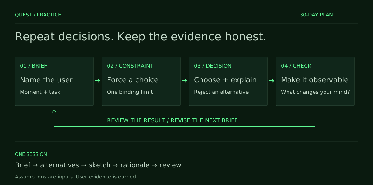
To fit practice into your calendar, timebox the whole loop. A simple split works: ten minutes to frame, ten to explore alternatives, twenty to sketch the smallest flow that demonstrates your decision, and fifteen to write the rationale. Use the remaining five to review the alignment between claim and screen. You are rehearsing the handoff, not just the interface; speed follows clarity when your routine is this explicit.
What you will train, and how you will measure it
Measurement makes practice stick. Each day ends with a short decision note that pairs your claim with the smallest screen or state that demonstrates it. You also record a pass-fail on five checks: your problem statement names a user, moment, and task; your decision addresses that problem; your alternative is meaningfully different; your next check is observable; and your screen supports your claim. That gives you a weekly baseline to improve.
Track two more numbers: cycle time and decision clarity. Cycle time is minutes from brief to decision note; clarity is whether a peer can restate your claim after a single read. If you are practicing alone, read your note the next day and try to produce the same flow from it without peeking at the screens. If you cannot, the note is vague. Practice makes your reasoning portable; the artifact is only one witness for it.
If you also want to build execution speed, keep the exercise honest: practice tools with a concrete objective and feedback. The guide to Figma practice projects that build useful muscle gives you contained tasks with quality bars. Use it to isolate tool craft. For this thirty-day plan, keep fidelity in service of the decision, not as a way to avoid the hard part.
AI belongs in the process you control
Let AI do what it is good at: ideation breadth, draft copy, naming edge cases, and generating alternative layouts that expose a trade-off. Start each session with a written guardrail: what comes from the brief, what you assume, and what you would need to learn. Ask the model to challenge your assumption or propose a competing decision you can reject on principle. That keeps the work attached to a problem, not a template.
Record what you accepted, changed, and rejected. If the model suggests collecting documents immediately but your decision is to preview requirements first, write why. Note the evidence that would change your mind. Do not turn any generated persona, pain point, or metric into a finding. The essay on why unsolicited redesigns teach nothing covers the boundary; treat Daily UI the same way.
A better replacement: the 30‑day plan
The plan alternates topics so you do not grind the same groove. Each day below gives you a decision seed, a deliverable, and a check. Before sketching, name the user and add one binding constraint: a device limit, a fixed policy, an unavailable dependency, or a time limit. Treat every problem as hypothetical unless you have evidence. Deliverables are small: one flow of three screens, a single difficult state, or a decision note with one annotated mock. Use the same rubric to evaluate yourself daily and review weekly. If you need a prompt to get started, try the sample design brief and adapt the structure.
- Day 1 — Account creation friction: Decide whether to delay email verification until first meaningful action; deliver three screens; check if the next step is unambiguous for a user who skips verification.
- Day 2 — Pricing comprehension: Choose between monthly default or annual savings emphasis for a trial; show comparison and selection; check whether the savings cue misleads trial expectations.
- Day 3 — Empty state for saved items: Decide whether to show a tutorial or examples; design the first use state; check if the next action is discoverable without reading body copy.
- Day 4 — Onboarding question order: Choose to ask goals before collecting details; sketch the first two questions; check whether branching changes the perceived length of the flow.
- Day 5 — Permission request timing: Decide to request notifications after demonstrating value; design the trigger moment; check refusal recovery and clarity of benefits.
- Day 6 — Search vs. browse: Choose default entry for a large catalog; design the home; check if novices can find a category without search.
- Day 7 — Failed payment: Decide between immediate lock or grace period; design the alert and action; check whether critical features remain understandable during the grace.
- Day 8 — Document upload: Choose preview of requirements before form; design preview and branch; check if users lacking a document can identify their path.
- Day 9 — Account deletion: Decide to require confirmation reasons or not; design confirmation; check if friction respects autonomy without dark patterns.
- Day 10 — Multi-step form progress: Choose visual progress style; design header and a mid-step; check if users can predict remaining time.
- Day 11 — Error copy strategy: Choose generic vs. field-specific errors; design one error state per choice; check comprehension without tooltips.
- Day 12 — Social sign-in fallback: Decide fallback path when provider fails; design retry and email option; check discoverability under stress.
- Day 13 — Upsell timing: Choose pre-checkout vs. post-purchase upsell; design the moment; check if conversion disrupts the primary task.
- Day 14 — Consent for data use: Choose default granularity; design consent UI; check if users can adjust settings later without hunting.
- Day 15 — Invite flow: Decide sender copy tone; design invite creation and preview; check if recipients understand who is inviting and why.
- Day 16 — Bulk action confirmation: Choose single confirm vs. per-item undo; design selection and confirmation; check safety and speed balance.
- Day 17 — First-run personalization: Decide opt-in vs. required setup; design entry and skip; check if optional feels skippable without penalty.
- Day 18 — Calendar event creation: Choose quick add vs. guided form; design entry and edit; check error recovery for ambiguous input.
- Day 19 — Checkout address entry: Decide auto-complete vs. manual validation; design fields and error handling; check accessibility and edge cases.
- Day 20 — Bookmarking behavior: Choose single-tap save vs. modal choose-folder; design interaction; check if organization remains discoverable.
- Day 21 — Notification center: Decide grouping rules; design default list; check whether critical items are visually prioritized without anxiety.
- Day 22 — File naming convention: Choose auto-generated names; design edit affordance; check if collisions and duplicates are understandable.
- Day 23 — Account recovery: Decide verification path order; design entry and fallback; check if locked-out users can proceed without secondary device.
- Day 24 — Trial to paid conversion: Choose timing of “enter card” prompt; design banner and flow; check if users can evaluate value before payment.
- Day 25 — Multi-language selection: Decide default language detection; design first-run picker; check if change later is discoverable.
- Day 26 — Feature discovery: Choose spotlight vs. snackbars; design the first exposure; plan a follow-up task after one week; do not treat stated recall as measured retention.
- Day 27 — Reporting dashboard: Decide default chart and time range; design overview; check if anomalies are noticeable without filters.
- Day 28 — Referral code entry: Choose pre vs. post-purchase entry; design field location; check if codes are discoverable without harming flow.
- Day 29 — Workspace roles: Choose default role for invites; design role picker; check least-privilege without surprising senders.
- Day 30 — De-risk a v1: Decide what to ship behind a flag; design opt-in; check if feedback collection is proportional to the change.
Run each session like a tiny handoff
Protect the structure even when you feel you could draw more. Start with the brief, list one assumption, write your decision, name one strong alternative you rejected, and define the next check. Then sketch only the screens that prove your claim. Close with the decision note. If you exceed the timebox, cut scope, not the rationale; the discipline is part of the skill.
Adopt a minimal critique routine. Read your decision note aloud and mark jargon, passive voice, and vague benefits. Ask a peer to restate your claim from the note alone and point to the screen that supports it. If they cannot find the screen, your flow is incomplete. If they cannot restate the claim, your note is muddy. This is how you raise the quality bar without adding hours to your calendar.
Pitfalls, weekly review, and raising the bar
Do not count output instead of outcomes. Thirty artifacts matter less than thirty defended choices. Avoid invented metrics that make you sound confident and teach you nothing. Write dependencies explicitly: what traffic or access you would need to measure a result after launch. For a concrete routine, follow how to run a 60-minute design challenge.
End each week with a short retro. Aggregate your pass-fail checks, cycle time, and how often peers could restate your claim. Note where you consistently stumble: weak alternatives, vague checks, or misaligned screens. In the following week, tighten your constraint. If you avoid error states, make the next two sessions only about difficult states. If your notes bloat, cap them at 150 words and force a single claim.
Where this leads, and how to start today
This plan aligns with the direction of the field, not nostalgia for old workflows. The question designers keep asking is whether the role is still worth it as tools change; the honest answer depends on the skill you choose to train. Read whether becoming a product designer in 2026 is still worth it and map your practice to the compounding skills that remain scarce.
If you want a permanent anchor, add the reference card at the practice skill to your bookmarks and keep the checks visible where you work. Then put it to use once today. Start with the sample brief, apply this loop in sixty minutes, and end with a decision note and three screens. You will produce fewer artifacts than Daily UI, and that is the point. You will know what you learned.
You are a senior product design coach. I will provide: [product/context], [user, moment, task], [design decision I’m considering], [strong alternative], [constraints and assumptions], [what I’d need to learn to be confident], and a [timebox, e.g., 60 minutes]. Produce a decision note and run plan that meet these criteria: 1) Problem statement naming user, moment, and task. 2) One-sentence testable decision claim and one strong alternative I reject. 3) The smallest flow or states to sketch (max three items) that prove the claim. 4) A measurable next check and the evidence that would change my mind. 5) Explicit dependencies to measure after launch. 6) AI guardrails plus an accept/change/reject log template for model suggestions. 7) Pass/fail against these five checks: problem clarity, decision alignment, meaningful alternative, observable check, screen-claim alignment. 8) A minute-by-minute plan matching [timebox] (e.g., 10/10/20/15/5) and a one-paragraph rationale (≤150 words). Ask for any missing inputs, then deliver the artifact in crisp bullets and short sentences.
Frequently asked questions
How do I write a strong problem statement for this daily practice?
Write one sentence that names the user, the moment, and the task, plus the friction that blocks progress, without slipping into solutions; add one constraint that forces a trade-off and keeps scope honest (time, device, policy, or risk). Example: “We suspect that unexpected document requirements prevent a first-time applicant from starting.” Mark this as an assumption until observed. If it reads like a feature, rewrite until someone could test it as a claim.
What exactly should my decision note include to be defensible?
Keep it to ~150 words: one testable claim, one strong alternative you reject, the smallest screens or states that prove the claim, the next measurable check, and the evidence that would flip your decision; add dependencies for real validation. Pair it with a quick sketch plan and stop when claim maps to screen. Use the reference at practice skill to keep the checks visible.
How do I know if the practice is working without real users or analytics?
Score daily against five pass-fail checks, track cycle time from brief to decision note, and rate clarity by whether next-day-you can recreate the flow from the note alone; add a peer restatement test when possible. Log dependencies instead of inventing numbers, and avoid turning guesses into “findings” as warned here: limits of speculative redesigns. Review weekly and tighten your constraint where you stumble.
How do I use AI in this loop without it turning into template work?
Write guardrails first (what’s in-brief, assumed, and unknown), then ask the model for competing decisions, edge cases, and contrasting layouts that expose trade-offs; keep an accept/change/reject log with reasons and evidence that would change your mind. Cut anything that dilutes the brief or smuggles certainty, keep drafts that sharpen the trade-off, and always close with your decision note and smallest proof screens.
How can I fit this plan when I only have 30 minutes a day?
Keep the structure, shrink the scope: pick one critical state instead of a three-screen flow, and compress to 5/5/10/7/3 (frame/explore/sketch/write/review). Use a weekly retro to target your weakest check, and schedule separate tool-craft reps so decision practice stays pure; the tasks at Figma practice projects and the starter at sample brief help you isolate muscle without bloating fidelity.