
Key takeaways
- Airbnb’s social proof works by bundling verified trust, load‑reducing pre‑sorting, and timeboxed, listing‑local demand cues at the exact booking moment.
- Reviews become a checkable claim via visible counts, distribution, timestamps, language filters, and named, recent badges that stay screenshot‑stable tomorrow.
- Pre‑sorted themes, recent/language filters, and representative quotes narrow what to read so you can decide without leaving the listing.
- Place trust, filters, demand cues, and the undo beside price, dates, fees, and Reserve, where trigger, ability, and reversibility meet.
- Write the hypothesis and instrument lift with cancellations and quality tickets, then ship sourced, timeboxed demand copy plus visible review distribution next to Reserve.
Airbnb social proof does three jobs at once: it builds trust with verified, recent reviews; reduces cognitive load by pre-sorting what to read; and creates legitimate scarcity by showing timeboxed demand near the decision. One element, three mechanisms — and that’s why copying the component rarely copies the effect. The lever is causal fit, not chrome.
One module, three mechanisms
The reviews module is not a single nudge but a bundle. Aggregate rating and badges set a baseline of credibility; highlighted themes and filters narrow attention; and demand cues like “Booked in the last 24 hours” sit beside Reserve to nudge timing.
When your eye lands on price and dates, the same frame shows whether people like you chose this place recently, and how they described it, without asking you to pogo-stick around the app.
Trust: reviews as a checkable claim
Reviews are credible because they are a checkable claim: a visible count, a distribution, timestamps, language filters, and a path to read what makes the score real. Badges like Superhost add named criteria and a recency window, making the premise screenshot-stable tomorrow. That’s the bar we set in the Social Proof skill.
Unsourced popularity lines are cheap; sourced, aged, and population-scoped claims are expensive to fake and easy to defend. That is the ethical line drawn in dark patterns vs. persuasive design: if the fact cannot be named and checked locally, skip the lever or choose clarity instead.

Load reduction: pre-sorting the decision
When a listing has hundreds of reviews, the job is not “show them”; it’s “help me decide which ten to read before I click Reserve.” Airbnb pre-sorts by surfacing themes like “Great location” or “Clean,” lets you filter by recent or language, and highlights representative quotes.
That turns a firehose into a shortlist and moves ability above the action line. The lever is not the star count; it’s the distribution and affordances that help you form a view fast enough to act.
Scarcity: timeboxed, sourced, and local
Demand cues near the CTA create a different effect: they give you a reason to decide today that is tied to reality. Lines like “Booked in the last 24 hours” or “Rare find — this place is usually booked” work when they’re timeboxed, scoped to the listing, and placed where commitment happens.
This approach keeps urgency as context, not theatre — the same standard we apply in the Anticipation skill.
Placement: trigger meets ability
Airbnb stacks these levers exactly where ability and motivation overlap: beside the price breakdown, dates, fees, and the Reserve button. Trust sits in the summary and next to Reserve; load reduction lives in tabs and filters that keep you on the listing; demand copy sits in the same frame, not in a banner two scrolls up.
The undo sits there too, often as “You won’t be charged yet” and a clearly stated free-cancellation window. They lower perceived risk by naming a reversible path. Put the trigger, the check, and the undo together, and the decision feels reasonable instead of pushed.
What a copycat UI misses
Clones grab the stars and slap a “Popular” badge on the CTA, then wonder why cancellations rise after conversion. They copied the pixels and skipped the premise, the source, the age, the placement, and the undo.
You see the same pattern in the Duolingo streak teardown: the effect is in how the moment, the claim, and the undo fit, not in the illustration. Mechanism beats motif.
Measure the bundle, not the badge
If you test only conversion, any pressure tactic will look like a win. Pair lift with a stop-loss on cancellations, refunds, “not as described” tickets, and low-star follow-ups, and the picture changes.
Write the hypothesis before you draw: “Sourced, timeboxed demand copy beside Reserve plus visible review distribution will raise same-session reservations with cancellations flat.” If you can’t name the source and age of your demand line, pick clarity instead — price locks, fee breakdowns, and cancellation windows beat theatre every time. That’s the craft inside persuasion principles for product designers.
Design takeaways you can ship this week
- Write the claim and the check: “Recent, verified reviews and a visible distribution” is the claim; the check is timestamps, filters, and a readable path in-frame.
- Place demand cues at the CTA and timebox them: “Booked in the last 24 hours” beats vague “Very popular,” because it names scope and age.
- Put the undo beside Reserve: “You won’t be charged yet” plus the cancellation window, not buried in policy docs.
- Instrument regret with lift: track same-session reserves, next-week cancels, and “not as described” tickets in the same window.
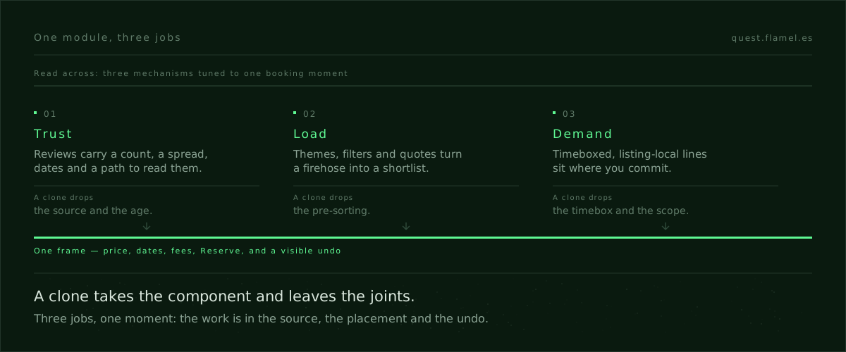
Airbnb social proof works because it is three mechanisms tuned to one moment, with the check and the undo where attention already is. Your edge is learning to pick and place those levers, not to paint the widget. If you want to practice the bar for truth, sourcing, and placement that compounds rather than backfires, start with the Social Proof skill.
You are a senior product designer acting as a UX strategist and experiment lead. I will describe my context; you will produce a one‑page spec that applies bundled social proof to a booking‑like decision. Inputs: [describe the decision moment, surface, and CTA], [paste current reviews/demand UI], [list available data sources and age windows], [state cancellation/undo policy], [name key risks]. Output the following: 1) The claim and its check: review distribution, counts, timestamps, language filters, badges with named, recent criteria, and the in‑frame path to read them. 2) Load‑reduction plan: themes, filters, and quotes that pre‑sort what to read. 3) Demand cue copy options (3): sourced, timeboxed, listing‑local, and screenshot‑stable tomorrow. 4) Placement map: exactly which elements sit beside the CTA, price, dates, and fees. 5) Undo copy: “You won’t be charged yet” plus the visible cancellation window. 6) Experiment hypothesis and metrics: include same‑session reservations, next‑week cancellations, refunds, and “not as described” tickets with a stop‑loss. 7) QA checklist and data requirements. Enforce: no vague or unsourced popularity lines.
Frequently asked questions
What makes a social proof claim “checkable” and why does it matter?
A checkable claim names the metric, the source, the population, and the age, and gives a visible path to read it now: counts, distribution, timestamps, language filters, and badges with criteria and recency. It stays screenshot‑stable tomorrow, so trust compounds and legal risk drops. That’s the bar set in the Social Proof skill and the ethical line in dark patterns vs. persuasive design.
When do lines like “Booked in the last 24 hours” actually work?
They work when they are timeboxed, listing‑local, sourced, and placed beside the CTA at the commitment moment. That turns urgency into context, not theatre, by tying timing to real, recent demand. Vague “Popular” lines backfire because they lack scope and age. See the framing for legitimate urgency in the Anticipation skill.
Where should I place reviews, filters, and demand cues relative to the CTA?
Put them in the same frame as price, dates, fees, and the Reserve button. Trust elements appear in the summary and adjacent to the CTA; filters and themes keep you on the listing; demand cues sit by Reserve; the undo line sits there too. Trigger, check, and reversibility meet where the decision happens, not in a banner two scrolls away.
What does “undo” mean here and how does it reduce cancellations?
The undo is the named reversible path at the action line: copy like “You won’t be charged yet” plus a clear, near‑CTA free‑cancellation window. It lowers perceived risk without adding pressure, aligns expectations, and reduces regret‑driven cancels. Instrument next‑week cancellations alongside lift to validate the effect. This fits the discipline in persuasion principles for product designers.
How do I measure this bundle without rewarding pressure tactics?
Pair conversion with a stop‑loss: track same‑session reservations, next‑week cancellations, refunds, “not as described” tickets, and low‑star follow‑ups in the same window. Write the hypothesis upfront and treat trust and load‑reduction as the primary levers, with demand as a sourced, timeboxed nudge. This bundle‑level view avoids false wins, as echoed in the Duolingo streak teardown and persuasion principles.