

Key takeaways
- When every product design portfolio looks polished, screens stop separating candidates; reviewers look for a case with a moment, a decision and a number.
- One growth case beats ten polished screens because it shows what changes when you make a call, not only that you can execute.
- A practice brief supplies the person, the moment and a baseline, but never a result: state the bet and how you would measure it.
- Open the case with the cost of the status quo in concrete units, so the reviewer reaches the problem before you argue it.
- This week, write the three lines for one practice redesign before you choose a single screen for your portfolio.
Most advice on a product design portfolio is a gallery: thirty portfolios to admire, ten layouts to borrow. Read enough of them and the problem shows, because they all look good. When every portfolio looks polished, a reviewer stops grading the finish and starts looking for the one thing a model cannot produce for you: a case with a moment, a decision and a number in it.
That is why one growth case beats ten polished screens, and you do not need a shipped experiment to write one. A practice brief gives you a real problem, a baseline and a person. What you add is the moment you fixed, the number you would move and how you would measure it, without claiming a result that never happened.
What reviewers look for in a product design portfolio
A reviewer working through a stack of portfolios spends the first minute deciding whether to keep reading, and screens no longer settle that. A competent screen is now the cheapest thing in the file, because a model drafts one for anyone. What they look for instead is evidence that you can choose: who the work was for, what it had to change and what you refused to do to change it.
The UX case study examples on this blog share that shape: they open on a decision, show the mechanism behind it and put the screens last, as proof. For most designers the hard part is not the structure but the raw material. Their best projects shipped without a number they can show, or with a number that belongs to the team, the client or an NDA.
Why one growth case beats ten polished screens
Ten polished screens answer a question reviewers have mostly stopped asking: can you execute? A growth case answers the one a hiring manager is paid to ask: what happens when you make a call? It names a person at a specific moment, the behaviour that has to change there and the number that will show whether it did, which is what a reviewer needs to picture you on their team.
That is the argument of how to prove the judgement was yours: when the surfaces look alike, the decision and its bounds are the only signal left. A growth case is the most compact form of that proof. It is also the case most portfolios lack, including those of designers who run experiments every week but cannot publish a single one.
A practice brief gives you everything except the result
A good practice brief carries most of what a growth case needs. It names a client and what makes it different, the person who arrives and the state they arrive in, a number with a baseline, and a starting design that already exists. That last part matters: you are not designing on a blank page, you are beating the version the client already has.
What it cannot give you is a result, and that is where practice work usually goes wrong in a portfolio. A redesign nobody shipped has no outcome, so the honest case states the bet and the plan to measure it instead. Reviewers know the difference, and a plan with a baseline survives the follow-up question that a percentage from nowhere does not.
You can see that raw material without an account. The sample brief on Quest shows the full format, and its objective already carries a number: raise email capture from about 3% to 10% on mobile, for a fan who lands from an Instagram story at night with headphones on. That is a moment and a number; the case is what you do with them.
Worked example: Wheel & Patience
Wheel & Patience is one of the practice briefs on Quest: an online pottery school started by a working potter from Stoke-on-Trent, teaching six-week beginner courses live in cohorts of eight. Visitors arrive from Instagram reels of clay on the wheel, on mobile, often on a weekend morning, already inspired. The enrolment page deflates that feeling with bullet lists and FAQs, and it converts under 2% even from that warm traffic.
A 76-minute redesign in the showcase turns the page into a twelve-screen onboarding. The first screen introduces the class of eight, the next ones use everyday scenarios to show a beginner they are already creative, a screen before checkout hands out two playful medals, and the last shows the people at the same step and the goals they chose, so the visitor meets possible classmates before paying.
As a design case it is strong: every screen names the mechanism it uses, commitment, pride or connection, and the visitor's two fears, that they are not creative and that they will look bad as a beginner, are answered head on. As a growth case it is missing three lines, and none of them needs a new screen.

The three lines that make it a growth case
Written for this brief, the three lines are short. Each one is a decision a reviewer can check against the brief, and together they turn a set of good screens into a bet with a price.
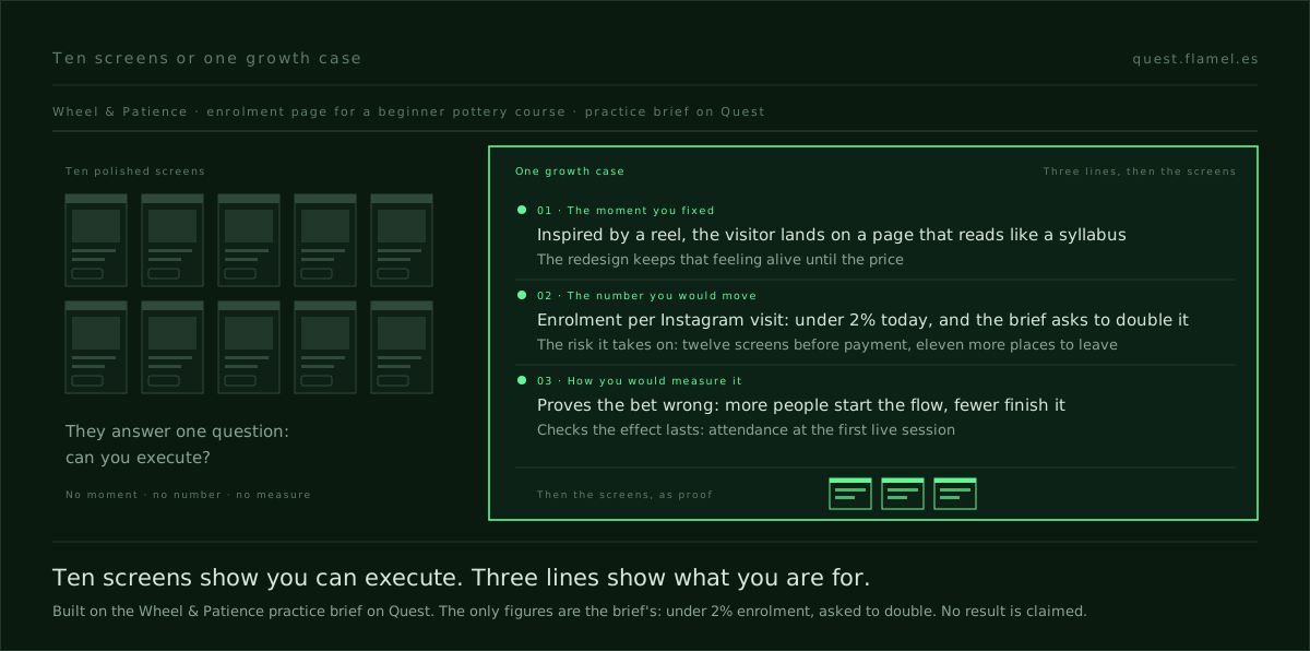
- The moment you fixed. A visitor who has just watched a reel and already wants to try lands on a page that reads like a syllabus; the redesign keeps that feeling alive until the price instead of asking a beginner to judge a curriculum.
- The number you would move. Enrolments per visit from Instagram, under 2% today, which the brief asks to double; and next to it the risk the redesign takes on, because twelve screens before payment are eleven more places to leave.
- How you would measure it. Run the flow against the current page over the same weeks, read enrolment per Instagram visit and the exit rate screen by screen, and write down in advance the result that proves the bet wrong: more people start the flow, but fewer finish it than enrolled on the old page.
The third line is the one reviewers remember, because it shows you know what failure looks like before you see it. It also keeps you honest about the brief's own warning: this visitor has bought online courses they never finished, so enrolment alone can flatter the design. Attendance at the first live session is the number that says whether a commitment made on screen outlasts the checkout.
Put the number before the screens
Where the three lines go matters as much as what they say. Open the case with the cost of the status quo in concrete units: of every hundred people who arrive from a reel already wanting to try, fewer than two enrol. A reviewer who reads that sentence reaches the conclusion on their own, that the page is losing people who were already convinced, before you argue anything.
That is the mechanism of insight turned on your own reader: a conclusion someone reaches themselves meets no resistance, while the same fact delivered as a claim invites argument. Writing that you are a data-driven designer is a claim. A baseline, a bet and the result that would prove you wrong let the reviewer discover it, which is also why they remember the case.
The screens come after, each captioned with the decision it carries. The UX case study template written from the brief has the full order; in a growth case, its third field, the number, and its eighth, the result that would prove the bet wrong, do most of the work. Ten screens with no number above them read as taste. Three under a baseline read as judgement.
Build one growth case this month
Pick one practice brief that comes with a number and a person, and do the redesign inside its time box. Before you choose a single screen for the portfolio, write the three lines: the moment you fixed, the number you would move with its baseline, and the result that would prove you wrong. If you cannot write them, the redesign is not a growth case yet, however good it looks.
Then put that case first, ahead of the polished ones, and let the gallery prove what the case claims. In a growth design portfolio it is the case that gets you the interview. To start today, open the sample brief: read the problem and the objective, write the three lines for its mobile email capture before you open your design tool, and only then start beating the starting design.
You are a hiring manager for growth and product design roles, reviewing one case from my portfolio. My redesign: [describe the brief, the person, the moment they arrive and what you changed]. The number the brief gave: [the metric and its baseline, or "none"]. Do not invent results and do not comment on visuals.
1) Write the moment I fixed in one sentence: who arrives, in what state, and what the old version did to them.
2) Write the number I would move, with its baseline, and the risk my redesign adds.
3) Write how I would measure it, including the result that would prove the bet wrong and one number that checks whether the effect lasts past the conversion.
4) Write the opening sentence of the case as the cost of the status quo in concrete units.
5) Tell me which of my screens prove those lines and which I should cut.
Frequently asked questions
How many projects should a product design portfolio have?
Fewer than most designers think. Three or four cases built around a decision read better than ten projects of screens. Put the strongest growth case first, with the moment, the number and the measure in its opening lines, and keep the rest short. A reviewer convinced by the first case reads the others to confirm it, not to find it.
Can I put a practice project or a redesign in my portfolio?
Yes, if you present it as what it is. Name the brief and the starting design you had to beat, state the number the brief gave with its baseline, and replace the result with a measurement plan: what you would read, over what period, and which result would prove the bet wrong. What reviewers reject is a practice project dressed up with an invented outcome.
How do I show growth impact without real data?
Use the baseline the brief or the client gave you and stop there. State the number you would move, the risk your design adds and how you would measure both, then write the result that would prove you wrong. If there was no baseline, say so and name what you would count. A practice brief with a number in its objective is the easiest place to rehearse it.
Should a growth designer's portfolio look different from a product designer's?
The format is the same; the emphasis is not. A growth designer is hired to move a number, so at least one case has to open with a metric, its baseline and the moment it measures, and show how the work would be read. A product designer can lead with a decision about the person; a growth designer leads with the decision and the number together.