Search for UX case study examples and you get a gallery of beautiful slide decks: a mood board, a persona, a user journey, three screens in a phone mockup, a pastel gradient. They look like case studies. Most of them are portfolios of visual output pretending to be records of thinking.
That distinction matters because of who reads them. A hiring designer scanning twenty portfolios in an afternoon is not evaluating whether you can produce a clean screen — the tools make that cheap now, and every candidate has it. They are trying to answer one question: what happens in this person's head when the problem is ambiguous? A case study is the only artefact in your portfolio that can answer it, and the standard template is designed to hide it. It is the same question the room asks out loud later, which is what interviewers are actually testing once the slides come down. It is also why this matters more in 2026 than it did five years ago.
Why most case study examples mislead
The dominant format — Problem, Research, Personas, Wireframes, Final Design — spread because it is easy to fill in. It has three failure modes, and once you see them you cannot unsee them in other people's work.
It presents the outcome as inevitable. The design appears fully formed after the research section, as if the personas produced it. No alternative is shown, no rejected direction, no fork in the road. But the interesting content of any design decision is the option you did not take and why.
It substitutes process for judgement. Pages of affinity mapping and journey diagrams demonstrate that you know the rituals. They do not demonstrate that the rituals changed your mind about anything. If your research section could be deleted without altering the final design, it was decoration.
It ends at the handoff. The last slide is a hero shot. Whether the thing worked, whether anyone used it, what broke — absent. That absence reads as either the work never shipped, or it shipped and you did not look.
What strong case studies actually show
Across case studies that survive scrutiny, five things keep appearing.
The real constraint, stated early
Every real project is shaped by something inconvenient: a two-week deadline, a legacy checkout nobody was allowed to touch, a founder with a strong opinion about the colour green, a business model that required an upsell you did not believe in. Naming the constraint is the fastest credibility signal available to you, because constraints are what separates professional work from a personal project. A case study with no constraints describes a fantasy. The same holds when the work is under NDA: the agreement is a constraint like any other, and naming what it took out of the case reads as more honest than a gallery of screens you had to invent.
The decision, with the alternative you rejected
This is the single highest-value section and the one most often missing. Show two directions you seriously considered, then say which you chose and what made you choose it. The reasoning is what a reader can transfer to their own work — a screenshot is not transferable.
Be specific about the trade-off. Not "we chose option B because it was cleaner", but "option A converted better in the tests we could run, but it required a data field we could not collect at that point in the flow, so we took the slower option and planned to revisit it".
The mechanism, not just the aesthetic
Strong case studies explain why a decision should work on a human being, not just that it looks resolved. If you moved social proof from the footer to the point of decision, say that proof works hardest under uncertainty and that the footer is where uncertainty has already been resolved or abandoned. If you cut a pricing page from six plans to three, reference the fact that more options reliably raise interest and lower completion.
This is where most portfolios are thinnest and where the difference between a designer and a decorator is most visible. The behavioural vocabulary for it already exists — the persuasion and behaviour design principles that underpin these decisions are well documented, and using them precisely signals that your choices were reasoned rather than intuited. If you want the behavioural principles behind them set out in one place, start there.
What did not work
Include one thing you got wrong. A direction that tested badly, an assumption that collapsed, a pattern you shipped and then reverted. This is counterintuitive advice that consistently pays: an admission of error is the strongest possible signal that the rest of the account is honest. Case studies without failure read as marketing, and readers discount them accordingly.
The outcome, or an honest account of its absence
If you have numbers, give them with their context: what moved, over what period, measured against what baseline. If the project never shipped, say so plainly — "this was killed in a reorg" costs you nothing and buys you credibility. What damages you is the implication of impact that the reader cannot verify.
A structure that works
You do not need the standard six sections. This shape is shorter, harder to fake, and answers what the reader came for.
- The situation in three sentences. Who the client was, what was broken, what constraint you were operating under.
- The one decision that mattered. Every project has one. Name it, show the alternative, explain the trade-off.
- The mechanism. Why the chosen direction should work on the person using it.
- What you shipped. Now the screens, annotated with the reasoning rather than presented as a gallery.
- What happened. Results, or an honest account of why there are none.
- What you would do differently. Two or three sentences. This section is where senior readers decide how senior you are.
Length is not the variable people think it is. A tightly argued 600-word case study beats a 3,000-word one that never commits to a claim.
Where to find examples worth studying
Read case studies from designers who write about decisions rather than deliverables. Growth.Design publishes teardowns that consistently explain mechanism rather than taste. The Nielsen Norman Group archives are useful for the opposite reason — they are rigorous about evidence and will recalibrate your sense of what a claim requires. And any portfolio where the designer explains a reversal is worth more than ten that do not.
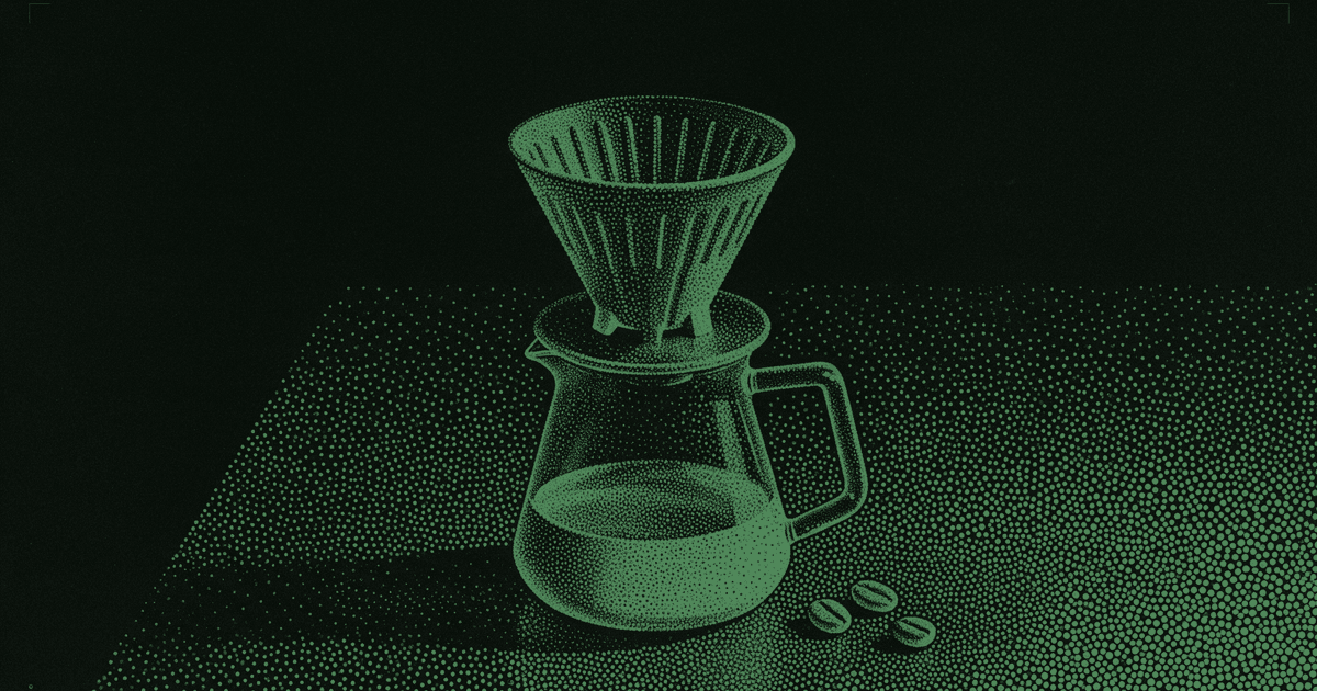
You can also read the case studies published by Quest designers: each one records a real brief, the starting design, the iteration and the behavioural skills applied, which is the structure argued for above. Three to start with: rebuilding a coffee subscription's onboarding around a choice the body already knows how to make, turning a plant shop's signup form into a companion, and an enrolment page that makes a beginner feel like a potter before they pay.
The harder problem: having something to write about
Most people struggling to write a case study do not have a writing problem. They have a material problem — the work they did was execution against someone else's decision, so there is no decision to narrate.
The fix is to put yourself in situations where you have to decide under constraint, repeatedly. That means practising on briefs that have a real client context, a real business objective and a real limitation, rather than redesigning Spotify for the ninth time. A redesign with no brief has no constraint, which is precisely why it produces nothing to write about.
If you want to see what that looks like, here is a complete brief — brand context, UVP, the problem, the objective, the customer and the targeted behavioural skills — the format used in a timed 60-minute session. Working through one produces exactly the raw material the structure above needs: a constraint, a fork, a decision, and something you would do differently.
Do that twenty times and the case study writes itself, because you will finally have something to say.
And once you have something to say, the next problem is credit. When every portfolio looks finished, the reader still has to believe the choices were yours rather than the tool's, which is a separate craft with its own moves: proving the judgement was yours.