Key takeaways
- Start a case study from the brief, not the screens: anyone can produce a competent screen now, and only you can write the brief.
- The first four fields are the brand, the person and their moment, the number, and what you left out. None of them needs a screen.
- Write the bet as a behavioural mechanism, then show the one decision that mattered and the alternative you rejected.
- Screens come seventh, each captioned with the decision it carries. If nothing shipped, say what would prove the bet wrong.
- This week, fill fields one to four for one project before you open the design file.
A UX case study template should start where the work started: the brief. Write down the brand and what it sells, the person you designed for and the moment they arrive, the number the work had to move and what you decided not to do. Then add screens, and only the ones that prove a decision. Anyone can produce the screens now; the brief is the part only you can write.
Below is the template field by field, why the order matters to the reader, and the template filled in on a practice brief whose client has a case study problem of its own.
The template, field by field
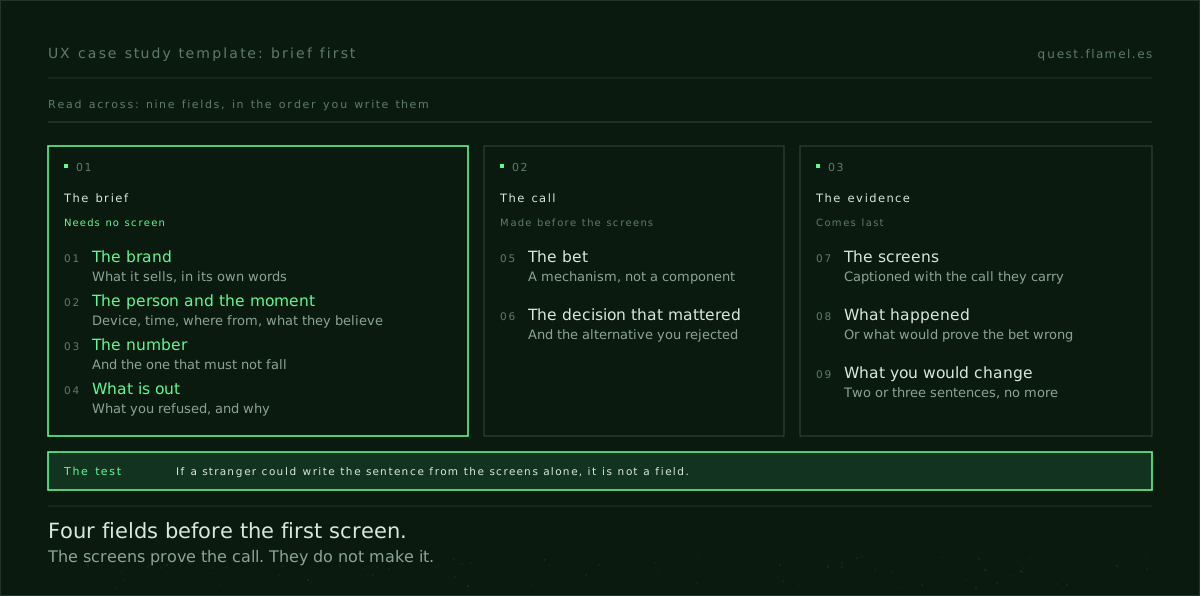
Nine fields, in this order. The first four come from the brief and none of them needs a screen. If you cannot fill them without opening your design file, the case study is not ready to be written.
- The brand. One sentence a stranger can follow: who the client is, what they sell and what makes them different, in their words.
- The person and the moment. Who arrives, on what device, at what time, from where, and what they already believe when they land. Specific enough to be wrong about.
- The number. What the work had to change, the baseline if there was one, and the number that must not fall while it moves. If the brief gave no baseline, say so and say what you would count.
- What is out. The tactics and messages you refused, including ones that would have moved the number. Reviewers remember this field.
- The bet. The behavioural mechanism you expected to move the number for this person at this moment. Name the mechanism, not the component: a carousel is not a bet.
- The decision that mattered. One call, the alternative you rejected and the trade-off you accepted. If no decision was at stake, there is no case study yet.
- The screens, as evidence. Only the ones that show fields five and six, each captioned with the decision it carries.
- What happened. The result against the baseline or, if the work never shipped, what you would measure and which result would prove the bet wrong.
- What you would change. Two or three sentences on what you would test next. It shows you kept thinking after the handoff.
The structure in UX case study examples covers what a strong case study shows once it exists. This template is the step before it: the fields you fill so that there is something worth showing.
Why the brief goes before the screens
The reader of a case study is usually a designer working through a stack of portfolios. A finished screen tells them little now, because a model produces a competent one for anyone. What they are looking for is the call behind the screen: who you decided it was for, what you refused to do and why. A screens-first template hides exactly that.
Screens-first templates also fail in a predictable way. The study opens on screens instead of a decision, the rationale is about how the page looks rather than what it does to the person, and the claims come without a baseline. Those are three of the red flags reviewers notice in the first minute, and they fade when the brief is written first, because it makes you state a bet before you show its result.
If your recent work came without a written brief, practise on one that has every field. The sample brief on Quest carries the brand, the person and their moment, a number with a baseline and the skills the work is scored on. Try fields one to four on it before you read the example below.

Worked example: the Praxis Atelier brief
Praxis Atelier is one of the practice briefs on Quest. It is a seven-person architecture firm in Porto, twelve years in practice, working on houses and small cultural projects. Its case study page for a finished house reads like a real estate brochure: good photographs that say nothing about how the firm thinks. The task is to rebuild that page so a visitor feels walked through the project by the architect.
The starting design is the version a model drafts in a minute: a photo grid, a sidebar of specs with square metres, year, location and client, a description, more photos and a contact form. Nothing in it is wrong. Here are the first four fields, filled in from the brief.
- The brand. A small firm that delivers every project with its reasoning visible: an essay by the lead architect, and drawings and models published next to the finished photographs.
- The person and the moment. Someone aged 40 to 60 commissioning their first serious house, with a high budget and little patience for jargon. They arrive from Pinterest, Are.na or a referral, on a desktop in the evening, comparing three or four firms, and they will share the page with a partner before getting in touch.
- The number. Requests to book a discovery call from the page, not generic contact messages. The brief gives no baseline, so the honest field names what will be counted and leaves the figure empty.
- What is out. The specs sidebar as the first thing read, the generic contact form, and the words the firm never uses about itself: iconic, bespoke.
Field five follows from the first four. A visitor comparing firms cannot judge a building from photographs alone, so the bet is authority: competence shown through detail that only the people who did the work would know, not claimed in adjectives. The brief asks for a three-act story across the photos and the firm's principles stated outright.
One defensible decision is the order of the page. The alternative, photos first and the essay below, keeps the brochure and leaves the thinking for the few who scroll. The chosen version opens with the problem the house had to solve and runs the photographs in three acts, with a drawing beside each one it explains, and ends on the discovery call instead of a form.
Field eight is where a practice brief keeps you honest. Nothing shipped, so the case study states what would be measured, discovery-call requests per visit against the current page, and which result would prove the bet wrong: people reading further and booking no more calls.
Why this order reads as authority
The brief-first order works on a reviewer for the same reason it works on Praxis Atelier's visitor. Authority, as the authority skill on Quest puts it, has to be shown, not claimed, and what shows it is specific detail that only someone who did the work would know. A screen is no longer that detail. What you decided to leave out, and why, is.
That is also why a filled-in field four is worth more than the template. A template is easy to copy. When a reviewer reads that you replaced the contact form with a discovery call because this visitor wants to feel matched by an architect's thinking and does not want a sales pitch, they learn how you work in one sentence. That sentence is how you prove the judgement was yours when every portfolio looks polished.
Where AI fits in the template
A model helps with what can be judged on the page alone: tightening captions, proposing orderings of the screens, turning rough notes into clean sentences. It cannot fill fields one to four, because they record decisions it was not there for. Ask it to and it will invent a plausible audience and a plausible number, and a reviewer who asks one follow-up question will find the gap.
Fill in the template this week
Take one project from the last six months and write fields one to four without opening the design file. If you cannot, you have found the gap, and it is not a writing gap: either you need the brief, or you say plainly that you worked to someone else's. If you can, write fields five and six next, and only then choose the screens.
If none of your projects has a brief worth writing up, start with one that does. The sample brief shows the full format of a Quest session: a new brief, a starting design to beat and sixty minutes on the clock. That is the material a case study needs, a decision made under a constraint and a written record of why.
You are helping me write a UX case study from the brief, not from the screens. Interview me one field at a time, in this order: 1) the brand and what it sells, 2) the person, their device, time of day, where they arrive from and what they already believe, 3) the number the work had to move, its baseline and the number that must not fall, 4) what I decided to leave out and why, 5) the behavioural mechanism I bet on, 6) the one decision that mattered and the alternative I rejected, 7) the screens that prove fields 5 and 6, 8) what happened, or which result would prove the bet wrong, 9) what I would change. Rules: never invent an audience, a number or a result; if I do not know, write "not known" and ask what I would count instead. After field 9, list every sentence in my answers that a stranger could have written by looking only at the screens, and ask me to replace each one with a decision.
Frequently asked questions
What should a UX case study template include?
Nine fields in this order: the brand, the person and their moment, the number, what is out, the bet, the decision that mattered, the screens as evidence, what happened and what you would change. The first four come from the brief and need no screen. For what the finished version looks like, see UX case study examples.
What if my project never had a written brief?
Reconstruct the brief you can and say where each field came from. If you executed someone else's decision, say so and describe the call you did make, however small. If there is nothing to reconstruct, practise on a brief that has every field, like the sample brief, and write the case study from that session.
Can I write a case study for a project that never shipped?
Yes, if field eight is honest about it. State what you would measure, against which baseline, and which result would prove the bet wrong. A practice brief makes this explicit: nothing ships, so the case study is judged on the bet and the decision, which is what reviewers were reading for in the first place.
How many screens should a case study show?
Fewer than most portfolios do: one per decision you want the reader to see, each captioned with the call it carries rather than with what the screen is. A gallery that argues taste instead of mechanism is one of the red flags reviewers notice in the first minute; three screens that each prove a decision read as judgement.
Should I use AI to write my case study?
Use it for what can be judged on the page: tightening captions, ordering screens, cleaning up notes. Do not let it fill the brief fields. A model asked for an audience or a result will produce a plausible one, and a reviewer who asks a single follow-up question will see that you never made that call.