
Key takeaways
- A designer does not need a dashboard to win a review: one number per customer moment, and one sentence that defends it.
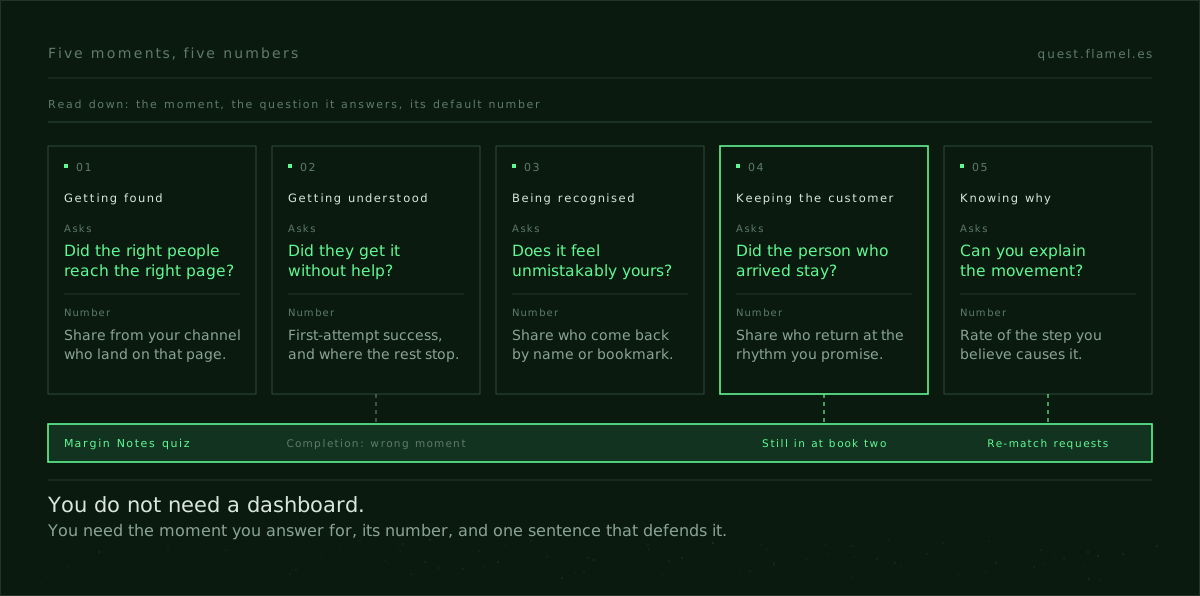
- The five moments are getting found, getting understood, being recognised, keeping the customer and knowing why it worked.
- The sentence has four parts: who the change touches, the number, the timeframe and the mechanism that should move it.
- Measure a subscription quiz by who is still subscribed at the second shipment, not by who finishes it.
- Change the number when you change the moment you answer for, never because the current one looks bad.
The UX metrics a designer can defend are not a dashboard. They are one number per customer moment (getting found, getting understood, being recognised, keeping the customer, knowing why it worked) and one sentence that ties that number to the screen you changed. In a review, the person who brings that number and that sentence is the one the room listens to.
This matters more now that a model drafts the screens. Three layouts and a working prototype are an afternoon's work, so the debate has moved from which version looks right to which version should ship. Taste alone loses that debate to whoever can say what will move and how they will know. You do not need an analytics team for that, only the moment, the number and one line.
What a dashboard gets wrong
A dashboard answers every question at once, which means it answers none of them in the meeting. Forty lines move in different directions, and whoever speaks last picks the one that suits their argument. That is how a design review turns into a debate about taste with charts attached, and why most lists of UX metrics leave designers no better armed than before.
The fix is to decide in advance which number you answer for. A change touches one moment of the customer's journey more than the others. Name that moment and the number that tells you whether it worked, and the dashboard becomes where you check your claim instead of where you go looking for one.
One number per moment
Each moment has a question and a number that answers it. Your product will need its own version of each, but the shape holds.
- Getting found: did the right people reach the right page? The share of visitors from the channel you designed for who land on the page you meant them to, not total traffic.
- Getting understood: did they get it without help? The share who complete the task on their first attempt, and the step where the rest stop.
- Being recognised: does it feel unmistakably yours? The share who come back by name, typing the brand or using a bookmark, instead of searching for the category again.
- Keeping the customer: did the person who arrived stay? The share of people who used the thing and come back at the rhythm the product promises, next week for a habit, next billing cycle for a subscription.
- Knowing why: can you explain the movement? The rate of the specific step you believe causes the outcome, so you can see whether your lever moved before the outcome does.
The last one is the one teams skip, and it is the one that lets the other four compound. Without it a flat result tells you nothing, because you cannot separate a weak idea from a timeframe that was too short. With it, a flat result tells you where to look next.
The sentence that defends the number
A number on its own is still easy to argue with. What makes it hold is the sentence around it, and the sentence has four parts: who, what, by when and why.
For the people this change touches, success is one named number within a timeframe that can show the effect, because of the mechanism you are betting on.
Each part closes a door the room would otherwise open. Naming the population stops the change being judged against everyone since launch, which dilutes any real effect. Naming the timeframe stops the goalposts moving in week two. Naming the mechanism is what makes it design rather than reporting: it says which thing on the screen should cause the number to move, so if the number moves and that thing did not, the credit is not yours.
Write the sentence at the top of the brief before exploration starts, and say it in planning. Someone asking for three more numbers is usually describing three more moments, and those deserve their own sentences.
Worked example: a quiz measured by who stays
Margin Notes is one of the practice briefs on Quest: an independent bookstore in Brooklyn with around 1,200 subscribers, each matched to a monthly book by hand by its booksellers. The quiz that opens the subscription is a list of genre checkboxes, and the brief says the first match often disappoints because the quiz never built trust.

The obvious number is quiz completion. It is easy to observe, moves quickly after a redesign and looks good on a slide. It is also the wrong moment. Everyone can finish a quiz that still sends a first book nobody wanted, and that cost shows up a month later as a cancellation, not on the quiz screen.
The moment this quiz exists for is keeping the reader. So the number is the share of readers who subscribed through the quiz and are still subscribed when the second book ships. The sentence: for readers who subscribe through the quiz, success is second-month continuation, because a quiz that reads them well produces a first pick they would not have chosen and are glad to get.
Measure a quiz by who stays, not by who finishes.
Knowing why needs its own number, and the brief hands you one: subscribers can ask for a re-match without penalty. The share of first books that get a re-match request is the earliest sign that the quiz misread someone, weeks before the renewal. Add one check on the quiz itself: if most answer paths end in the same kind of pick, the quiz is not reading anyone. It is a funnel with questions.
Picking this number changes what you will accept on the screen. One more question is a bad trade against completion and a good one against continuation, if it is the question that tells a reader who wants difficult fiction from one who wants a book they can finish on the train. The brief's ideal reader will spend five minutes on the quiz if it feels worth it, so length is not the risk. A quiz that cannot tell two readers apart is.
What AI changes, and what it does not
A model will draft the quiz, its copy and a results screen in an afternoon, and it will build the dashboard too. What it does not do is decide which moment the quiz is for, commit to a timeframe in front of the team or answer for the number when it comes back flat. That is the design decision now, and it is most of what a growth designer is paid for, as what growth design is sets out in more detail.
It also makes a test cheaper: three sentences for three plausible mechanisms, all three built, is now an afternoon. The work is knowing which sentence you would bet on first. Every one of the 27 mechanisms in the Quest skills library has a section on what to measure for that reason: a mechanism you cannot observe is one you cannot defend.
When to change the number
Change the number when you change the moment you answer for, not when the current one looks bad. A number that refuses to move is telling you something: the mechanism is wrong, the lever is too weak or the timeframe is too short, and the knowing-why number tells you which. Swapping the goalpost throws that away and teaches the team to discount your next sentence.
Retire a number when it stops describing what the moment is for, even if it is easy to improve. Completion climbing while cancellations rise is the usual warning: you are polishing a screen that is not the problem. It is the same discipline as how to defend a design decision: the decision, the trade-off you accepted and the evidence you will bring back.
The skill that answers the threat
The threat is real. A team that brings numbers will win the room over a designer who brings screens, and AI makes the screens cheaper every month. The answer is not a BI tool. It is the habit of naming the moment, the number and the mechanism before you open the file, and the mechanism is where most designers are weakest: it means knowing why a screen should change what someone does.
A good place to train it is the insight skill: the moment a user realises something true about themselves, which is the mechanism behind every honest quiz. Its failure mode, a reveal that repeats what the user just typed, is exactly what a continuation number catches. This week, take one thing you have already shipped, write its sentence, say it in planning and follow the number for two weeks, even if it comes back flat.
You are a growth design lead reviewing my next design change before it goes to planning. Ask me, one at a time, for: [the product and who uses it], [the change I want to ship], [the customer moment it targets: getting found, getting understood, being recognised, keeping the customer or knowing why], [the mechanism I believe will move the outcome], [the people this change actually touches] and [what I can measure today]. Then give me: 1) one sentence in the form "for [population], success is [number] within [timeframe], because [mechanism]"; 2) the exact definition of that number, with numerator, denominator and the events behind them; 3) one knowing-why number that shows whether the lever moved before the outcome does; 4) the three objections the room is most likely to raise, with a one-line answer to each; 5) what would make me change the number, and what would not. Be strict: if my number belongs to a different moment from my change, say so before anything else.
Frequently asked questions
What are UX metrics, in one line?
They are the numbers that tell you whether a design change did what it was meant to do for a person at a specific moment. A designer needs one per moment, not a dashboard: the share who find the right page, finish the task unaided, come back by name, stay, and the step that explains why.
What is the difference between UX metrics and UX KPIs?
A metric is anything you can count. A KPI is the metric someone has agreed to be judged by. In practice the useful move is to turn one metric into your KPI for one change, with a population, a timeframe and a mechanism, so the team knows in advance what success looks like and who answers for it.
How do I pick the right timeframe for a design metric?
Match it to the mechanism. Ask when a person should feel the change and when the outcome should show up: first-attempt success can be read in days, a subscription renewal only after a billing cycle. Pick the shortest window that can show the effect honestly, and keep a knowing-why number for the wait.
Why not just measure quiz or form completion?
Because completion is the easiest number to move and often the wrong moment. A quiz everyone finishes can still send the wrong first product, and the cost shows up later as cancellations. Measure the moment the quiz exists for, usually whether the customer stays, and keep completion as a diagnostic.
When should I change the metric I am answering for?
When you change the moment the work is for, not when the number disappoints. A flat number is information: the mechanism, the lever or the timeframe is wrong. Changing it to one that looks better hides that. The same logic is laid out in how to defend a design decision.