
Key takeaways
- Growth design means answering for a number after launch: you pick the moment that blocks it, choose the lever that unblocks it, and measure the result.
- Start with a metric, a timeframe and a population, then map five moments: being found, being understood, feeling it is for you, coming back, and knowing what worked.
- Choose a mechanism before a motif: trust, load reduction, anticipation, identity or control, placed where the decision happens, with a check and an undo.
- Measure lift and regret together, with a stop-loss written before you ship, so a false win dies fast and pressure never turns into a dark pattern.
- Deciding which moment to fix first, and defending why, is the part of the craft AI does not do for you.
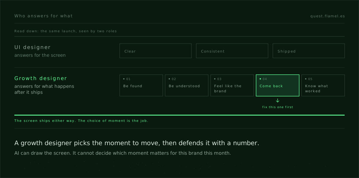
Growth design is designing for the number that moves after launch, and answering for it. A UI designer is judged on the screen; this role is judged on who finds the page, who understands it, who comes back, and how you know. Here it is on a live brief: Cassette Futurism, an indie label that needs emails before it drops a single.
The job: move a number you can name
The first deliverable is a number with a timeframe and a population: "email sign-ups from unique visitors on the single's landing page, this week." That constraint forces choices you can defend: which surface, which audience, which friction to remove first. It also sets an ethical line you can keep: pressure that sits at the action with an undo, not theatre two scrolls up.
The second deliverable is a map of the moments that lead to that number, with a guess at where it breaks. Designers who stop at the surface can only polish; designers who own a moment can argue a trade-off. Not "this is cleaner", but "this fixes comprehension for first-time listeners, the step where the visit ends today".
The third deliverable is a plan to measure lift and regret together. If you chase only sign-ups, any pressure will look like it works. Pair lift with unsubscribes, spam complaints and "not what I signed up for" replies, and false wins die fast.
Where the work starts
UI design asks what the surface should look like. This work asks which job is failing, where, and why now. Your first week is a tour of the path, not of the components: where people come from, what the page says in the first scan, what proof sits next to the ask, what happens after the form. The output is a short, ranked list of moments, each with a diagnosis, a lever and a measure.
You choose the mechanism before the motif: trust, load reduction, anticipation, identity or control. Each one unlocks a different jam. If comprehension fails, you give meaning; if timing fails, you give a sourced, timeboxed reason to act today. The lever goes where attention already is and comes with a check people can read. That discipline is the craft inside the persuasion principles for product designers.
You also decide what not to touch yet: if the page converts the people who stay, the problem is who arrives, not the hero.
One brief, five candidate moments
For Cassette Futurism, the path to "emails before the single" has five places where the first lift could come from. The list is the argument: each item is a different mechanism with a different risk, and choosing between them is the week.
- Be found: the people who already like this kind of music land on the single's page, not on a generic blog post, and the route is named in analytics so you can tell warm visits from curious ones.
- Be understood: a first screen that names the genre, the mood and the date in one scan, with a ten-second preview that plays in place, so a cold ear can place the sound without leaving.
- Feel like the brand: a visual identity and a one-line "for fans of" reference that make "this is for me" legible in a blink, not a scroll.
- Come back: the email is the return ticket, so the page gives a concrete reason to come back on release day (a date, a send time, a named reward) instead of a vague newsletter promise.
- Know what worked: sign-up sources, preview plays and release-day opens are tracked, so captured emails can be tied to real interest and not just to a filled field.
Score each moment on impact, time to ship, risk and reversibility. If preview and proof are missing, they beat brand polish. The first bet is the one with a check you can read on the page and an undo you can name at the button. Deciding which to do first is the core skill: AI can help you produce the screen, not choose the moment.

The case: emails before the single
The week-one plan is a landing page with a playable ten-second loop, a one-line genre frame, a visible release date and an email form with a named reason to sign up. The number is email sign-ups per unique visitor over seven days. The checks are preview plays per visitor, abandonment at the email field, unsubscribes in the first 72 hours, spam flags and opens on release day.
The mechanisms are three. Trust comes from named, dated proof that the release is real, such as a premiere with the station, the date and a link to the clip. Load reduction comes from the in-place loop and a single genre tag. Anticipation comes from a timeboxed reason to act today, such as a download code for the first 500 sign-ups with the running count visible. Each cue is local, sourced and still true if someone screenshots it tomorrow.
Placement does the rest. Proof and preview live in the first screen; the button, the reason to act and the undo sit in the same frame as the form. The lever is not the form styling; it is the point where motive, ability and reversibility meet.
Mechanisms over motifs
Mechanisms beat motifs because they fix causes, not tastes.
Make claims checkable or leave them out. A premiere works when it names the station and the date and links to the clip; "blowing up" does not. A reward for the first 500 works when the count is on the page; "limited-time offer" does not. The same bar runs through psychology in UX design: if a fact cannot be named and checked where it appears, choose clarity instead.
Anticipation is a skill, not a banner. The effect lives in the scope, the date and the placement of the cue. A line that says when the release goes out and when the code arrives, next to the button, does more than "don't miss out" in the hero. The anticipation skill trains exactly that difference.
Measure lift and regret together
Write the hypothesis before you draw: "A ten-second loop, a one-line genre and a timeboxed reward beside the form will raise sign-ups per visitor while unsubscribes stay flat." Then write the stop-loss: if unsubscribes or spam flags rise above their current level, the reward or the copy rolls back; if release-day opens collapse, you attracted the wrong audience and narrow the scope until fit returns.
Owning the number includes owning when to stop.
Growth design is not shipping screens. It is moving a number and defending why.
What a UI-only pass misses
A UI pass can make the landing page beautiful and still move nothing, because it treats every part of the page as equally important. Without a named moment, effort goes to motifs instead of mechanisms: the loop, the genre line, the sourced cue and the undo. Whoever owns the number also thinks about what follows. The confirmation sets up the release-day email, the email sets up the play, and the play sets up the share. A vague capture makes a weak follow-up; a checkable promise makes a welcome one.
How to practise this week
Start with a one-page brief that names the metric, the timeframe, the population and the moment that is failing. Keep the bet small enough to read in a week and reversible enough to roll back cleanly.
- Write the one-line concept and choose a sample that makes the product legible to a stranger in ten seconds.
- Put the form, the sourced cue and the undo in one frame, and move decoration below it.
- Ship two variants that differ in mechanism, not in adjectives: identity against timing.
- Set a stop-loss you will honour and a date to read the result before you change anything else.
Designers asking what survives as AI improves are asking the right career question. The durable edge is not drawing faster; it is choosing levers, defending bets and placing mechanisms where attention already is. Read the skills that appreciate as AI improves for the wider argument. To practise the 27 skills that make those decisions defensible, start with the skills library.
You are a senior growth designer. Build a one-page growth brief for my case. My situation: [describe your product, audience, traffic source, current page, and the moment that is failing]. My number: [name the metric, timeframe and population]. Produce: 1) The failing moment and its diagnosis in one sentence. 2) Candidate levers (trust, load reduction, anticipation, identity, control), the one you choose and why it fits this break. 3) Placement: exactly where proof, preview, call to action, reward and undo sit in one frame. 4) Two copy variants that differ by mechanism, each with button text, a sourced proof line, a timeboxed reward and the undo line. 5) Measurement: lift and regret metrics, including field abandonment, unsubscribes in 72 hours, spam flags and one downstream outcome. 6) The hypothesis, a stop-loss and a rollback plan. 7) Scope, time to ship, risk and reversibility. Constraints: every claim must be checkable where it appears, every reward timeboxed and named, and every check placed beside the action.
Frequently asked questions
What does a growth designer do that a UI designer doesn't?
A UI designer answers for the screen. A growth designer answers for a number after launch: you name the metric, map the moments that block it, choose a mechanism that fits the break, place proof and undo at the action, and measure lift with regret. For the craft behind mechanisms, see persuasion principles for product designers.
What is a "mechanism" in growth design?
A mechanism is the cause you work on at a failing moment: trust, load reduction, anticipation, identity or control. It is not a style. It fits a diagnosis, sits where attention already is, and comes with a check people can read. For the psychology behind it, see psychology in UX design.
When should I use urgency or rewards on a page?
When the urgency is specific, sourced and timeboxed, and still true in a screenshot tomorrow. Name the cap, the date and the send time, and put them at the button with the undo. If you cannot verify it where it appears, do not ship it. The anticipation skill trains this.
How do I set a stop-loss for a growth experiment?
Tie it to regret, not just to lift. Set limits for unsubscribes in the first 72 hours, spam flags and "not what I signed up for" replies, plus one downstream quality signal such as release-day opens. If any goes past its limit, roll back the change. Write it down before you ship.
How do I pick the first bet?
Score the candidate moments on impact, time to ship, risk and reversibility. Prefer a lever with a check you can read on the page and an undo you can name at the button. Fix comprehension and timing before brand polish when preview or proof are missing. For the skills that keep their value, see skills that appreciate as AI improves.