

Key takeaways
- Vibe coding means describing a page to a model and accepting the code it writes; for designers, it puts working behaviour in front of real people weeks earlier.
- Let the tool be conventional in interaction grammar: familiar forms, navigation and errors cost users nothing to learn.
- What it hides is structure and words: the order of the page, what looks equal and what the main button says.
- A running page makes its defaults look like decisions, which is why they survive review.
- Before prompting, write the structure, the words and the one convention you are breaking on purpose, then judge the build against those lines.
Vibe coding for designers means building a working prototype by describing it to a model and accepting the code it writes, usually without reading it. It is the fastest way yet to put real behaviour in front of real people. It also hides something: the tool quietly decides the structure of the page and the words on it, and a page that works looks decided.
The term is young. Andrej Karpathy coined it in February 2025 for a way of working where you "fully give in to the vibes, embrace exponentials, and forget that the code even exists", and by the end of the year Collins had made it its word of the year. For a designer, the interesting part is not the code you forget. It is the decisions you forget you never made.
This post splits the practice in two: where vibe coding earns its place in a product designer's week, and where it takes over the part of the work that makes you worth hiring. The split follows the rule behind the product designer's AI workflow: if the quality of a piece of work can be judged from the artefact alone, it can be delegated; if judging it needs the reason the work was asked for, it cannot.
What a working prototype gives you that a file does not
A file describes an interface; a running page behaves like one. It loads, it waits, it fails, it shows a surname twice as long as the one in the mock-up. Until recently, getting that behaviour meant a handoff and a sprint, which is why most design decisions met their first real user after they had shipped. Vibe coding moves that meeting forward by weeks.
That is its real value, and it is narrower than the demos suggest. A handful of people from the right audience clicking through something that works will usually tell you more in an hour than a week of reviewing a static file: where they hesitate, what they skip, which word they read twice. It is the same reason the design engineer role is growing: the shortest route between a decision and its evidence now runs through code, and a model does most of the typing.
Where it helps: convention you do not have to build
The first thing to notice about vibe-coded interfaces is how conventional they are. Ask for a sign-up flow and you get the sign-up flow: an email field, password rules, an error in red under the field, a button at the bottom. The model produces the most probable version of whatever you describe, and the most probable version of an interaction is the one people have already used a thousand times.
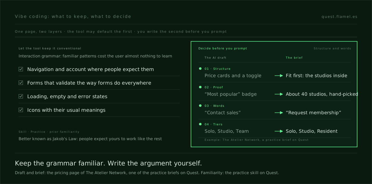
At the interaction layer, that is a gift. Familiarity is borrowed ability: a pattern the user already knows costs almost nothing to operate, because the learning was paid for elsewhere. Quest trains it as practice, the ability lever of prior familiarity in Fogg's model, better known in interface work as Jakob's Law: people spend most of their time on other sites, so they expect yours to work the same way.
So let the tool be conventional there. Standard placement for navigation and account, forms that validate the way forms do everywhere, icons with their usual meanings, each platform's own conventions respected. You would spend hours drawing those states by hand and gain nothing. This is the half of vibe coding that is pure saving, and it is most of the code.
Where it hides the decision: structure and words
The trouble starts one level up. The same pull towards the most probable answer also decides what the page is: which blocks appear and in what order, how many options are shown and whether they look equal, what the headline promises and what the button says. Those are not interaction grammar. They are the argument the page makes to one particular person, and the most probable argument belongs to nobody.
A static mock-up made the same mistake visible. You could see the generic hero and argue with it before anyone built it. A vibe-coded page arrives running, responsive and with its states filled in, and finished-looking things are hard to argue with. The structure looks chosen because it works. That is the hiding: not that the tool decides badly, but that its defaults stop looking like defaults.
It is the split that AI prototyping already runs into, made sharper by code. There, the decisions a model fills in silently are who the screen is for, which moment it fixes and what gets left out. Vibe coding adds one more: the moment you accept the code without reading it, you also accept the page's structure without having designed it.
A worked example: a pricing page that should not look like one
Take The Atelier Network, one of the practice briefs on Quest. It runs two locations, in Madrid and Lisbon, home to about 40 hand-picked creative studios, and membership is application-only. Founders arrive after a current member refers them, usually on desktop. The brief's problem is that the pricing page reads like a real estate listing: half the visitors close the tab, and the rest book a tour but underprice the offer before they arrive.
Now the draft a model produces when asked for that page, which is the starting point the brief hands you: three equally sized pricing cards named Solo, Studio and Team, bulleted features, a monthly and annual toggle, a "Most popular" badge on the middle card and a "Contact sales" button. Vibe-code it and it runs on the first try. Every element is a convention, and every element contradicts the brief.
- The structure makes price the headline. Equal cards and a billing toggle invite comparison shopping. The brand's own line is that the price is not the headline; fit is.
- The badge borrows the wrong proof. "Most popular" says many people chose this. A capped membership of about 40 studios needs to say who was chosen.
- The words sell instead of qualify. "Contact sales" is a purchase. The brief wants "request membership" to feel more desirable than booking a tour.
- A name changed on the way. The brief calls the third tier Resident, an access level. The draft calls it Team, a headcount.
None of this is a bug a code review would find. It is convention working as designed, and the practice skill names the exception itself: deviating is justified when the convention encodes a business model you are rejecting. A pricing grid encodes a shop. The Atelier Network is selling admission, and the decision the page turns on is exactly the one the tool made without being asked.
How to vibe code without handing over the decision
The fix is order, not abstinence. Before you open the tool, write down the decisions the code will otherwise make for you, in words a stranger could check against the result. For most pages, three lines are enough:
- Structure: what the visitor sees first, what comes second and what is deliberately absent. For the Atelier page: the studios already inside, before any price, and no toggle.
- Words: the headline's promise and the label on the main button, written out in full. "Request membership", not a placeholder you will fix later.
- Convention: which patterns stay standard and which one you break on purpose, with the reason. The application form behaves like every form; the tiers do not look like a price grid.
Then prompt with those lines pasted in, let the model build everything else, and read the result against them rather than against how polished it looks. When a default sneaks back in, and it will, you will see it, because you wrote down what should be there instead.
Finally, put it in front of people, since that is what the speed was for. The practice skill names the measure for the conventional half: time to the first successful action, and hesitation on first use. For the Atelier page, add one question of your own after each session: what did they think a membership costs, and what did they think it was for? If the second answer is "a desk", the structure is still the draft's.
What to practise this week
Pick a page you have designed recently and vibe-code it twice. The first time, describe it in one sentence and accept what comes back. The second time, write the structure, the words and the conventions first, and paste them in. Put the two versions side by side and list every difference. Each one is a decision the first version made for you, and most will be about structure and words, not code.
That list is the skill. Knowing which defaults to keep is knowing where familiarity helps the user; knowing which to override is knowing what the page is for. Each structural choice maps to a mechanism you can name, from the scarcity of a capped membership to the social proof of the studios already inside, and the skills library lays them out one at a time, with how each one fails and what to measure.
You are a senior product designer reviewing a page I built by vibe coding, before I test it with users. The page is for [who it is for, where they arrive from and on which device]. Its job is [the one thing the visitor should do or believe]. Before building, I wrote three lines: structure [what comes first, what comes second and what is deliberately absent], words [the headline and the main button label, in full], conventions [what stays standard and what I break on purpose, with the reason]. Here is the code or a description of the result: [paste it]. Do three things. 1) List every place where the page's structure or words differ from my three lines, and name the default the tool chose instead. 2) List every interaction pattern that is non-standard and say whether it was one of my deliberate breaks. 3) Propose two questions to ask each test participant that would show whether the structure is doing its job. Do not rewrite the page.
Frequently asked questions
What is vibe coding?
Vibe coding is building software by describing what you want to a large language model and accepting the code it generates, often without reading it, then steering with follow-up prompts. Andrej Karpathy coined the term in February 2025, and Collins named it its word of the year for 2025. For designers, it is mainly a fast route to a working prototype.
Should designers learn vibe coding?
Yes, as a way to test decisions rather than as a new job. A working prototype shows behaviour a static file cannot, such as loading, errors and real content, and puts it in front of users weeks earlier. The skill worth building alongside it is deciding the page's structure and words before you prompt, so the tool builds your decision instead of its default.
What does vibe coding get wrong in design?
Rarely the interaction details: forms, navigation and validation come out conventional, which helps users. The risk sits one level up. The model picks the most probable structure and copy for the page, such as equal pricing cards or a "Contact sales" button, and because the result runs, those defaults look like decisions and survive review.
Is vibe coding the same as being a design engineer?
No. Vibe coding is a technique: describing what you want and accepting code you have not read. A design engineer is a role: a designer who works in code and reads it well enough to judge what a model wrote, so that what reaches users is the decision as it was meant. Vibe coding is often how designers start moving towards that role.
When should a designer break convention in a vibe-coded prototype?
Only on purpose, and mostly in structure rather than interaction. Keep forms, navigation and icons standard, because familiar patterns cost users almost nothing to learn. Break convention where it encodes a business model you are rejecting, such as a price grid on a page meant to qualify applicants, and write the reason down before you prompt.