

Key takeaways
- A critique for growth work judges the screen against its brief: the moment it was meant to fix, the number it should move and the mechanism it bets on.
- Without the brief in the room, critique drifts to taste, because the screen is the only thing anyone can see.
- Ask the three questions before anyone comments on the visuals; if the presenter cannot answer one, that is the first finding.
- Every note points at a screen element and says what the user would do differently; notes about taste wait for the end.
- Quest scores each targeted skill from 0 to 5 against the brief, and an answer that would fit any brand stops at 2.
A design critique for growth work judges a screen against the brief it was made for, not against the critic's eye. Three questions do the work: which moment the screen was meant to fix, which number it was meant to move, and which mechanism it bets on to move it. Comments on the visuals come after those answers, and many of them stop mattering.
Most advice on running critiques is about the room: keep it safe, separate the work from the person. That advice is right, and it leaves the hard part untouched. A kind, well-run session can spend an hour on a screen and never ask whether it does the job it was briefed to do.
For a growth designer, that question is the point: the screen exists to change what someone does. It is also the mirror image of defending a design decision: the questions a good critic asks are the ones the designer should be able to answer before the meeting starts.
A screen everyone in the room would praise
Take Available Light, one of the practice briefs on Quest. It is a two-person photography studio, nine years old, that shoots interiors, food and portraits for brands and has never owned a flash head. The page is its portfolio and commission page, and its job is to turn an art director browsing on a phone between meetings into a booking enquiry.
The starting draft, the generic version the brief hands you to beat, is a full-bleed masonry grid of images, a burger menu, an About page with a black-and-white portrait and a contact form asking for name, email and message. Put it up in a critique and listen. The images breathe. The grid is clean. Maybe tighten the gutters.
None of those comments is wrong, and none of them would change a single enquiry. They are reactions to the only thing in the room, the screen. The brief and the buyer are absent, so the conversation settles on the part everyone can have an opinion about at once: how it looks.
Why critique drifts into taste
Taste is not the enemy. It is how a designer generates options worth testing, and a good eye catches what a checklist misses. The trouble is that taste has no stopping rule: two people who disagree about the gutters can argue until the meeting ends, because nothing on the table can settle it.
A brief is the stopping rule. It says who the screen is for, what they are about to do and what the business needs from them. Once that is in the room, most visual disagreements resolve or stop mattering. It is the same reason that critiquing an AI-generated screen starts from the decision it fails to make, not from its polish.
Three questions that tie a critique to the brief
Ask these before anyone comments on the visuals, in this order, because each answer narrows the next. If the presenter cannot answer one, that is the first finding of the session, and it is worth more than any note about the layout.
- Which moment was this screen meant to fix? Name the person, where they are, what they did just before and what they are about to decide.
- Which number was it meant to move? One number tied to that moment, and what you would watch after launch to know it moved. If one number per moment feels too narrow, the screen is probably trying to fix two moments.
- Which mechanism does it bet on, and where is it? The reason the user would act differently, and the element on the screen that carries it. A mechanism you cannot point at is a hope.
Only then look at the visuals, and judge each choice by whether it helps or hurts one of those answers. The gutters may still matter. The difference is that the note now arrives with a reason the room can check, which is what a stopping rule means in practice.
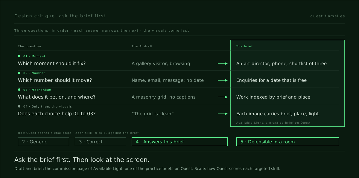
The three questions on the Available Light page
The moment. The buyer is an art director at an agency or an in-house brand team, on a phone between meetings, with three studios open. They shortlist in under two minutes, rarely come back, and screenshot two images into Slack for a second opinion. The draft treats them as a gallery visitor.
The number. The objective is to turn a two-minute phone browse into an enquiry, qualified before it lands by showing availability. The brief gives no baseline, so the number is a definition, not a target: the share of phone visits that end in an enquiry for a date the studio has free. A form with name, email and message knows nothing about dates.
The mechanism. Here the draft fails in a way no visual note would catch. In the brief's own words, the buyer can see the work is good but cannot tell whether the studio can deliver their brief, on their date, in their city. The brief hands over two answers: index the work by brief and location, and publish availability by month instead of a contact form.
A third answer is easier to miss. The brief wants the no-flash constraint to read as a signature, not a limitation, and notes that the two-person crew is what most clients discover is the real saving. That is a moment of insight: the buyer realises the constraint they took for a weakness is why the day is shorter and the crew smaller. The draft never says it.
The insight skill names the signal to watch: the share of people who share or screenshot the result. This buyer already screenshots. So the note that matters most is not about the grid: when two images land in Slack, does each carry its brief, its place and its light, or does the second opinion start again from taste?
You can try the three questions right now, without an account. The sample brief on Quest writes out the moment, the buyer and the targeted skills, and has a number to move: email capture from about 3% to 10% or more on mobile.
How Quest scores a challenge against its brief
Quest scores its own challenges with the same logic. A session ends with the designer submitting their screens and writing how they applied each targeted skill. Each skill is scored from 0 to 5 against the brief, with a written reason, and the look of the screen is not on the scale. The upper four levels:
- 2: attempted, but generic. It would read the same on any other brand.
- 3: present and correct, but not specific to this client's problem.
- 4: applied with intent. It answers this brief, and the choice is legible.
- 5: applied with judgement. It changes what the user would do, and the designer could argue it in a room.
Most visual critique stops at 3 without noticing. A grid that shows good work is correct; it is not specific to an art director with a shortlist of three. The jump to 4 comes when the screen answers the brief, and to 5 when the designer can say what the buyer will do differently.
Two rules from the scoring are worth stealing. The designer's explanation is a claim, not evidence: it is checked against the screens, and what is not visible does not count. And every reason points at something concrete, by screen number, because a critique the designer cannot locate is a critique they cannot act on.
How to run a design critique against the brief
Before the session, the presenter writes the three answers at the top of the file, one line each. If they cannot, the session becomes a working session on the brief, which is more useful than an hour on a screen with no stated purpose.
During the session, critics comment against those lines. Each note names a screen, an element and what the user would do differently because of it. Notes about taste go on a list for the last ten minutes, and by then most of them have been answered or dropped.
After the session, every accepted note becomes a change with the number from question two attached, so the next critique of the same screen starts from what moved, not from what people remember liking. That turns critique from a ritual into the feedback loop growth work runs on.
What to practise this week
Take a screen you are about to present, or the sample brief, and write the three answers before you look at the design again. Then critique it in writing against those lines only, one note per element, each with the behaviour it would change, and grade each note with the scale above.
Expect most of your first notes to land at 3. That is the useful discovery: it is far easier to see what is correct than what answers this brief. Training the second is the work, whether the screen came from a colleague or from a model.
You are a senior product designer running a critique of my screen against its brief, not against your taste. The screen is [what it is and where it sits in the product]. The brief: the user is [who they are, where they are and what they are about to decide]; the number the screen should move is [one metric, and what I would watch after launch]; the mechanism I am betting on is [the behavioural reason the user would act differently, and the element that carries it]. Here are the screens: [paste or describe them, numbered]. Do four things. 1) Tell me which of my three answers the screens do not support, pointing at a screen by number. 2) Grade each mechanism from 0 to 5: 2 if it would read the same on any brand, 4 if it answers this brief and the choice is legible. 3) Give me up to five notes, each naming an element and what the user would do differently. 4) List any notes about taste separately, at the end. Do not redesign the screen.
Frequently asked questions
How do I run a design critique for growth work?
Ask three questions before anyone comments on the visuals: which moment the screen was meant to fix, which number it was meant to move, and which mechanism it bets on. Write the answers at the top of the file before the session. Critics then comment against those lines, each note naming an element and the behaviour it would change, and notes about taste wait for the end.
What should design critique feedback include?
A useful note names a screen and an element, says what the user would do differently because of it, and ties that to the moment or the number the brief cares about. "The grid feels clean" is a reaction. "An art director cannot find a food shoot in their city in under two minutes" is a note the designer can act on and check later.
How do I know if my critique worked?
Every accepted note should leave the session as a change with a number attached, the one the screen was meant to move. If the next critique of the same screen can start from what moved rather than from what people remember liking, the critique worked. If notes cannot be turned into a change with a number, they were taste.
What is the difference between a design critique and a design review?
In common use, a critique is a working session to improve a design while it can still change, and a review is a checkpoint that approves or rejects it. Both get better with the brief in the room. A critique that judges the screen against its moment, number and mechanism also leaves the designer ready for the review, because they already know how to defend the decision.