Key takeaways
- AI can render patterns, but only you can choose a premise and mechanism that fit this person and moment.
- Design for causal truth: state a checkable claim, place the trigger at ability, and keep a visible, honoured undo in the same frame.
- Social proof and authority only work when sourced, timeboxed, and relevant; when pressure is real, choose clarity that adds a verifiable fact over manufactured urgency.
- Measure lift with regret in the same window: pre-commit the bad event to hold flat and a stop-loss that kills a variant even if conversion rises.
- Ship two variants: your disclosed mechanism with check and undo, and a no-nudge clarity baseline; keep the one that lifts while the bad event stays flat.
AI can redraw any component you describe, but it still stumbles when the job is choosing which component to use and why. That gap is where psychology in UX design lives: a model can mirror the visual pattern of social proof without knowing when social proof is the wrong lever, or when the right move is clarity over pressure.
Choosing the mechanism means understanding a specific person in a specific moment, naming the claim that would move them, and defending it. That part is human, and it is the moat you can train. The pixels can look right while the premise is wrong — the most expensive kind of polish.
Where execution ends and judgment begins
Patterns are not strategy; they are delivery mechanisms for a premise. The premise is the claim you ask a user to act on, and the decision is whether it is true for the person and moment in front of you. “Twenty teams upgraded this week” might clarify a plan picker and turn to noise on a destructive dialog. The work is deciding whether a mechanism adds missing information or hides a blind spot.
A generator can place a testimonial, a badge and a default with immaculate spacing; none of that tells you whether trust would be better built by a price lock, a trial that names its renewal, or a quota that resets on the hour. The choice is causal, not stylistic, and you reach it by tracing how the moment, the claim and the undo fit. That is what psychology in UX design buys you, and it is not prompt engineering.
AI can render a pattern; only you can choose a premise.

If you cannot explain what the mechanism changes in the user’s mental model or effort curve, you are pushing vibes rather than outcomes. Adopt that lens and components become interchangeable, because you are focused on the claim, not the chrome.
A concrete moment: the freemium cap
Picture a collaborative doc tool where free teams hit their storage cap near the end of a sprint. The moment is the block on upload: delete files or upgrade to the Team plan. The metric that matters is same-session upgrade with low next-week downgrades. The temptation is to drop in a “2,143 teams upgraded this month” banner and a dim “continue free” path. It tests well on a landing page and misfires in-product. Name the premise a user needs: “Can I finish today’s work without losing something?” The better mechanism is a short exception plus an honest countdown: “You are at 100 GB. You have 24 hours of overflow to finish this sprint. Upgrading keeps your files; deleting frees 10 GB.”
If you do present social proof here, source and timebox it, link it to the team’s context and make the exit honoured — or skip it. The lever is the ability to finish, not popularity. A claim like “2,143 teams” is credible only if it names its population, timeframe and source, and could withstand a screenshot tomorrow without jumping: the bar set in the reference pattern for Social Proof.
If you invoke expertise instead, say what changed and why the guideline applies in this moment, then back it with a reversible path. The line between signal and bluff is the point of the Authority skill: name the expert, the evidence and the exception path, or skip the lever and ship clarity.
Mechanism over style: trigger, ability, motivation
Moments convert when a trigger lands where ability and motivation overlap. The Fogg model is not a slogan; it is an operating diagram for UI. Reduce effort until the intended action sits above the action line, then place the trigger there, not six clicks earlier or a page later.
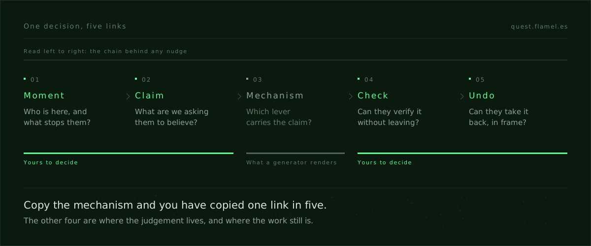
Ask three questions before you pull any lever: what fact are we making visible, what friction are we removing or adding, and what undo sits inside the same flow. If your answer starts with “we need a banner” instead of “the user needs this fact”, you are in style land, not mechanism land. The Fogg Behavior Model for designers shows how to place a trigger relative to effort.
Direct the model with mechanisms
You will ship generated screens. The edge is whether you can critique them for causal fit instead of surface fit. Ask what premise the design is advancing, whether a reasonable person could verify it in-flow, and whether the undo is visible and honoured. Reject work that moves the check off-screen.
Direct the tool with the mechanism, not the vibes. “Produce three variants that disclose the source and age of the claim and keep a visible undo near the primary action” is a design brief; “make the social proof stronger” is a guess. The point of how to critique an AI-generated screen is a checklist that travels across patterns and generators.
To see where teams invest when they stop chasing polish and start training leverage, read skills that appreciate as AI improves. The work that compounds is not assembling pixels; it is choosing and defending a premise you can verify locally. To rehearse the call on something real and low-risk, use the free sample brief: it asks you to pick a mechanism for a time-boxed early access and a tribe count on a launch page, exactly where the levers get confused. Decide what would make each claim true before you draw.
Train the repertoire, judge the moment, measure regret
You train three things. First, the repertoire: a working map of behavioral design skills with their mechanisms and ethical lines, so you reach for a lever with eyes open; the four frameworks underneath them are laid out in persuasion principles for product designers, and the library at Quest skills is built for that. Second, the judgment to pick the right lever for a specific person and moment, then defend it. Third, the muscle to measure lift with regret in the same window.
Measurement is where teams lose the plot because short-term lift shouts and long-term pain whispers. Count only conversion and any pressure-heavy tactic wins your A/B: cancellations, refunds and “item not as described” tickets land after the applause. Commit, up front, to keep a bad event flat and to cut a variant that borrows revenue.
Write hypotheses that name the claim, the moment and the risk you expect to hold steady: “Disclosing overflow with a 24-hour window and a visible upgrade will raise same-session upgrades 8-12%, with next-week downgrades and ‘lost files’ contacts flat.”
A one-nudge audit you can ship this week
1) Name the moment and the person. Write one sentence for what they are trying to get done right there, and what stops them. If you cannot say it, your nudge will default to style instead of solving the block.
2) State the claim your nudge makes, its source and its age. If you cannot say where it comes from and how fresh it is, on screen, do not ship the nudge. Treat every number and badge as a fact with lineage.
3) Write the check a reasonable user could perform without leaving the flow, and put it where attention already is. If there is no local check, add a reversible path that buys time: a hold, an exception window or a small quota that resets on a schedule.
4) Place the undo inside the same frame as the trigger, visible and honoured. If the undo sits in email or a support queue, it is not an undo; it is a cost you pushed away.
5) Commit the success event and the bad event you will keep flat, and the effect size you would call a win. Keep the window the same for both, and name the stop-loss that will pull the variant even if the top-line number moves in your favour.
6) Ship two variants: your mechanism with disclosure, check and undo, and a no-nudge clarity version that just removes friction. Keep the one that lifts with regret flat. If neither passes, the premise was not yet true on screen.
Choosing social proof, authority, or clarity
Reach for social proof when the decision is low-stakes and the crowd is relevant, fresh and sourced; Social Proof shows the bar, and the Airbnb social proof teardown shows one module doing three jobs at once. Reach for authority when expertise removes real risk and you can name the expert, the evidence and the exception path; Authority draws the line between guidance and bluff. Reach for clarity when the pressure is real but the information is hidden: a price lock, a timestamped refresh, a trial that emails before charging. If you need a trick to move the decision, your premise is not ready.
Close: the part AI cannot copy
A model can propose patterns in infinite style; it cannot know whether the premise is true for this person, here, now. That is why product psychology for designers matters more as generation gets cheaper: your edge is picking the lever, stating the claim and making it verifiable where the decision lands. A good screen is easy to make; a good decision is hard to earn. Start with one mechanism, ship one honest version, measure lift with regret in the same window, then add another. The point is not to memorize patterns; it is to choose premises you can defend and design them so the check lives on screen.
You are a senior product designer and behavioral UX reviewer. Analyze a single in-product decision moment and produce a one-nudge mechanism brief. Use this input: Moment [describe the moment], User [describe the person], Goal [primary decision], Success [primary metric], Risk [bad event to keep flat], Options [candidate mechanisms], Source [data/source for any claim], Undo [reversible paths], Constraints [legal/ethical]. Output these sections: 1) Moment and person in one sentence. 2) Claim, with source and age exactly stated. 3) Local check a user can perform without leaving flow. 4) Trigger placement mapped to ability using the Fogg model. 5) Visible, honoured undo in-frame. 6) Hypothesis with target lift range and stop-loss for the bad event, same window. 7) Two variants: a) disclosed mechanism with check and undo, b) no-nudge clarity baseline. 8) Instrumentation plan. Constraints: no fabricated urgency; disclose source and timeframe; verify in-flow; place trigger at ability; avoid moving checks off-screen; use only provided numbers; include copy snippets where helpful.
Frequently asked questions
How do I choose between social proof, authority, or clarity for an upgrade wall?
Start with the block: if users doubt they can finish work, choose clarity that adds a verifiable fact (quota, reset time, overflow window) and an honoured undo. Use social proof only when the crowd is relevant, fresh, and sourced, per https://quest.flamel.es/skills/social_proof. Use authority when named expertise removes risk and you show the exception path, per https://quest.flamel.es/skills/authority.
What makes a claim credible in-product and how do I show source and age?
State the population, timeframe, and source on-screen, close to the action, and make it screenshot-stable tomorrow. Example: “2,143 teams (50+ seats) upgraded in Sept 2026 — billing data.” Link or show a local check if possible. If you cannot name source and age, skip the lever or switch to clarity; the bar is outlined in https://quest.flamel.es/skills/social_proof.
Where exactly should I place the trigger so it converts without pressure?
Map the effort curve for the intended action and reduce friction until motivation and ability cross the action line, then place the trigger exactly there, not earlier or later. Keep the check and undo in the same frame. Use the walkthrough and examples in https://quest.flamel.es/blog/fogg-behavior-model-for-designers to translate the Fogg model into concrete UI placement.
How do I write a hypothesis and stop-loss that measure lift with regret?
Pair your success metric with the bad event in the same time window and pre-commit thresholds. Example: “Same-session upgrades +8–12% with next-week downgrades and ‘lost files’ tickets flat; stop-loss: bad event +2% triggers kill.” Write it before launch, then pull the variant if the stop-loss hits. The free brief can guide structure: https://quest.flamel.es/sample-brief.
How do I critique an AI-generated screen for causal fit, not just style?
Ask three checks: What premise is the design advancing, can a reasonable user verify it in-flow, and is the undo visible and honoured near the primary action? Reject any variant that moves verification off-screen or manufactures urgency. Use the checklist in https://quest.flamel.es/blog/how-to-critique-an-ai-generated-screen to standardize feedback across patterns and generators.